Matthew MontesanoImproving a points race scoreboardWhen I watch track cycling broadcasts, I find it hard to keep track of the score in a points race. Since I’m an experienced track cyclist…Nov 1, 2019Nov 1, 2019
Matthew MontesanoinNightingalePublic Health in the USA: How Data Viz Moves Government Toward EquitySeries: Communicating Data for Health ImpactJul 8, 2019Jul 8, 2019
Matthew MontesanoUser-centered design without users“We’re planning a user-centered design process for this web product.”Feb 22, 2019Feb 22, 2019
Matthew MontesanoPublic health’s obesity errorFor a while I’ve been concerned that public health, as a field of practice, is on a steady, definitive, slow-motion crash course with a…Mar 15, 2018Mar 15, 2018
Matthew Montesano“That graphic didn’t need to be a map”I had a short exchange with Andy Kirk when he tweeted something that reminded me of one of my pet peeves.Jan 26, 2018Jan 26, 2018
Matthew MontesanoUSPS, UX 101, and Missile AlertsI read Erie’s piece on What Healthcare.gov has to do with the Hawaii false alarm while I was standing in a long line at the Post Office.Jan 19, 2018Jan 19, 2018
Matthew MontesanoData Communication Sandbox #4From Sanofi Pasteur, a pharmaceutical company that focuses on producing vaccines, comes this infographic that tells the story of measles in…Jan 17, 2018Jan 17, 2018
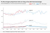
Matthew MontesanoData Communication sandbox #3I got some flu data recently. It looks like this:Jan 11, 2018Jan 11, 2018
Matthew MontesanoInformation Equity (part 1)I work in health communications. I think that working with the government to make better, clearer health information — and really, any and…Jan 3, 2018Jan 3, 2018