Moritz StefanerBeyond heatmaps — Data visualization for a warming planetAs it seems, we have hit a wall in the visual rhetorics surrounding global warming. How can data visualization help to make our changing…Mar 27, 2019Mar 27, 2019
Moritz StefanerDöner charts, eye roll gifs and word clouds — some things we learned visualizing Google Trends data…Google Trends provides a fascinating data source, and I’ve had great fun working with it in the past. So when the Google News Lab reached…Sep 27, 2017Sep 27, 2017
Moritz StefanerinVisualizing, The FieldThere be dragons: dataviz in the industryI started being serious about data visualization around 2005, when the field was still pretty niche and people like Martin Wattenberg, Ben…Mar 23, 20179Mar 23, 20179
Moritz StefanerProcess and Progress: A Practitioner’s Perspective on the How, What and Why of Data VisualizationDavid Bihanic’s “New challenges for Data Design” for Springer features a full-chapter interview with me on my work process and approach…Mar 18, 2016Mar 18, 2016
Moritz StefanerPropositional density in visualizationReposted here on Medium, the original article is from 2010.Mar 18, 2016Mar 18, 2016
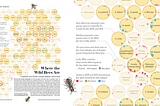
Moritz StefanerWhere the wild bees areThis is a repost here on medium, original post was from November 2013Mar 18, 2016Mar 18, 2016
Moritz StefanerWorlds, not storiesYou will often hear these days, that data visualization is great for “telling stories”, to “make the complex simple” or to “make boring…Mar 18, 20161Mar 18, 20161
Moritz StefanerinData Driven StorytellingSome things I learned about data-driven storytelling in Schloss DagstuhlI am just home after an intense week of discussions, brainstorming, writing, interviews and ping pong in Dagstuhl, a German castle hosting…Feb 13, 20162Feb 13, 20162
Moritz StefanerLittle boxesWould the field of data vis benefit from a clear line between art and design, as Lisa C. Rost suggests (see also the follow-up post)?Jan 12, 2016Jan 12, 2016