Gymshark Training Mobile App Re-Design Project
Introduction
For the purposes of this blog post, the writer will discuss a group project that took place as part of the User Experience Design Master’s programme at The Institute of Art, Design and Technology, Ireland.
The project brief was to identify and validate an existing UX problem to solve, based on an existing application and to design an appropriate solution for the chosen target audience.
The group explored different options and collectively decided to look at Gymshark Training: Fitness App. This application is designed to help people access a wide range of workouts and plans, with the aim of making working out accessible to everyone. (Gymshark 2022)
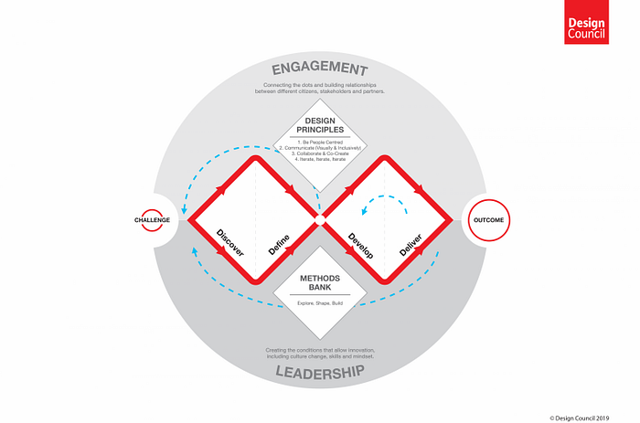
The group followed the Double Diamond process model, and went through the stages of discover, define, develop and deliver. (British Design Council 2005) It is a user-centred process that leverages user data to create designs that address real user needs and problems. (Gibbons 2016)
1. Discover
Heuristic Analysis
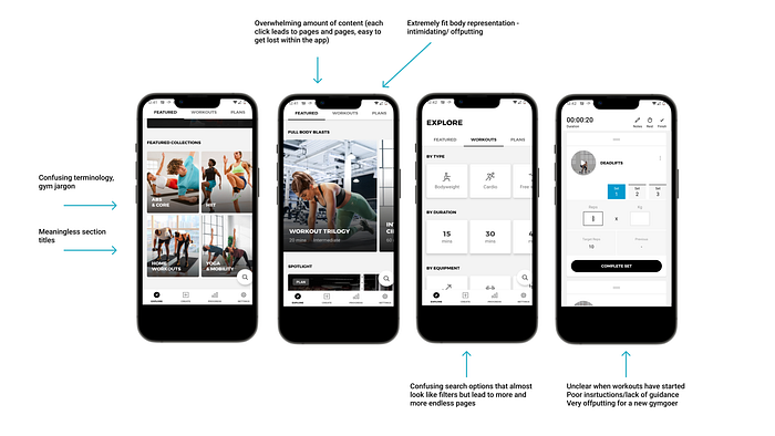
The writer began by conducting a heuristic analysis of the existing application. Nielsen (1994) describes this method as a means for identifying usability issues within an application, so that they can be addressed as part of an iterative design process. See Appendix 1 and Appendix 2.
The writer discovered that the most severe heuristic violations related to 1) Visibility of System Status 2) Aesthetic and Minimalist Design 3) Match Between the system and The Real World and 4) User Control and Freedom. See figure 2.

Competitor Analysis
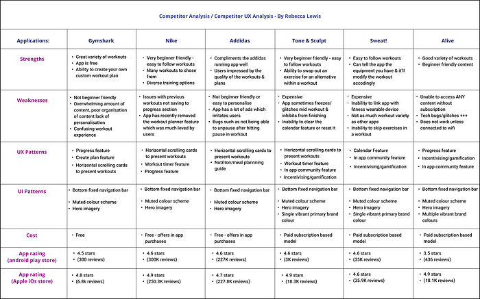
The writer conducted competitor analysis and UX analysis on similar mobile applications. Competitor analysis can be used to identify UX/UI patterns, trends and relevant features. It can help to discover strong and weak points in competitor products as well as to identify opportunities for differentiating the product from other existing products. (Goodman et al 2012) One weakness of this type of research is that it can lead to inadvertently copying or stealing design ideas when trying to adopt industry standards. (Klein 2013)
The writer looked at popular training applications such as; Nike, Addidas, Sweat, Tone and Sculpt and Alive. These applications appeal to a similar demographic and offer the same services as Gymshark. See Appendix 3.
See Figure 3 for an outline of the most interesting research findings obtained from the competitor research.
Other Research Methods: Surveys, Usability Testing and Interviews
The group selected three user research methodologies in the discovery phase. They used surveys, usability tests and user interviews to gather both qualitative and quantitative data.
Surveys
Surveys are a quantitative research method which aim to discover the prevalence of traits and characteristics of a user base. (Goodman et al 2012)
The group used surveys to investigate people’s needs, goals, motivations and barriers relating to exercise and the use of exercise applications. The data obtained helped the group to design with this information in mind in order to address any gaps in the existing application as it related to these.

Surveys are typically better for gathering data from a larger group of people in comparison to interviews or usability tests due to being able to widely distribute them. (Baxter et al 2015) The types of data collected by surveys can be either attitudinal or behavioural. Surveys can be implemented early in the product development phase or before redesign. (Goodman et al 2012)
One critique of this methodology is that it relies on self report from users. Self report methods aren’t as reliable as other research methodologies. Another potential limitation of this type of research lies in that the right questions need to be asked in the right way in order to obtain any usable or meaningful data.
Usability Testing
Usability testing was implemented by the group to discover problems with the existing user experience of Gymshark. Usability testing is a qualitative research method that generally gleans behavioural data. Usability testing requires a smaller number of participants than other methods like surveys. The group integrated quantitative measures during usability testing such as measuring time on task and task success to assess design effectiveness. The group implemented formative usability testing to discover insights and to shape design direction.
The team held testing sessions both remotely and in person and asked participants to use the “think-aloud-protocol” as per best practice recommendations. (Nielsen 2012) A total of four user tests were conducted, which is slightly less than is recommended. (Nielsen 2012)
One benefit of usability testing is that it is often a cost effective way to discover interaction problems. (Goodman et al 2012) One weakness of usability testing is that it doesn’t address the user’s underlying needs, it simply assesses the users ability to perform task driven actions within the interface. (Baxter et al 2015) For this reason, the group used user interviews in conjunction with usability testing to gather further qualitative data.
Interviews
The team conducted interviews during the discovery phase. This type of research methodology can be defined as a structured one on one conversation between the researcher and the participant for the purposes of gaining a rich understanding of their motivations and experiences. (Buley 2013) The data collected is typically qualitative, however, may be quantitative if a larger group is sampled, similarly to user testing. This research methodology was employed in the discovery phase to gather requirements, however, it may be used at any stage of the product development process.
The group members employed semi structured interviews, involving broad and open ended questions and allowed for freedom and flexibility so that the participant could go into as much or as little detail as he/she desired. (Klein 2013) The group used this methodology to develop a hypothesis about what the user might want or need, as well as to develop realistic personas. (Buley 2013) One strength of this type of research method is that
One limitation of user interviews is that it took additional time to collate and analyse all of the research findings from each of the participants completed by each of the group members. Another limitation is the potential for bias. (Baxter et al 2015) This can occur if the interviewee is uncomfortable or unconsciously wishes to please the interviewer. This can lead the participant to give answers that do not reflect their true thoughts or feelings. (Baxter et al 2015)
The group aimed to reduce this risk by taking efforts to make participants feel as comfortable as possible. This was achieved by conducting interviews in their own environments and implementing ice breaker questions before the interview. (Fessenden 2021) The group were also mindful of factors such as body language, tone of voice and how questions were worded so as to avoid leading the participants.
2. Define
The Problem Statement
“Exercise Novices want to get fitter and build exercise confidence, but are unsure how to achieve their goals due to a lack of experience & the unclear, unwelcoming nature of the Gymshark App.”
Personas and Empathy Maps
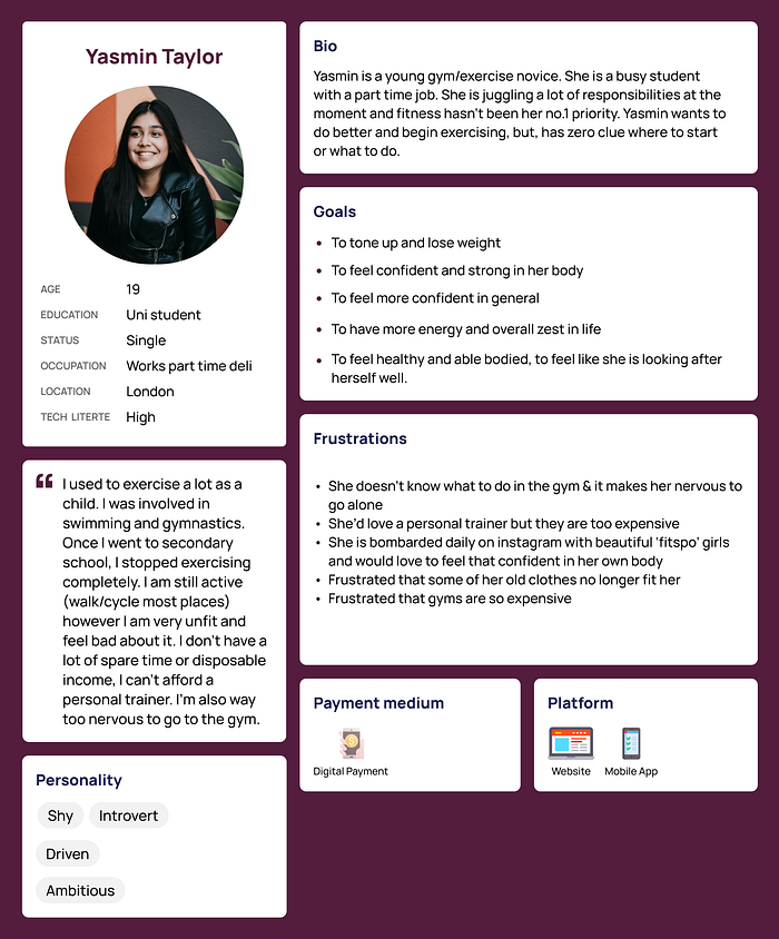
The group decided upon a problem statement and identified two key personas following data analysis in the research phase; The Gym-Phobe and The Exercise Novice. See rationale for this choice in Appendix 4.
Personas and empathy maps were developed as a means of giving a voice to our users. The group compiled quotes and insights from our research (surveys, interviews) to inform these as a way to help design with these user’s needs, goals and motivations in mind. (Goodman et al 2012) See Figure 4 and 5.
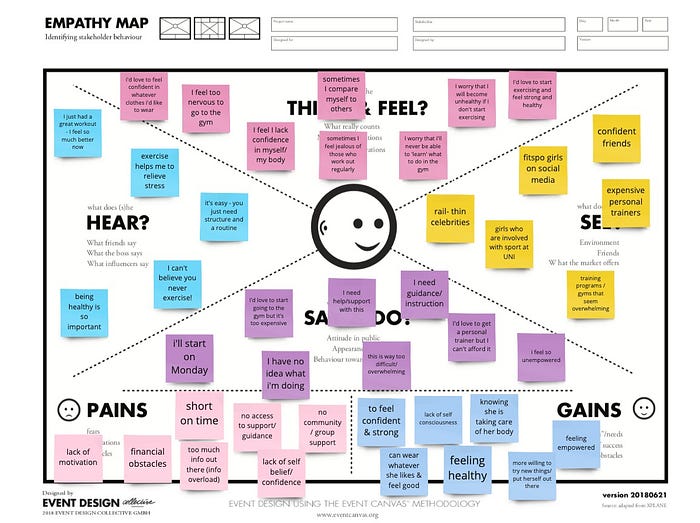
To view each group member’s personas and empathy maps, please see the shared Miro board.
User Scenarios
The writer formulated “as is” user scenarios in order to document the existing use case for our primary persona. See Figure 6.

The writer then created “to be” scenarios to document the envisioned use case for our primary persona, with the new redesign of Gymshark. See Figure 7.

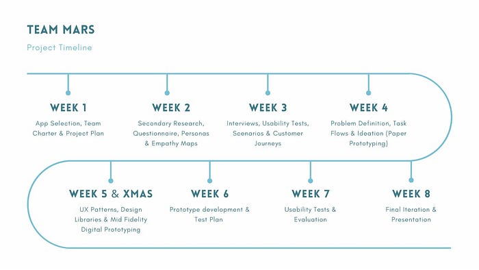
Project Plan & Timeline
The group collectively devised a team charter for the purposes of: defining roles and responsibilities and defining expected outcomes. (Ramzipoor, 2020) See Figure 8.
Although the team had assigned roles, the team did not adhere strictly to these over the course of the project. For example, the leadership role was taken by almost everyone in the group at different points in the project.
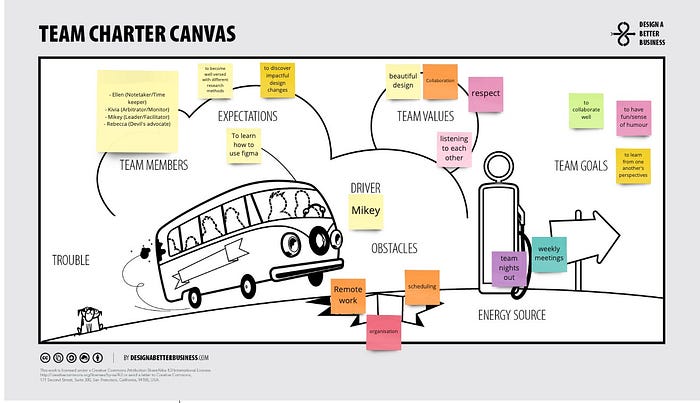
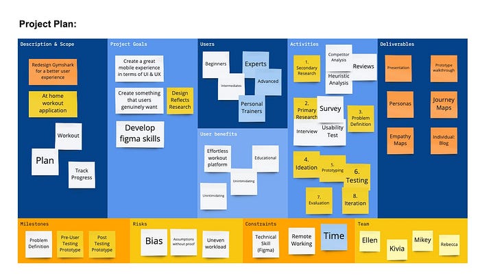
The team met once weekly for 1–2 hours outside of class at a time that suited each group member. Unfortunately, the group struggled to have all team members present for these meetings due to conflicting schedules and availabilities. The team however persevered and worked hard to continue to drive the project forward. For our project timeline, see Figure 10.
The team made use of online collaborative Tools like Miro and Figma for project planning and design work.
In terms of responsibilities, each group member took on one task within the Gymshark app to focus on throughout the project. See Figure 11. For these tasks, the group member was responsible for developing task flows, paper prototypes, and digital prototypes. The group member was also responsible for making any changes required after user testing or following feedback sessions with the module co-ordinator.

3. Develop
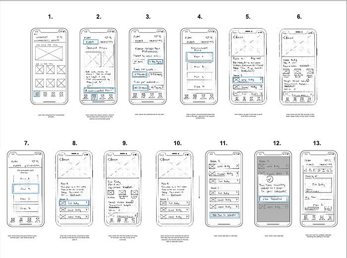
Iteration 1
For the first iteration, the group developed a set of paper prototypes. Paper prototyping can be an easy, cost and time effective way to brainstorm and express ideas at the earliest stages of a design. (Krugg 2013) Klein (2013) argues that this method can be ineffective when testing with users due to their complete lack of interactivity in allowing users to explore a product.
To see the group’s entire first iteration with detailed notes for design choice rationale, see Appendix 5.
Iteration 2
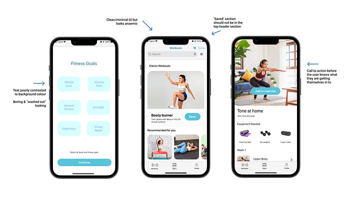
The group then moved into Figma to develop digital wireframes. The group made changes to the prototype based on the feedback from the module co-ordinator. To see the group’s entire second iteration with detailed notes for design choice rationale, see Appendix 6.
Iteration 3
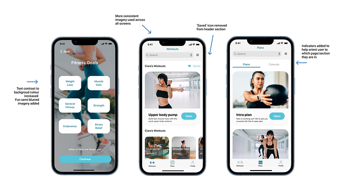
The group made some final changes to the prototype before user testing. To see the group’s entire third iteration with detailed notes for design choice rationale, see Appendix 7.
User Testing
The group planned the usability testing sessions around the primary tasks/core functionalities of the app. See Appendix 8.
Users were recruited both inside and outside of the class group with friends and family. A total of four usability tests were conducted as is recommended. (Nielsen 2012) The testing sessions were conducted remotely over Teams. Each group member took turns in being the facilitator and the note taker. Interview transcripts/ key observation notes were placed in Figma and the thematic data analysis was performed. (qualitative) Time on task and task completion were recorded (quantitative) See Figure 15 for a summary of the usability testing findings.

4. Deliver
Final Iteration — Iteration 4 — Post Usability Testing
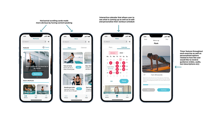
The group analysed the usability testing findings and each set to work on improving the screens within their tasks. To see the group’s final iteration of the prototype with detailed notes for design choice rationale, see Appendix 9.
Visual Research and Visual Treatment
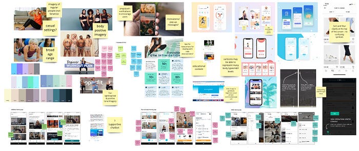
After speaking to beginners in the research phase, the group knew the importance of having representative imagery including regular people with normal body types. The group included representative imagery where possible.
The group wanted to have a focus on encouraging, supportive and motivating language that was easy for the user to understand. During formative user testing, the group discovered that the heavy use of jargon and gym terminology added to the intimidation of new users/gymgoers. See Figure 17.
The group used the iOs design system to build the prototype as the majority of Gymshark users are iPhone users. Gymshark’s target market audience is Gen Z, and the research also showed that this group have a preference for iOs over android. (Kostadinov, 2021) Our choice of font, SF Pro Text, was pulled directly from the iOs design system as it is a mobile friendly font. The writer created text styles within Figma to ensure consistency of font usage across all group members and all screens.
The group followed design patterns and trends as outlined in Figure 3. The decision to implement horizontal scrolling cards, fixed bottom navigation, calendar/workout planner feature, workout timer feature as well as a personalised progress section, was influenced by industry standards in the fitness app space.
Minimalist design with one primary brand colour was also a noted pattern amongst competitor apps. The choice of our primary brand colour #3C7A89 was influenced by a desired feeling of calm, reassurance, stability, reliability and security. (Tapaniya, 2019) From all of the knowledge gained in the research phase, the group wanted beginners to feel as welcomed and as reassured as possible. See Figure 18.
The choice of our secondary brand colour #D35269 was influenced by a desired feeling of self love, positivity and kindness. (Tapaniya, 2019) The group learned in the research phase that beginners were often hard on themselves and felt guilty or lazy for not working out. This punchy pink was implemented with the idea of inspiring feelings of bravery and power. See Figure 18.

Interaction Design Patterns and Principles
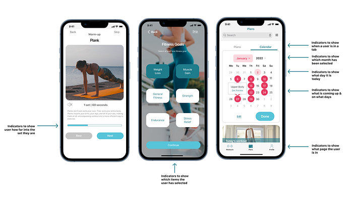
- Feedback/ Visibility
The group redesigned the interface to keep the users informed as to where they are and what is happening in the app at all times. See Figure 19.
2. Design with aesthetics and minimalism in mind
The group designed with the focus of minimising the user’s cognitive load wherever possible. The existing design failed to do this due to having too much content, too much choice and not enough organisation and order. See Figure 20.

3. Control, Trust and Explorability
The writer aimed to allow for the user to control their experience within the app as much as possible. Certain features were implemented to allow for the user to explore throughout the app and to easily recover from any errors. See Figure 21.

4. Consistency
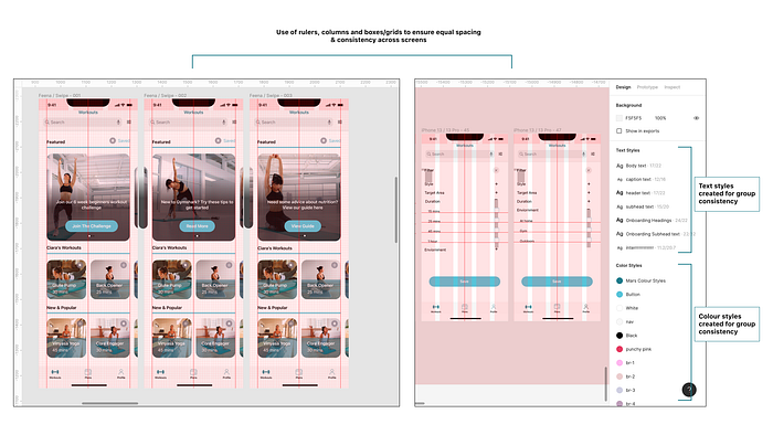
The group struggled with maintaining consistency across the designs initially as each member was developing different screens for different flows. The group overcame this by developing reusable components, text and colour styles as well as using 4px layout grids in order to maintain consistency. See Figure 22.
Project Conclusion and Reflections
Ethics
The group discussed how an ethical design framework would be applied throughout the project. See Figure 23.

The decision to focus on democratising access to fitness was central to design choices. Maintaining the ‘freemium’ model ensured that users could enjoy content no matter what their financial situations were. The use of diverse imagery reflective of a range of body types and capabilities is in line with advocating for accessibility.
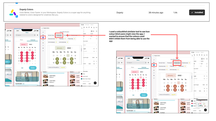
The writer used browser plugins and Figma plugins for tools such as a colour blind simulator and a colour contrast checker to ensure designs were as accessible as possible. See Figures 24 and 25.

Teamwork
The writer feels that the team worked well overall and collaborated effectively throughout the project. One major constraint was being 100% remote throughout the project. This meant that the group had to do a lot of planning and organising to communicate online. Differing work and personal life commitments meant at times, not all group members contributed equally.
Individual Contributions
The writer helped in areas such as maintaining regular contact/meetings amongst the group. The writer took on a leadership position in this regard by organising meeting dates/times, sending links and follow up messages with updates to those unable to attend.
The writer took on a leadership role specifically when it came to developing the digital prototype in Figma. As the writer has had previous working experience using the software, she felt confident in this portion of the project in particular. The writer helped the other group members who were less familiar in Figma to develop their parts of the project.
Overall Learnings
Throughout this project, the writer learned the importance of having effective project planning and accountability in place. In the future, the use of project management tools such as Monday.com or Trello will be implemented.
Overall, this project was an excellent learning experience particularly in learning how to apply research methodologies, interaction design principles and to work effectively as part of a team.
For a full list of references used in this blog post please see Appendix 10.
