PinnedNick MartininDev Genius4 Ways to Visualize Year to Year Comparisons1. Slope ChartDec 19, 20221Dec 19, 20221
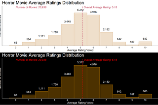
PinnedNick MartinHow to R: Making Better HistogramsThe story you tell with your data visualizations is only as good as the visualizations themselves. In this article we will look in ways to…Nov 26, 2022Nov 26, 2022
PinnedNick MartinHow To R: Visualizing DistributionsDistributions are a very important thing to understand during any EDA process. In this article we will look into multiple different ways to…Nov 22, 2022Nov 22, 2022
PinnedNick MartininDev GeniusHow To R: Lollipop ChartsLollipop charts are an alternative to the bar graph. These can be shown for one or multiple variables.Nov 20, 2022Nov 20, 2022
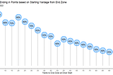
PinnedNick MartinNFL — Probability of Points from Drives (Part 2)How much does the starting position of a drive affect success; and are there teams that do much better/worse than expected?Nov 20, 2022Nov 20, 2022
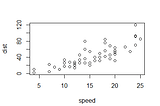
Nick MartininITNEXT10 Ways to View Correlation from a Noisy Scatter PlotA scatter plot is an excellent tool for viewing the correlation between two variables, but when there is too much noise, this can become…Dec 8, 20221Dec 8, 20221
Nick MartininDev Genius10 Alternatives to the Bar ChartThe bar chart is a great visualization, however having many of them on your presentation/dashboard can make it pretty bland.Dec 8, 2022Dec 8, 2022
Nick MartinFind Datasets Inside of R PackagesThere are multiple places to find datasets to use for training or various data science projects. In this post I will go over the vast…Dec 1, 2022Dec 1, 2022
Nick MartinNFL — Probability of Points from Drives (Part 1)How much of a difference is there between teams when a drive begins and the chance that they will score points when it ends?Nov 18, 2022Nov 18, 2022