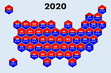
Oscar LeoinTowards Data ScienceHow to Create Hexagon Maps With MatplotlibUsing shapes to represent geographic information·7 min read·Nov 21, 2023--1--1
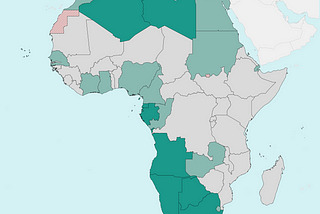
Oscar LeoinTowards Data ScienceMatplotlib Tutorial: Let’s Take Your Country Maps to Another LevelHow to draw beautiful maps with Python and Matplotlib·10 min read·Sep 24, 2023--5--5
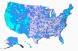
Oscar LeoinTowards Data ScienceHow to Create United States Data Maps With Python and MatplotlibCreating maps that capture the eye·7 min read·Sep 7, 2023--1--1
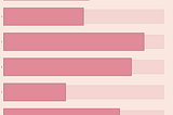
Oscar LeoinTowards Data ScienceHow to Create a Lipstick Chart with MatplotlibA data visualization when the lower the value, the better·6 min read·Sep 2, 2023--1--1
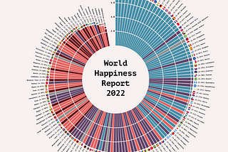
Oscar LeoinTowards Data ScienceHow to Create a Polar Histogram With Python and MatplotlibCreating a graph that captures the eye and tells the beholder an insightful story.·10 min read·Aug 24, 2023--4--4
Oscar LeoinTowards Data ScienceHow to Create Beautiful Bar Charts with Seaborn and Matplotlib (Including Animation)A data visualization tutorial for Python·7 min read·Jun 15, 2023--1--1
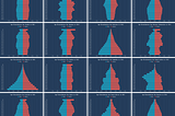
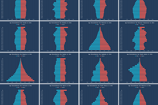
Oscar LeoinTowards Data ScienceHow to Create Beautiful Age Distribution Graphs With Seaborn and Matplotlib (Including Animation)Visualizing demographics for countries and regions·9 min read·Jun 22, 2023--1--1
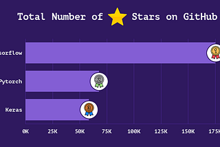
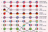
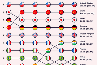
Oscar LeoinTowards Data ScienceHow to Create Eye-Catching Country Rankings Using Python and MatplotlibA beautiful alternative to standard line charts·7 min read·Aug 18, 2023--8--8