Book Summary: Laws of UX by Jon Yablonski | Part 1
Using Psychology to Design Better Products and Services

We know that the designer is a multidisciplinary professional and needs to have knowledge in several areas: psychology is one of them. In the area of user experience, work is done by and for people, and this requires some knowledge in psychology so we can understand, even in an introductory way, how users behave and interact with digital interfaces. In his publication, Jon Yablonski brought the main concepts of psychology applied to UX.
In this article, I will summarize what I have learned about the first five concepts (out of ten): Jakob's Law, Fitt's Law, Hick's Law, Miller's Law and Postel's Law.
1. Jakob's Law
“Users spend most of their time on other sites, and they prefer your site to work the same way as all the other sites they already know.”
This Law was presented in 2000 by Jakob Nielsen (usability expert), who described it as the tendency of users to apply their knowledge based on their cumulative experiences in previous websites. In other words, the less time the user needs to spend understanding an interface, the more time he has to accomplish his goals, and familiarity plays a key role in this process. We can see examples on e-commerce websites. Most use the same elements to cause familiarity: search fields, profile, shopping cart. Look:


This Law does not defend that we cannot innovate, only that we must do it with caution.
2. Fitt's Law
"The time to acquire a target is a function of the distance to and size of the target."
When we design good products and services, we always value usability. In this sense, Fitts’ Law states that:
- Touch targets must be large enough for users to click without difficulty, and for this we have minimum size recommendations (which can be exceeded whenever necessary), namely:
Apple — Human Interface Guidelines: 44 x 44 pt (dots)
Google — Material Design Guidelines: 48 x 48 dp (density independent pixels)
WCAG — Web Content Accessibility Guidelines: 44 x 44 CSS px (pixels)
Nielsen Norman Group: 1 x 1 cm (centimeters)
- A good spacing between the icons is necessary so that they are not mistakenly clicked, and for this we use the Google Material Design guidelines, which recommend that the touch targets be separated by a space of 8 dp. In terms of information, Jon brought the MIT Touch Lab study, where he says that the finger of an average adult measures between 10 and 14 mm and the average fingertip is between 8 and 10 mm².
- Sizing and spacing mentioned, it’s time to talk about the position of touch targets. This part is not always obvious as it changes depending on user context, device, etc. Considering smartphones, some areas can be difficult to click when holding the device with just one hand. According to Steve Hoober, people prefer to view and touch the center of the screen, so that’s where the highest accuracy is.

Also in this Law, we can cite accessibility exemplifying with the iPhone that allows access to the upper half of the screen.

3. Hick's Law
"The time it takes to make a decision increases with the number and complexity of choices available."
Redundancy and excess create confusion, it is based on this that we, designers, seek to synthesize information and facilitate processes. Formulated in 1952 by psychologists William Edmund Hick and Ray Hyman, Hick’s Law states that increasing the number of available options logarithmically increases the decision time. In short, people take longer to make a decision when they have more options to choose from.
There is an actual formula to represent this relationship:

It’s a fact that you don’t need to understand mathematics to draw a conclusion from all this: Hick’s Law seeks to reduce the user’s cognitive load, making decisions simpler, clearer and easier. A classic example is TV controls modified to simplify the interface:

4. Miller's Law
"The average person can keep only 7 (± 2) items in their working memory."
This concept bears a lot of similarity to basic design concepts such as hierarchy and chunking (separation into blocks). When he published his article in 1956, George Miller observed that the memory retention capacity in young adults was approximately 7. Focusing not only on the number 7, but on the concept of blocking, Miller concluded that:
"The size of the chunks did not seem to matter — seven individual words could be held in short-term memory as easily as seven individual letters. While there are factors that influence how many chunks a given individual can retain (context, familiarity with the content, specific capacity), the takeaway is the same: human short-term memory is limited, and chunking helps us retain information more effectively."
Let’s go to the examples:


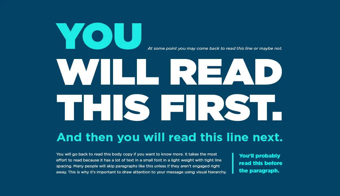
In this case, textual hierarchy, formatting and contrast also apply. In UX, we’re talking about simplifying information and making it easier to understand, and we can use design foundations for that.
Postel's Law
"Be conservative in what you do, be liberal in what you accept from others."
This is how Jon Postel introduced what he called the principle of robustness, where the idea at the beginning was to be a guideline for network engineering, with regard to the transfer of data through computer networks. This philosophy, when applied to user experience, means designing good human experiences. In this sense, Postel’s Law has a design approach similar to the philosophy of human-computer interaction:
"we should anticipate virtually anything in terms of input, access, and capability while providing a reliable and accessible interface."
The most common example is input forms, which are very present in the digital environment. In essence, it is through them that the interaction between humans and computers takes place: a product or service requires information, which will be made available by the user and sent for processing. Putting Postel’s Law into practice even in the forms: be conservative with the number of information requested, the more energy and cognitive effort required from users, the lower the quality of the decisions taken.
The flexibility of the system is also taken into account, since there is often a discrepancy between the information that the user provides and that which the system expects to receive, for this reason computers must be robust to accept the variable types of human input. This can be done in a number of ways, but those that require the least effort are preferable.
Let’s go to the examples:


Where you can find the book:
Thank you for reading! This was part 1 of a summary where I cover the 10 main psychology concepts applied to UX. In part 2, I’ll talk about Peak-End Rule, Aesthetic-Usability Effect, Von Restorff Effect, Tesler’s Law and Doherty Threshold.
