Rapido: Enhancing the flow of the package delivery feature| UX Case Study
Team: Design Warriors (DG-1)
This is the first time I try to apply my UX skills that I developed so far on a real product. By doing this project, I understood how much a business depends on the user experience. I also learned about the different kinds of business metrics that can be impacted by improving the user experience. Even improving the user experience for a few features in a single flow can bring great impact to the business.
Problem Statement:
Evaluate the “Local — Send Items” feature’s flow in the Rapido app, which includes sign-up, sign-in, home, product page, feature booking reviews, and redesign the experience while identifying the opportunities to make usability better for the category of the users that includes the employees commuting on a daily basis which will lead to increasing the daily active users and reducing the bounce rate.
The whole process is divided into the following steps:
1. Understanding the Problem Statement:
a. Category of the problem
b. Understanding the Business
c. Understanding the user and their needs
d. Design outcomes
2. Self-Heuristic Evaluation (SHE):
a. Heuristic Evaluation
b. Hypothesis and Assumptions — Heuristic Assumptions and Intuitive Assumptions
3. Secondary Research:
a. Statistical Analysis
b. Behavioral Analysis
c. Competitive Analysis
4. Primary Research:
a. User Interviews
5. Customer Journey Mapping: Comparing insights from steps 2 and 3 with insights from step 4 and validating the ones that match.
6. Wireframing:
a. Pen and Paper wireframes
b. Digital wireframes
7. UI Design and Prototyping: Using the wireframes and designing the User Interface and making the Prototype.
8. Usability Testing: Testing the UI that is designed with the users and noting down further issues faced by them in understanding and using the design.
9. Redesigning UI: After testing, taking the user reviews and modifying the UI design.
I contributed in the following stages of the entire project:
1. Self-Heuristic Evaluation
2. Secondary Research
3. Customer Journey Mapping
4. UI Design and Prototyping
5. Usability Testing
6. Redesigning the UI
I worked on this project in a team of total 6 people. We started with understanding the problem statement in the business point of view and the user point of view. The steps we took in doing this project are elaborated below:
1. Understanding the Problem Statement: The problem statement speaks about the package delivery feature in the Rapido app. The aim is to study the flow of this feature from signing in till the service booking page. Identify any problems faced by the users. These issues should be solved by redesigning the UI. So that the user experience will be enhanced and the daily active user count will increase and the bounce rate will be reduced.
Category of the Problem: This is an evaluative type of study which means that we study the feature and its flow in an existing app and if the users are facing issues with it, then we redesign the UI and the flow according to the user needs, so that the user experience will be enhanced.
The targeted group of users for this problem statement are the employees who commute on a daily basis.
Understanding the Business:
· Rapido is an Indian Bike taxi aggregator and logistics service provider based out on Bangalore.
· In this app, people can book a bike taxi whose rider is referred to as “Captain”. After booking the captain will pick up the customer and drop them at the mentioned destination. The base fare is Rs. 15 and then the charge per kilometer is Rs. 3.
· This works similar to other taxi or cab booking apps, but here we can book bikes and autos.
· They provide a package delivery feature that allows people to send qualifiable packages from one address to another address within the city limits. This feature is named as “Local”.
Understanding the User: Users use this app for the following services:
· People who want to order a taxi, bike or auto.
· People who want to deliver their packages to another address.
· People who travel daily to work.
· People who buy things from a store within the city and needs that item delivered to their location.
Design Outcomes: The following are the expected outcomes of this case study:
· The number of daily active users using this “Local” feature to increase.
· Enhancing the onboarding, sign-up and sign-in processes and thereby increasing the conversion rate.
After studying in depth, we analyzed the existing flows in the app which can be seen below.


As you can see, we have divided the screens into 6 groups namely the Onboarding group, Sign-in group, Homepage group, Local feature introduction group, Adding details group which deals with the address filling part, and finally the Booking Locals group where we finalize the booking.
2. Self-Heuristic Evaluation:
Heuristic Evaluation: A heuristic evaluation is a way to test the app to find out whether it is user friendly or not. There are certain factors that should be considered and all the screens in the flow should be analyzed considering these factors or rules as a guide. Whether the screens satisfy all these rules or not. And marking the screens and writing the issues in case a heuristic is neglected.
We took each principle, compared all the screens with it, and wrote down the key points that will help us better understand the problem in the flow. Similarly, all the 10 heuristics are compared with all the screens and the key issues found from this evaluation are written down.
The 10 heuristics are:
1. Visibility of System Status.
2. Match Between the System and the Real World.
3. User Control and Freedom.
4. Consistency and Standards.
5. Error Prevention.
6. Recognition Rather than Recall.
7. Flexibility and Efficiency of Use.
8. Aesthetic and Minimalist Design.
9. Help Users Recognize, Diagnose, and Recover from Errors.
10. Help and Documentation.
If you wish to know more in detail about the 10 heuristics mentioned above, you can check the following link.
https://www.nngroup.com/articles/usability-heuristics-complex-applications/
In the image below, the insights from the heuristic analysis of all the screens in the considered flow are shown.

In this analysis, we get some insights from comparing the heuristic principles with all the screens. But we also did a self-evaluation of all the screens based on our instincts and got some insights from this method. Even though this self-evaluation or intuitive evaluation might appear like biased one but it would help a lot in the secondary and primary research part. It is not mandatory to get insights from the self-evaluation method.
After the heuristic and intuitive evaluations some assumptions as to how to proceed with the problem were made. And these assumptions are categorized into two areas. The assumptions made from the heuristic evaluation were the heuristic assumptions and the ones from intuitive evaluation were the intuitive assumptions. Combining these two a final hypothesis is prepared.
A brief description of the final hypothesis and the assumptions that were made with this analysis is given below.
Heuristic Assumptions:
· Our hypothesis is that we should the rename the feature from “Local — Send Items” to something different as we thought that, in reference to the 2nd heuristic principle mentioned above, the user may find it difficult to understand what the feature is about from its name.
· The feature is kept inside the hamburger menu on the home screen and if this feature needs to used more frequently by the users then it should be kept visible on the home screen.
Intuitive Assumptions:
· Our hypothesis is that executives should be made available even late at night or 24*7, just in case of someone needed some medicine or something like that late at night.
· Our hypothesis is that the fragile items must be insured like in the Ola app. This will boost the user confidence.
· Our hypothesis is that the map on the home page should be removed or reduced in size which will allocate space for some other features that should be made visible to the users.
· Our hypothesis is that if all the main features of the app are made visible on a navigation bar on the home page it would be easy for the user to find their required feature.
I participated in this part of the project. I made some assumptions in the heuristic part of the analysis and as well as the intuitive part of the analysis. After a thorough discussion among the group members we finalized the assumptions that are really important for the flow that we considered and kept the rest away to be considered later if needed.
After this part, the next part is about the secondary research.
3. Secondary Research: Secondary research, even though the name contains the word secondary, actually comes before the primary research. In this part we study various sources that provides us information about the product that we are dealing with now. This study will help us in doing the primary research part much better. Many sources about the product will contain a lot of statistical data like the profits and losses from this product, user opinions, positive and negative, their problems when using this product which comes under the behavioral data.
So, we searched online for articles, other case studies related to this product. The ones that are highly relevant for us are selected and got many insightful points from them. After careful analysis, these points are classified into statistical insights and behavioral insights. The articles studied and the data collected are mentioned below.
Statistical Insights:
· Rapido currently offers bike taxi services in 100 cities and auto-rickshaw services in 26 cities.
· With 150,000–160,000 bikes and 70,000 autos in operating on its platform. Rapido is clocking 10 million dollars per month.
· Rapido has tied up with 25 small and large aggregators for delivery services, and almost 90% of the business comes from Swiggy, Zomato, and Jiomart.
· Rapido has partnered with major online companies like Big Bazaar, Big Basket, and Spencers for the delivery of essential goods and is additionally supporting the Delhi Government in delivering essential items during the COVID-19 lockdown.
Behavioral Insights:
Sources:
a. https://bootcamp.uxdesign.cc/redesigning-rapido-a-case-study-c9c9c8d56f2d
b. Some reviews about the app and its service.
Reason to use the app:
o Reliable and robust mode of delivery of small packages.
Needs:
o Not wanting to hire a dedicated delivery partner as it might not be cost effective.
o Same day delivery of orders in the city.
o Pocket friendly app and easily accessible.
Preferences:
o Seamless package pickup and delivery experience.
o Willing to pay for premium if the experience is highly satisfactory.
o Would be best if the delivery guy do not ask for directions and locate the address on their own.
o Safety is the most important concern. Delivery should be done without damaging the package.
Pain points:
1. Users found it difficult to coordinate with the driver for the delivery of a package
2. Sometimes the delivery gets delayed which caused problems for the users. Reason could be the lack of coordination.
3. Sometimes users were unable to track their packages.
4. Sometimes the captains cancel the order for ride or delivery at the last moment which leads to delays.
5. At peak time it is difficult to book the captains.
6. The map should be in the control of the user and should not be reset every time.
So, this is all the information both statistical and behavioral that we could get from our research. I actively participated in this part of the project and researched various articles to get the key information about the Rapido product.
After this, the other part of the secondary research, which is the competitive analysis, comes.
Competitive Analysis: In this part, we compared the Rapido product and the flow under analysis is compared with other apps providing the same or similar service. This is done to find out if the other apps user experience is better than the Rapido’s or not. If they are better, then we need to find out why and take some important information about the flow and UI from those other apps. This will help us better understand how to solve the issues with the existing flow of the product.
For our analysis we chose the Uber app and the Ola app as they are the top most competitors with Rapido. First let’s see what insights the comparison with Uber app gave.
Comparison with Uber:
· Easy access to the main functionalities of the app
· Seamless booking a ride for the package.
· Better navigation
· The signing up procedure includes the Gmail and Facebook options which some users might prefer.
· The home screen is bright and clear.
After our analysis with Uber app we compared the Ola app. Some insights may the same as Uber. These are the insights.
Comparison with Ola:
· The home screen is bright and the font is distinct and very clear.
· The start screen has an attractive design.
· Has an option to log in with Google and Facebook
· Bright background, contrasting font, clear to the eyes.
· Payment options are very flexible and a favorite option can be set in the beginning when we sign up.
· Insurance policy for health, travel, and items is present
· The package delivery option is not directly present. We book the cab the normal way and once the cab arrives then we give them the package to deliver it. This is not such a good experience for the user when they want to deliver a package.
In this part of competitive analysis, I compared the Rapido app with the Uber app and the Ola app with another team member. After thorough discussion the insights mentioned above were the ones we came up with.
The image below shows the comparison analysis with both the apps.

Once the secondary research is complete, with the insights we gathered so far, we will move forward to the primary research part where we interact with the potential users and understand their current experience with the product’s flow.
4. Primary Research: The primary research part consists of the user interviews, where we interviewed the users about their current experience on the flow of the product. Since this is an evaluative type of problem we do not prepare a set of questions for the interview. Preparing questions for the interview will happen when we want to design a new product or a service which is the exploratory type of problem. In this evaluative type, we give the users the app and ask them to navigate through the existing flow of the package delivery service.
This process is done twice. During the first time we will simply observe how the user navigates through the flow from start to end and note down where they faced problems. During the second time we will probe them with questions and ask them why they took some action, what they felt, and their opinions on whether any improvements should be made. This is where the insights from the self-heuristic evaluation and the secondary research help us. With those insights we could accurately ask the right questions and form better insights during the primary research.
In this project, we selected the user age group to be between 25 years and 40 years. And the users are all employees commuting to work on a daily basis. We interviewed both first time users and also existing ones. We interviewed a total of 5 users and got some interesting insights after the interviews. These insights are completely new to us and we did not think of them in the previous steps.
So, in the interview we gave them a task, observed their behavior and noted down their reactions, the problems they face while performing the given task. And asked them to do it again but this time with some questions about their choices, reactions, and problems they faced.
Also, the insights obtained in the primary research part are compared with the ones from heuristic analysis and secondary research for validation purposes.
The insights obtained from these interviews are mentioned below:
· One of the most important assumption we hypothesized, which is that the user will find it difficult to locate the “Local — Send Item” feature, got validated here. Some have found it but couldn’t understand the meaning of it or the type of service provided which was also one of our assumptions.
· The users are habituated to look at their profile at the top right. But here, they couldn’t find it which frustrated them.
· The content on the onboarding pages (the other sites pages) was extremely confusing for the user.
· The users couldn’t understand a lot of buttons, like their purpose, throughout the application. They had to click on them to find out where they led. This made them unsure about the application.
· The address details page was really confusing for the users. The users found it extremely difficult to add, edit, and remove the contacts.
· Also, the users pointed out that there was limited space for writing down the address. They couldn’t write the whole address.
· The info button besides the Package Items was too small. Some users missed it and others found it difficult to press.
· The users were also worried whether their package would be delivered safe and secure without being damaged in the commute.
· The users were also concerned with what would happen if the person to collect the package is not available. It is better to have an alternative if this kind of situation comes up.
· Once the users have entered all the address details of pick-up and drop, and then only when they click on the Book Local button the app shows the availability of the captains in that area.
· And the users couldn’t understand the meaning of the “Book Local” button.
The image below contains all the insights from primary research each linked to the corresponding screen.
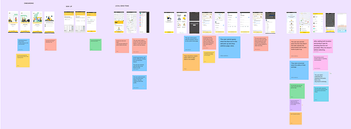
My contribution in the primary research part was minimal. I didn’t do the interviews but once the other members finished the interviews we discussed together and formulated the insights in the most meaningful manner possible as described above.
Once the primary research is done, the next part will be the Customer Journey Mapping.
5. Customer Journey Mapping: In this part, we will take all the insights from the heuristic analysis, secondary research, and the primary research and put them together linking all of them to their corresponding screens. Doing this will help us narrow down the problems for each group of screens, get better ideas and in turn generate better solutions.
Some key insights for each group of screens are mentioned below:
Onboarding Screen:
· Insights from the primary and the secondary that are validated:
o The user was confused whether the “Skip and Get Started” button will perform the skip action or the get started action.
Sign-in / Sign-up Screen:
Insights from the primary and the secondary that are validated:
o Sign-up screen should contain the Gmail and Facebook options and also should contain a password option in case the OTP did not work.
Home Screen:
Insights from heuristics:
o The profile icon should be consistent.
Insights from the primary and the secondary that are validated:
o The user faced difficulty in locating the “Local — Send Item” feature.
o And the name of the feature did not make much sense to the user.
Local — Send Item Screens:
Insights from Intuition:
o The weight limit is 5 kg. But the way it was mentioned is not eye catching enough for the user. More emphasis should be kept on it so that the user will not miss it.
Insights from the primary and the secondary that are validated:
o Info button is small. Important information can be missed by the user.
o The user cannot understand the purpose of the question mark in the Local homepage.
o In the address adding page, the user has to scroll down to enter some data, which can be easily missed if the user presses the save button without scrolling.
Adding Details Screen:
Insights from Intuition:
o The fare for a particular delivery is not made available unless there are some captains available. Since the fare depends on the distance travelled as it is known the fare should be made available as well.
Insights from the primary and the secondary that are validated:
o The user was confused about changing the location once it is entered.
o User wanted to choose his current location but no option is present for him to do so.
Booking Local Screen:
Insights from the primary and the secondary that are validated:
o When the availability of the captains is very low and there are high chances that the delivery will not be possible it should mentioned before booking. There were user reviews that the captains cancelled the booking in the last minute.
o The meaning of the Book Local button was very confusing to the users.
These are the insights we got from the three steps mentioned above. We combined all the insights together and formed the table as shown in the figure below.

I participated actively in this part. Since I contributed in the heuristic evaluation and the secondary research part I worked with the team to develop the journey map as shown in the figure above. After sorting the relevant insights together, we discussed and brainstormed the possible “How might we” or HMWs for each group of screens. These “How might we” or HMW questions will help us in focusing on the right problem so that the solution we develop works best. All the HMWs for each screen group can be seen in the figure above. As an example, the HMW questions for the Onboarding screens is mentioned below:
Onboarding Screen HMWs:
· How might we make the onboarding screen more clear so that it is understandable and more engaging for the users
· How might we eliminate the user’s confusion regarding the skip button
Similarly the HMWs for all the screens are developed using the insights from the Customer Journey Map. Once the HMWs are prepared we proceed to generate solutions to those questions in the form of wireframes.
6. Wireframing: Wireframing is about making a rough sketch of the solutions we thought of. These rough sketches can be on paper or we can also make a digital rough sketch of the prototype. We first made a paper sketch of the UI and then developed the wireframes digitally.
In the wireframing part we thought of multiple possible solutions for the UI and made the wireframes. But in the end after some discussion we finalized the proper design and developed the UI.
The wireframe designs done on paper are shown below:
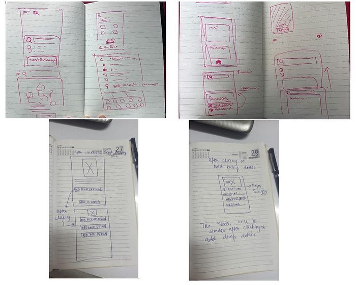
After developing these paper wireframes we worked on the digital wireframes which are shown below.

Some other members of the group worked on the wireframing part. I did not contribute to the designing of the wireframes.
After making the wireframes the next part is the User Interface designing and the prototyping.
7. UI Design & Prototyping: The wireframes made in the previous section were used as a guide and the UI screens are designed in figma software. A UI design is finalized and the screens are designed. The designed individual screen groups along with some explanation of the ideas implemented is described below.
Onboarding Screen UI:

Ideas Implemented:
· Skip button is added at the top right corner. Previously a single “Skip and Get Started” button was present.
· That single button is renamed as “Continue”.
· The introduction of the Local feature is added here so that the user might check it.
Sign-in / Sign-up Screen UI:

No changes to the previous design were made here.
Home Screen UI:

Ideas Implemented:
· The design of the homepage is completely changed to resemble the design of the Ola app’s homepage. Now all the features are clearly made available on the homepage so that the user will not have any problem locating what they need.
· The “Send Your Items” button will take the user to the package delivery page. A small description of the service is mentioned here.
Send — Local Items Screen UI:
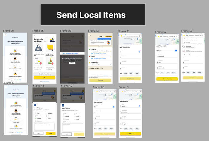
Ideas Implemented:
· A title page is added.
· Previously, the service guide and the restricted items were shown as pop ups when a certain icon is pressed. But now they were added as individual screens which are mandatory for the first time users to see.
· A “Handle with care” checkbox is provided which will let the captain know it is a fragile item.
· Package type is modified and a text box for the user to describe the package is provided.
Adding Details Screen UI:

Ideas Implemented:
· The scrolling on the address pages is removed and all the fields are made visible.
These are the ideas that are implemented in the UI design of this flow. As for the prototyping which deals with the flow from the starting screen to the end is shown in the image below:

I actively participated in the design of the UI along with other team members. Using the insights we gathered from the heuristic evaluation, secondary research, primary research, and a long discussion among the other team members we finally designed the UI and prepared the flow.
Once the UI is designed and the flow is prepared the next step will be the “Usability Testing”.
8. Usability Testing: After the prototyping is finished, the next step is the usability testing in which we go to the users again and show them the prototype. The process is similar to primary research procedure that was followed in this project. We gave them the prototype and asked them to navigate through the flow the same way they did before.
This was also done in two stages. In the first stage, the users themselves use the prototype and navigate through the flow. We observe their behavior and takes notes of their reactions, problems they faced during the navigations, and any insights from them. In the second stage, the users go through the flow of the prototype but we will ask them some questions about their understanding of the UI, the flow of the screens, the features provided etc.
I contributed to this part of the project. I did the testing with one of the users. In my testing process the user understood most of the UI and the flow. He gave a one important insight about the UI design. He mentioned a few possible issues that he experienced before with similar applications which could also arise in this application too.
The rest of the team did their part in the testing phase as well. And once we gathered all the insights from the testing phase we grouped them together linking them to their corresponding screens.
The testing insights for each group of screens are mentioned below:
Onboarding Screen Testing:
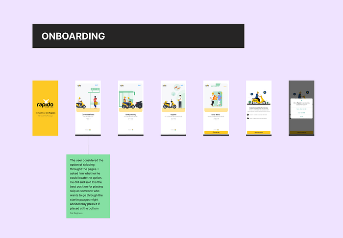
Insights:
· The user skipped through the introduction pages. And pointed out that the position of the skip button at the top is best as if it is placed at the bottom, someone who wants to see the introduction pages might accidentally press it.
Sign-in / Sign-up Screen Testing:
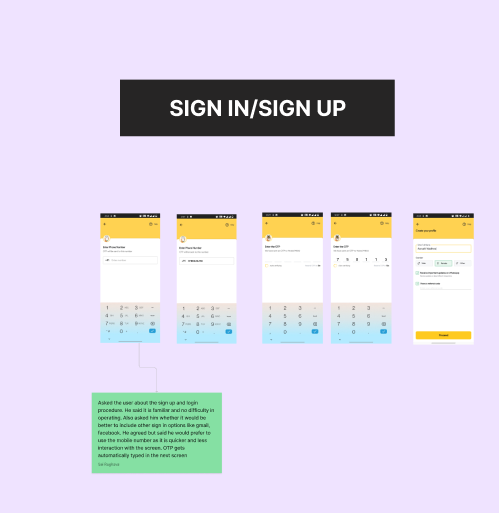
Insights:
· The user did not find any difficulty in using the sign-up pages. I asked the user whether the addition of Gmail and Facebook sign-up options would be better or not. The user mentioned that it is better to have them but using the mobile number and OTP is much quicker and easier.
Home Screen:

Insights:
· The user mentioned that since this app is mainly based on bike taxi feature, placing it as the first option in the navigation bar and highlighting it would be better.
· The user wanted to see the price of the service provided on the homepage.
· The “rating for the last ride” didn’t make sense to the user as this was the first time they used the app.
· The highlighting of the “Local — Send Item” feature and a small description for it in the hamburger menu is appreciated by the user.
Send — Local Items Screen and Adding Details Screen Testing:

Insights:
· The users thought that from the title page till the addresses page, there are more pages to navigate through and they did not like that.
· The users thought that the prohibited items button is not necessary as they are already mentioned.
· The user thought that the “Handle with care” option shows the delivery person will not care for the items unless it is clicked.
· The address entering page looked much cluttered for the users and were unsure about where to click.
· The user thought that the description textbox of the package is not needed as they selected the item.
· The user thought that going back from the final page to the homepage seemed difficult.
After the testing is done, the next step would be redesign the UI based on the feedback from the users.
9. UI Changes After Testing: The feedback from the users is taken and the necessary changes to the UI were made after a discussion among the group. We prepared the HMW questions again with the insights we got from the user feedback. Preparing these questions will narrow down the problems and helps us prioritize the issues that needs solving.
Some HMWs prepared in this section are as follows:
· HMW reduce the steps.
· HMW reduce the clutter on pick-up and drop page.
· HMW highlight the bike feature more in the homepage.
After ideating again, we came up with the solutions to these questions and redesigned the UI which can be seen in the image below.

I contributed to the redesigning of the UI along with a few other team members. We discussed our ideas, finalized the most meaningful ones, and applied them to the UI. Some screens with the first look and the changed look are shown below.
UI Changes Before vs After:
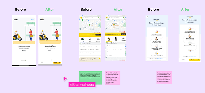

Some of the changes we made are:
· The bike service in the homepage is kept on the left and it appears highlighted as soon as the user opens the homepage.
· Added assistance and support on the page itself without having to open another menu.
· Added the skip function in the “Local — Send Items” service introduction page.
· Based on human touch points and user feedback, changed the CTA Next and Skip in the onboarding screens.
· Improved the UI of pick-up and drop inputs to make it seamless.
· The package description is made optional for the users.
This is the ending of our project but still the case study can be further continued as there is always scope of improvement and enhancement of the user experience.
My Learnings:
I learned a lot from doing this project. This is my first evaluative type of project. I worked on a real product where I learned how to analyze the existing flow with the heuristic principles which is completely a new learning for me. I have already experienced the secondary research part before but still do it for an existing product is a new learning for me. The primary research procedure is a lot different from the ones I did before. Asking the user to use the product and taking down the observations is a whole new experience for me.
As for the team, I had collaborated with some wonderful persons. I worked with more UX matured persons than me and I learned a lot from them, how they approached the problem, dealt with it etc. And one of the interesting points is that we completed this project in a hackathon event that lasts for 48 hours which is one of the best things in my life.
This was a wonderful experience for me and I am hoping to participate in events like these again.
