Material Design 3 for Flutter Application
This document contains details of material design 3. It also compares few aspects of material 2 and 3.
Introduction:
Material is a design system that helps you build beautiful, accessible apps across mobile, web, and desktop.
Setup:
To add Material 3 to your app, set the useMaterial3 flag to true in your theme’s constructor:
class MyApp extends StatelessWidget {
  @override
  Widget build(BuildContext context) {
    return MaterialApp(
      theme: ThemeData.light(useMaterial3: true),
      body: MyHomePage(),
    );
  }
}
New in Material Design 3 for Flutter:
- Improved ColorScheme with ability to generate full scheme from seed color
- Revamped typography
- Updated elevation
- Android 12 overscroll stretch effect
- New ink ripple
- Updated Material widgets: AppBar, FloatingActionButton (FAB), ElevatedButton, OutlinedButton, IconButton, Card
- New Material 3 widgets: NavigationBar, NavigationDrawer, SegmentedButton
- New M3-style buttons: FilledButton, FilledButton.tonal
1. Color:
Core Color Concepts
- Dynamic Color: M3’s dynamic color system can automatically generate a color scheme from the user’s wallpaper, ensuring a cohesive UI experience.
- Tonal Palettes: M3 generates tonal palettes with different shades of color, providing a spectrum of hues that can be used across your app.
- Color Roles: Colors in M3 are categorized into roles like primary, secondary, and tertiary, which are then applied to various UI elements (buttons, backgrounds, etc.).
Key Color Roles
- Primary Color: This is the most prominent color in your theme and is used for key components like app bars and FABs.
- Secondary Color: A complementary color used for less prominent UI elements like secondary buttons or floating action buttons.
- Tertiary Color: Used for accent elements, giving your app a distinctive feel without overwhelming the primary color.
Tonal Palettes
Each color in M3 can be expressed as a tonal palette with a range of shades from light to dark, represented by a numerical scale (e.g., 0 = lightest, 100 = darkest). Tonal palettes are used to create a consistent look for UI elements in different states (e.g., enabled, disabled, hovered, focused).
Example:
- Primary10: Lightest shade of primary color.
- Primary90: Darker shade of primary color for focused states.
ColorScheme:

Generate Material 3 scheme color with single color i.e. seedColor
class MyApp extends StatelessWidget {
  @override
  Widget build(BuildContext context) {
    return MaterialApp(
      theme: ThemeData.light(
          useMaterial3: true,
          colorScheme: ColorScheme.fromSeed(seedColor: Colors.green),
      ),
      body: MyHomePage(),
    );
  }
}
Dynamic Color:
A new feature in M3 is dynamic color. Instead of using custom colors, an M3 ColorScheme can make use of device wallpaper colors on Android 12 and above.
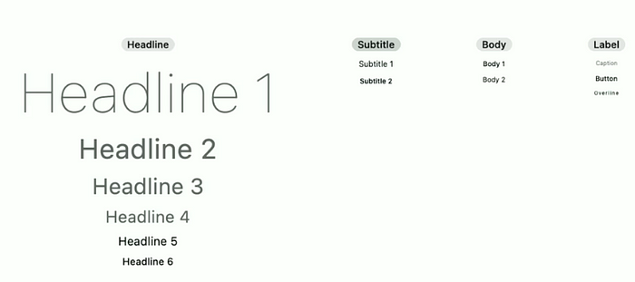
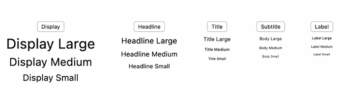
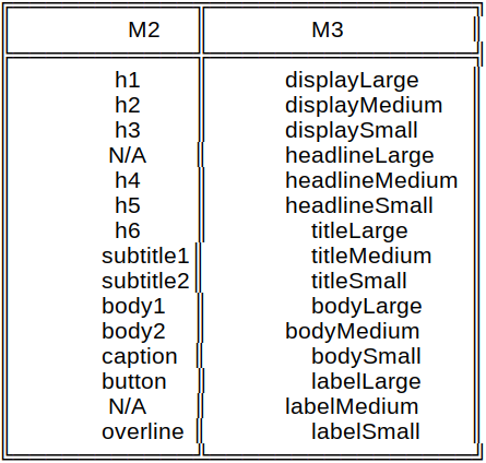
2. Typography:
Material 3 has simplified typography naming by dividing type scales into 5 primary groups — Display, Headline, Title, Body, and Label. This new naming convention provides an intuitive description of each group’s role, resulting in hassle-free use of varying sizes within a typography group.
3. Elevation:
In Material 2, each elevated component gets a shadow. The higher the elevation, the bigger the shadow. Going even further, Material 3 introduces a new surfaceTintColor color property. When applied to elevated components, the surface of the elevated components gets this color, and its intensity depends on the elevation value.
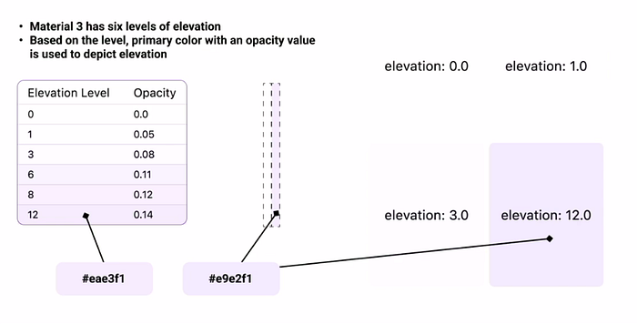
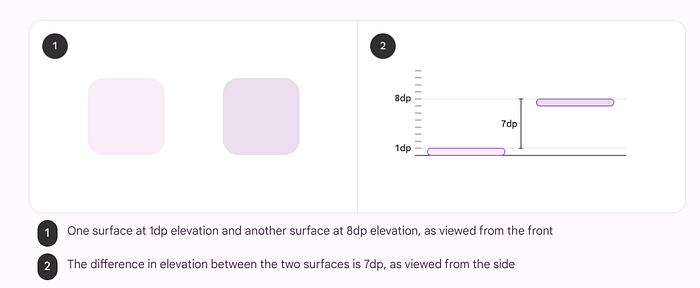
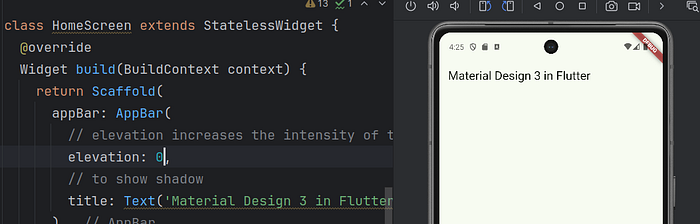
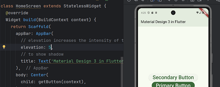
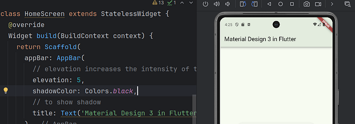
The surfaceTintColor property is added to all the elevated widgets in Flutter, along with the elevation and shadow properties. Please look into below examples with elevation, surfaceTintColor and shadowColor.
Elevation 0:
Elevation 5: Here only app bar color intensity increases. There is no shadow
Elevation 5 with shadow color: It shows the shadow with color intensity.
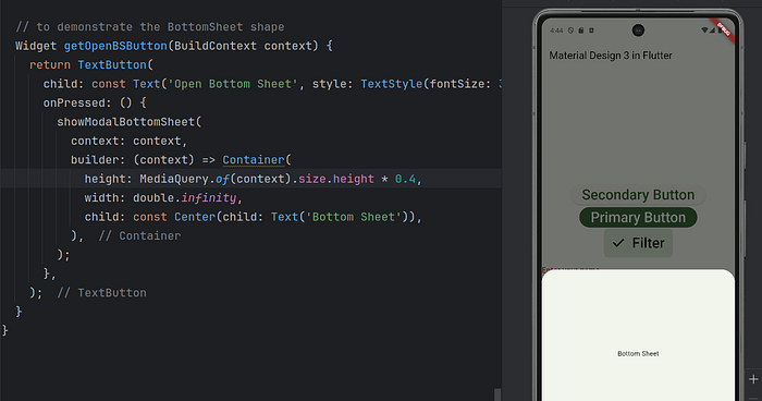
4. Shape:
Material 3 offers a wider range of shapes, including squared, rounded, and rounded rectangular shapes. The FAB, which was previously circled, now has a rounded rectangular shape, and material buttons went from rounded rectangular to pill shaped. Widgets like Card, Dialog, and BottomSheet are also more rounded in M3.
5. New Material 3 Widgets
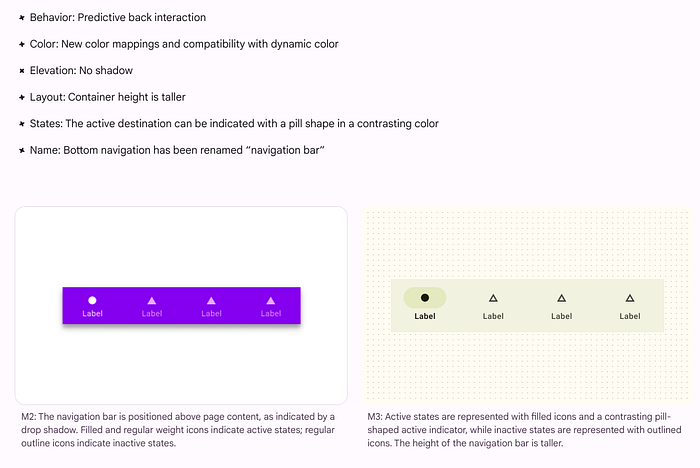
Navigation Bar:
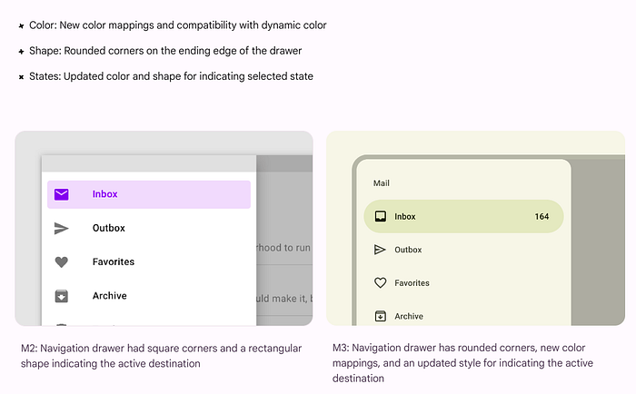
Navigation Drawar:
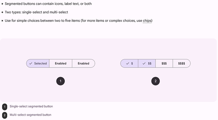
SegmentedButton:
Segmented buttons are used for the select options, switch views, or sort elements. They are typically used in cases with only 2–5 options. By default, we can only select a single item unless you specify the multiSelectionEnabled parameter.
6. New M3-style buttons:
In Material Design 3 (M3), the button components have been revamped to provide more flexibility and style options. Here are some of the new M3-style buttons:
1. Filled Button:
- Purpose: This is a prominent button with a background color that draws attention to the primary action on the page.
- Usage: Used for important actions that need to stand out, such as a “Submit” button.
- Appearance: It has a solid, high-contrast background color and can have optional icons.
2. Filled Tonal Button (FilledButton.tonal):
- Purpose: This is a variant of the filled button but with a softer, tonal background color that blends more into the UI.
- Usage: Typically used for secondary actions that are important but not as prominent as the main action.
- Appearance: It has a lower contrast compared to the filled button but still has a solid background color, though more muted.
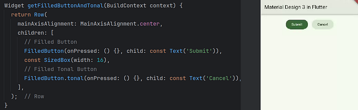
These new button styles help provide better hierarchy in user actions by visually distinguishing between primary, secondary, and other levels of interaction.
I hope this explanation has provided some insights into Material design 3 and how it is improved over Materail design 2. I look forward to writing more about other topics. 👏 Please clap 👏 if you have learned at least one thing, and share if you believe the content deserves it. Feel free to provide feedback, comment, or start a discussion.
Find me!
LinkedIn: www.linkedin.com/in/radheshyam-singh-9a2747a9
Happy coding!