Interactive data visualization to compare the water release from dams during Kerala Flooding.
This post documents the process during DE705 — Interactive Data Visualisation (offered by Prof Venkatesh Rajamanickam) at IDC. The goal of assignment was to create a visualisation or a data story or a tool using the dataset provided. The Topic for visualization was most recent ‘Kerala Floods’.
There were many subtopics to choose and i decided to work on the Major dams of kerala. As there are many claims that floods happened due to release of water through dam so to check the validity of such arguments i visualized rainfall data and the dam capacity . The visualization maps the geolocation of the selected four dams and plot the comparison depicting their water release.

Link for the visualization:
The most challenging task i found was finding the right datasets .I am hereby posting the links of the datasets i used in my visualization.
Datasets :
Capacity of Dams
Source : http://www.india-wris.nrsc.gov.in/wrpinfo/index.php?title=Dams_in_Kerala
Long Lat data of the dams was taken from http://www.mapcoordinates.net
And location and capacity of the Major dams were plotted.
After plotting the dam capacities and their locations i decided to work on 4 major dams Idukki, Idamalayar, Pampa and Maddupetty as data for opening dates for these dams was available in newspapers.
Daily storage data
Then i gathered the info about the storage and rainfall data for the corresponding dam .
Source for this data was current/historical data of storage levels in dams
I then Downloaded the data for all the 4 dams for month of august and created different spreadsheets for each dam.
PLOTTING DAMS
Then I plotted the location of each dam on Mapbox.And decided to create a timeline on that map which will talk about the dam and will take us to its location.
Comparing Dam storage and rainfall
The tool I chose to compare the dam storage and rainfall was Flourish. So i plotted interactive graphs for each dam on flourish.
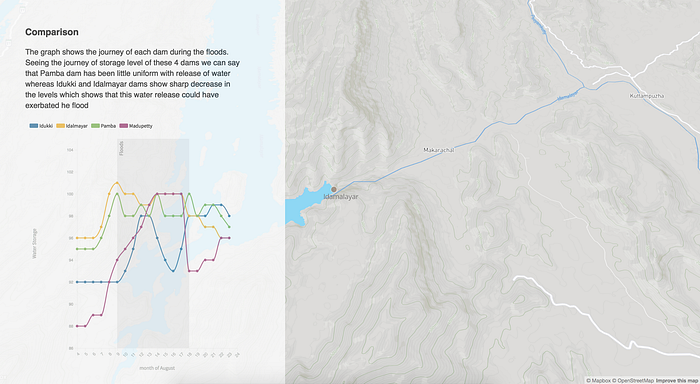
The bubble is the indicator of amount of rainfall.On hovering to the bubble info about rainfall and dam storage is being displayed.The dates when the gates were opened are also marked and flood range is also marked.Such grapghs were plotted for every dam and then a comparison map was created.
The graph shows the variation in the regulation of water of different dams and its interesting to note that how at the end of the month how all dams are trying to maintain the storage level around 95.