TeleMed — Mobile App Design Process: UX/UI Case Study
TeleMed will make it easy for many health care specialties like family practice, mental health and physical therapy to offer patients a secure telehealth experience.
View Prototype: TeleMed

My Role — the “UX Dude”
Research, User Flow, Wireframes and Visual Design
Understanding the Problem
As telehealth becomes more mainstream due to the pandemic, more and more patients are turning towards virtual alternatives.
What’s the Impact?
- Increase Staff Efficiency
TeleMed app visits are more efficient than in-person appointments. You spend less time on administration tasks and more time face to face with patients. - Increase Patient Outcomes
TeleMed helps patients to comply with treatment plans, manage medications, and engage in lifestyle coaching, resulting in better health outcomes. - More Satisfied Customers
TeleMed offers patients the convenience and accessibility of telehealth. We outlook a 98% satisfaction average of all TeleMed app visits. - Scheduling Flexibility
TeleMed visits can happen anywhere, and anytime. Health specialties can offer extended hours and even weekend availability without incurring office and staff overhead. - Reduce Patient No-Shows
Transportation issues, time off from work, and child care are no longer an issue for patients seeking follow up appointments and convenient care while using the TeleMed app. - Generate Incremental revenue
Convert unpaid follow up phone calls or emails to fully reimbursable video telehealth visits.
Research
To better understand the needs of the healthcare specialties and their pain points, I defined a series of questions and began researching the problem.
- Who are the users that are using or will use the telemed app? What do they use now that’s similar? Do they know what telemed is capable of, and its benefits?
- What are the available apps out there? What apps do they like? I did a competitive analysis, to understand those pain points.
- I analyzed customer comments on existing telehealth apps to get a better understanding of what shortcomings they currently have.
- What does a solution look like? I created prototypes along the process to understand if the product was going in the right direction.
User Interviews
I performed user interviews to help understand both the patient and doctors usability. I conducted the interview at local clinics over the phone and in person over the course of a week. I interview all personnel that have used some sort of telehealth application as well as any individuals who has never used one at all. The main insights I gathered from the interviews are:
- 75% of them had concerns about training and how they could fit training into their schedule.
- 35% of them think it’s a necessity and wish they had it “yesterday”. They get countless calls from patients asking if their appointments can be done virtually. The other 65% think it would be useful but are concerned about the cost and maintence.
Competitors “User Comments”
Reading the competitors user comments gave me a few valuable insights:
- Users complain about bad video receptions
- They want to be able to dispute payments made on the app base of insurance coverages
- They want to be able to print records or have some type of cloud base storage
- Users complain about appointments on the app not getting to the health providers scheduling department. This was the biggest complaint during my competitive analysis research.
Target Audience
Based on the research, the user that is more likely to use telehealth are both men and females, between 35 and 50 years old.
Wireframes
***

User Flow
To help me and the team visualize and identify the different elements of the process, and the interrelationships among the various steps, I used the diagram flow as a graphical representation of the ecosystem.

Visual Design
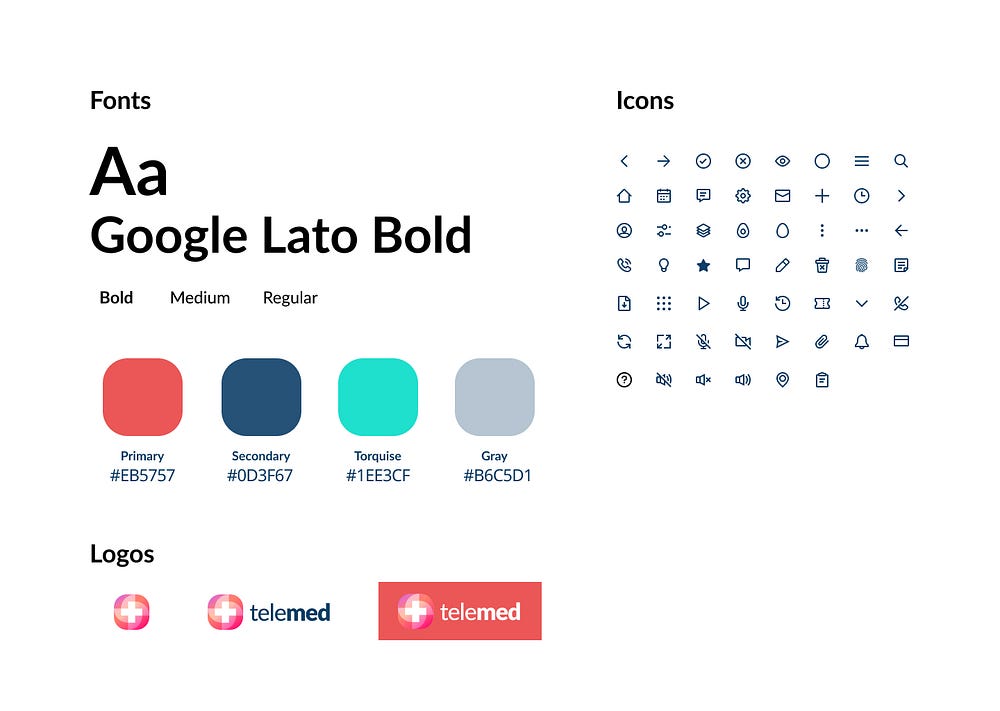
Style Guide
***

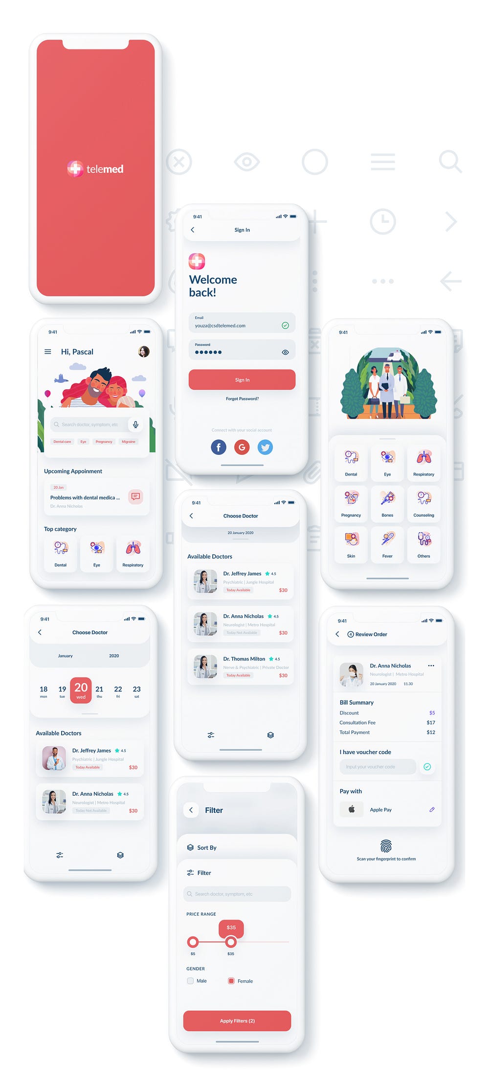
User Interface (UI)
***

Thank You.
