Creating My Developer Portfolio in 2019 — (source code included)

The past year has been a wild ride. I got engaged, had all of my possessions stolen, moved to Los Angeles, and tried a million and 10 things to solve the digestive issues I’d been suffering from (shout-out to UCLA for the amazing help they’ve given me!).
I also tried a lot of new things professionally. I helped create a successful Kick-Starter campaign, which I helped shoot, edit and produce, along creating the supporting campaign assets. I also worked on Jameson Whiskey’s social account, making a bunch of crazy videos and supporting props.
Flash-forward to my new life in LA. It was time to rebuild my broke-ass portfolio and start getting work in Los Angeles. I really wanted to communicate that I can do a lot more than “just code.” I love all aspects of a creative challenge, and to do just one portion of it, isn’t using my skills in a resourceful manner. I also wasn’t interested in making a “grid of thumbnails” website. If you want that, just head over to Squarespace. Ultimately, I wanted to show that I have really diverse, useful talents. Not only that, but I can create a cool conceptual wrapper for them and tie it together with design. If you like that, hire me :)
I also wanted to HAVE FUN while making this portfolio site. I wanted to try things I haven’t done before and learn something new. In the rest of this post, I’ll go through my process and share the tools/resources that I used, along with going into some of the pitfalls of just how difficult it can be to make something good. I often want to be “good” at something right away. The “right away” is the problem, because it just takes time. I think we want it right away for the wrong reasons. For acceptance, fame, or just to be noticed. We often inadvertently miss opportunities to truly dig into the experience of making. I’m writing this as a reminder to myself, and for anyone else who feels life’s challenges in the creative process.
Design
I first started in my note book and outlined what I wanted to feature.

I kept trying to figure out what I wanted to feature, but was trying to do it all in my head, instead of breaking it down in a note pad. What I had spent ‘spinning my wheels’ on in my head, took an hour on paper and after, I was clear on what needed to be done. Just a good reminder for us to pick up the pen and translate the mush in our brains and crystallize it on paper.
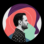
As I came up with the concept, I realized I wanted to make sections that were “archetypal” parts of me. First I would Illustrate them and then I would animate them. I liked this direction and it allowed me to feel good enough about breaking the standard “grid of thumbnails” I mentioned earlier.
Onward —
While having design experience, I hadn’t exercised that muscle in a bit and wanted of course to make something that I was happy with but also in-line with the reality of my current design capacity. For that reason, I went for isometric projection because I knew could be successful at it if I worked at it, and I could use that talent in helping draw plans for building things in real 3D life. I found this skillshare tut that helped me out immensely. I took these virgin skills and sketched out my ideas in my notepad.


I used an isometric grid that was provided by the skillshare tutorial to re-do my sketch a few times. Working on these illustrations, I wanted to make them “perfect” the first time. I would finish and want it to be perfect! So much so that I’d almost talk myself into it, until I’d be honest with myself and say: “We’re new at this, we need to do a few more times before it’s going to look right.” You can see the evolution below.

Once I had all my illustrations in place I figured out my color pallet with the help of Adobe Color (previously Kuler).

I usually design in Sketch, Figma or Photoshop but I needed the tools in Adobe Illustrator so often that I skipped transferring my vector files back forth. I have included the .AI files for you to poke around.
Animation

Next was to start “prototyping” the animations. I’ve used Lottie in a few projects all ready but there where some things I really wasn’t sure if Lottie could pull off. For example, my “Tinkering” section I wanted to have a motherboard ribbon cable flapping in the wind. I knew from previous attempts that things like zig-zag and wiggle paths (AE ‘effects) don’t work, also most layer effects will not work. I ended up for the ribbon and other ‘squggles’ I used pre-zig-zagged paths in illustrator. That I would loop the movement and use a mask to give the appearance that it was continuously looping. You can see the finished product here:

A couple tools that I discovered that made working with Lottie a lot and I mean A LOT easier were these plugins. First Overlord, it allows you to move vector files from Illustrator to After Effects with ease (This should just be built in imop). Check it out:
Another plugin I used by Battle Axe is Rubber Hose. This plugin is incredible. It makes animating arms and legs a breeze and it works with Lottie out of the box (you’ll need to turn a couple settings in the export menu in bodymovin). I used it on the “Developer” section as the hand typing one key at a time and the robot arm in “Animation” section. Check it out!
Development, onward!
Next, I moved to development of the portfolio. I was feeling a little rusty on the dev side. Last year I built a wine chat-bot that could respond to things like “Show me white or red wines, mmm maybe just white under 20 bucks that pair well with hot dogs, cool?” It could pair odd food profiles dynamically with wine profiles and parse out all the unneeded language and kick back a selection of wines that was really smart. I mention this because a year later, If you asked me to do that, I would get pretty nervous, as that I hadn’t been keeping up those skills. So I walked into this side feeling a little insecure. I knew the best thing I could do, is just size all my tasks down into smaller tasks that I could wrap my head around and then glue them together into a bigger picture later.
First, I picked what I wanted to build the site in. My first goal was to use React, GSAP and Lottie. I’ve tried to make “animation heavy” sites in React in the past and found that the amount of time I’d wrestle with Reacts rendering process and even with things like React Transition Group and React Motion it wouldn’t be smart for a such a small site. Instead, I decided with writing it in Vanilla js and a few supporting libraries like GSAP . Use Stylus as my css preprocessor and pug as my markup preprocessor. I was excited to use ParcelJS as that Webpack was starting to remind of every other build tool. You start building “the build tool” instead of the site. Despite how easy parceljs is, I wanted to try to use a tool like codepen.io to build out my animation and test my transitions. I liked this idea, because I would always know what the site would do under real bandwidth constraints. I was planning to have lot’s of assets load in and if something was too big or there where race conditions on an asset loading, I’d find them sooner then later.
Below is first attempt to “code sketch” my ideas out.
I finished up my codepen and started migrating into separate components. I learned a lot of new things during the development. First, native css custom variables. I usually use a css prepocessor for this and it was nice to see that all the major browsers support this new (to me) feature in ‘vanilla’ css code. For example, you can set a variable at the top of your document like this:
:root{ --colorGreen: #25434}
and later, recall that value:
.title{color: var(--colorGreen, green)}
Notice, all you have to do use the browsers “var()” function. With the first parameter being your variable name and the second, a default value if for some reason it can’t read your variable name or value. I used this to control the “parallax” effect I used on the desktop version of the site. I set the variables using JS based on mouse movement calculations:
document.body.style.setProperty("--rot-x", value);
and later used the value in my css to move around parts of the generated SVG lottie. Really cool!
Next, I often use javascript promises to help make my code readable. So I was happy to see the feature async, await. Where you can drastically reduce the code you produce to generate promise executing functions. Check it out!
Last on the new knowledge docket is ‘IntersectionObserver’

My friend Suny mentioned that she was using and I should check it out. I ended up using it on the mobile section to trigger animations when the user scrolls the element into view. I would usually use something like superscrollorama or waypoints to achieve this effect. But with IntersectionObserver you could achieve the same thing and I think it’s easier to understand and extend.
That’s all! — Hope you enjoyed and learned something.
I have the source code on gum road. You can choose to download it for $0 or send me a small thank you with a donation! ❤