FLIGHT DELAY ANALYSIS
By Saurabh Thakrani & Rima Deshmukh
Tableau Public Link: https://public.tableau.com/profile/saurabh.thakrani#!/vizhome/FlightDelayAnalysis-1/Dashboard1 https://public.tableau.com/profile/saurabh.thakrani#!/vizhome/FlightDelayAnalysis-2/Story1?publish=yes https://public.tableau.com/profile/rima.deshmukh#!/vizhome/SankeyDiagram_55/Dashboard1?publish=yes https://public.tableau.com/profile/rima.deshmukh#!/vizhome/FlightDelayVisualizations_0/DayOfWeekvsDelay?publish=yes

Why This Study?
Flight delay is one of the most common but an unpleasant experience that people dread to have. Every year, a lot of flights get delayed which involves some cost both for the airline and the passenger in different ways. The passenger’s time and money get affected and at the same time, the airline’s reputation is at stake. Delay is treated as one of the most remembered performance indicators of the airline. There could be some reasons which are inevitable such as weather conditions, air trafficking or any unforeseen event; but there also could be some reasons which can be dealt with by improving the process. Therefore, statistics of the flight delays becomes crucial factor in understanding the flight’s performance.
This study presents the analysis driven from flight delay data for the city of Miami from the United States for the year 2017. This study analyses the variety of factors responsible for and associated with flight delays for different airlines.
Design Approach
Once the vision of our study was clear, we performed a literature review by reading different research papers and articles to understand how the airplane dataset has been already used to create meaningful visualizations. After performing the literature reviews and carefully studying the available dataset, we made some sketches which could be turned into visualizations by using visualization tools. Different types of sketches were created so as to observe the trends about the delays based on delay types and airplane carriers. Having the sketches ready, we implemented our designs on the visualization tool called Tableau wherein we focused on creating visualizations that were simple and easily readable.
Target Audience
The target audience for this study are the people such as passengers, airport officials, crew members, etc who are directly related to the airline industry and the people such as data analysts who are interested in the analysis of flight dataset.
Implementation of Designs
Goal 1: Checking Destinations and associated delays
The flight dataset which we have worked on revolves around the Miami airport. It consists of all the flights coming to and going from Miami for the year 2017. Thus, it was in our interest to know all the destinations which are connected to Miami as well as the carriers which make this possible. In order to do so, a destination map was created.

This map can be used to see which airline carriers connects which destination to Miami. Also, the average arrival delays(color coded) can be checked selecting the incoming or outgoing flights from Miami for a particular flight.
Goal 2: Insights based on Carrier
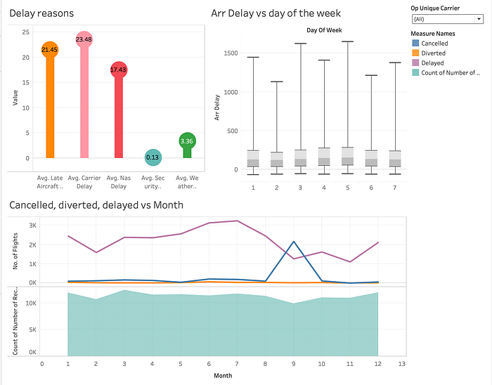
Next, we wanted to gain the insights based on the carriers. For this we created a dashboard that gives details about the carrier specific information.

By selecting a particular carrier from the dropdown filter, we can easily see what type of delay is prominent for that carrier. Also, we can see that on which days of the week a particular carrier functions and what is the range & median of the overall average delay for those days. We can also check the number of cancelled, diverted and delayed flights as compared to total number of flights for each month. Therefore, this dashboard describes the behavior of flights based on carriers.

One more point of interest was to see the range of arrival delay based on carriers. This was important to learn the performance of each carrier as the average arrival delay can be misleading. It can be seen from the graph that the carrier ‘OO’ i.e. Skywest Airlines has the least variation in delays. While the median of delays for all the carriers are comparable, it can be seen that there is a large range of delays for the other four carriers.
Goal 3 : Analyzing Delay types based on time
Next, we wanted to check which type of delay accounts for most of the delays and therefore, we created a sankey diagram.

This diagram tells us about the connection between the delay types and different months. The visualization shows what reasons accounted for the flight delays in a particular month. Finally, it gives the percentage contribution of all types of delays for the overall delays in a year.
After getting the high level idea about the impact of different types of delay over the whole year, we wanted to increase the granularity and look at every month seperately.

By looking at this visualization, it is clear that the NAS delay is the major cause of delays for almost the whole year. Aircraft delay and carrier delay are comparable to each other and close to NAS delay and alternatively bags the second position depending on the month. Weather delay is too less as compared to other three while Security delay is almost zero over the whole year.


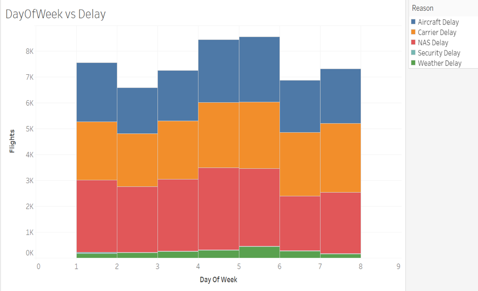
Next we drilled down to the dates of the month and the day of the week. It was found that the major percent of the total arrival delays in a month comes from the first 10 days of the month. It can also be seen from the above visualization that NAS delay is major contributor of the delays on every day of the week.
Goal 4: Finding Patterns and Relationships
One of the goals of this study was to find meaningful patterns and relationships. For this we came up with the idea of making a scatter plot between the departure delay and arrival delay.

From this scatter plot, it can be seen that there is a linear relationship between the departure delay and arrival delay i.e. if the flight arrives late at an airport then it will depart late and vice versa.

Next we plotted the no. of flights delayed with respect to the arrival time of the flight and it can be seen that the least number of flights gets delayed whose arrival time is between 2 am to 9 am.
Abnormally high cancellations

Through our visualizations, we encountered a huge number of cancelled flights in the month of September. On investigating, we found out that this was the time when Hurricane Irma hit Florida in the year 2017. The impact of the hurricane was major during the time period between 30th August and 13th September and therefore, most of the flights were cancelled at this time.
References
1. Anderson Ong, M. (2017) “Data Visualization of Flight delays with Tableau”. Medium, 2017
2. Ball M., Barnhart C., Dresner M., Hansen M., Neels K., Odoni A., Peterson E., Sherry L., Trani A., Zou B. (2010). Total Delay Impact Study — A Comprehensive Assessment of the Costs and Impacts of Flight Delay in the United States. Final Report — October, 2010. Accessed from website: http://scholar.rhsmith.umd.edu/sites/default/files/mball/files/total_delay_0.pdf?m=1467366850
3. Dey, T., Phillips, D. and Steele, P. (2011). A Graphical Tool to Visualize Predicted Minimum Delay Flights. Journal of Computational and Graphical Statistics, 20(2), pp.294–297.
4. Gopalakrishnan K., Balakrishnan H. (2017). “A Comparative Analysis of Models for Predicting Delays in Air Traffic Networks.” Air Traffic Management Research and Development Seminar, June 2017, Seattle, Washington, USA, ATM Seminar, June 2017
5. Gupta P., Dwivedi A., Agrawal A. (2016). “An Analysis of US Domestic Flight delays using SAS Enterprise Miner”. South Central SAS Users Group Educational Forum, 2016
6. Mainero A., Schmidt T. and Sugarman H. (2013). Heat Mapping and Predicting Flight Delays and Their Propagations in a Real-World Air Traffic Simulation. December 2013. Retrieved from Stanford University. Access website — http://snap.stanford.edu/class/cs224w-2013/projects2013/cs224w-056-final.pdf.
7. Michael T. Crotty. (2014). “Visualizing More Than Twenty Years of Flight Data for the Raleigh-Durham International Airport.” SAS Institute, USA, 2014
8. Rebollo Jose J. and Balakrishnan H. (2012). “A Network-Based Model for Predicting Air Traffic Delays.” 5th International Conference on Research in Air Transportation (ICRAT 2012)
9. Rodríguez-Sanz, Á., Gómez Comendador, F., Arnaldo Valdés, R., Cordero García, J. and Bagamanova, M. (2018). Uncertainty Management at the Airport Transit View. Aerospace, 5(2), p.59 Received: 28 January 2018; Accepted: 21 May 2018; Published: 1 June 2018.
10. Sternberg A., Soares J., Carvalho D., Ogasawara E. (2017). A Review on Flight Delay Prediction. CEFET/RJ Rio de Janeiro, Brazil, November 6, 2017.
11. Understanding the Reporting of Causes of Flight Delays and Cancellations | Bureau of Transportation Statistics. [online] Available at: https://www.bts.gov/topics/airlines-and-airports/understanding-reporting-causes-flight-delays-and-cancellations.
12. Wicklin, R. (2009). “An Analysis of Airline Delays with SAS/IML Studio”. SAS Institute Inc., 2009