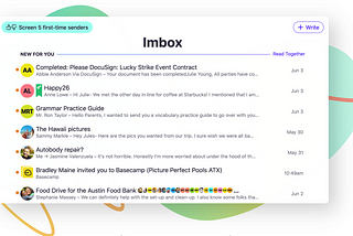
Shkodran ArifiinUX CollectiveAnalyzing HEY.com designHow did HEY team design their product and what could it be better?Jul 1, 20201Jul 1, 20201
Shkodran ArifiMy 2019 — Left my company, joined new company…I have picked 4 most important events during 2019 without mentioning smaller ones:Jan 31, 2020Jan 31, 2020
Shkodran ArifiinUX CollectiveUseful tips you need to know before working on your next product UXIf you are a new UX designer, or moving from Graphic Design to UX Design and you want to do things right…Oct 14, 2019Oct 14, 2019
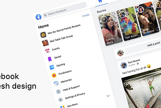
Shkodran ArifiinUX CollectiveAnalyzing Facebook’s major redesign, from website to appYesterday Facebook had F8 developer conference where they usually show their innovations and new additions for their products. Among…May 1, 2019May 1, 2019
Shkodran ArifiinUX CollectiveIs Google Drive design team getting “inspired” by Dribbble concepts?We are living in the age of applications and we usually get at least one app-update per day. Many apps that we use are always working hard…Mar 26, 2019Mar 26, 2019
Shkodran ArifiinUX CollectiveFrom complex to simple, are messaging apps striving for “less is more”?We have been using Messaging apps to communicate with family, friend and colleges since the old phones that had just SMS option.Feb 23, 2019Feb 23, 2019
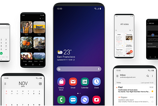
Shkodran ArifiinUX CollectiveSamsung’s new One UI: a UX perspectiveA deeper look at what Samsung calls “viewing your phone with an experience that feels second nature.”Nov 9, 20181Nov 9, 20181
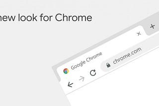
Shkodran ArifiinUX CollectiveChrome’s new design — a UX perspectiveYesterday Chrome celebrated its 10th birthday and for this double-digits anniversary they made new design updates. Although Google says…Sep 6, 20185Sep 6, 20185
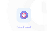
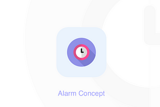
Shkodran ArifiA brand new alarm conceptI have made an Alarm concept back in 2016 by trying to improve UX and UI of Alarm iOS, but I couldn’t write some words for it so I decided…Jun 6, 2018Jun 6, 2018
Shkodran ArifiinUX CollectiveUX Critique: SnapchatThere have been news everywhere about the new Snapchat Update. But why this has caused a big chaos? What are the reactions from the users…Feb 25, 20182Feb 25, 20182