Case Study: The app that can increase the productivity of farmer
In this Case Study, I’m going to give you a walkthrough of how I designed an app for farmers to rent latest agricultural equipments and what was my process and design thinking behind.

Background Story 👈
In the Google UX Certification Program, I need to showcase a design solution for any existing problem that I have come across. I decided to choose a major problem of farmers, which I noticed during my last year graduation days in Agricultural Science.
Problem Statement


Despite of having continuous innovation in agricultural technologies and equipment, the income and productivity of farmers are still less than expected. One of the massive reasons for this is farmers are not having access to new tools and tech. They still have to rely on old methods and techniques of farming. How can I make it accessible to farmers ? 🤔

Process ⚙️
In order to fulfil the objective of this Project, I decided to follow a pipeline of 3 steps which includes Research, Conceptualisation and Design.
1. Research 🔬
The step Research includes interviews of users i.e., farmers and students, and competitive analysis of existing solution.
User Interviews 🎙️
I interviewed 12 individuals of young to middle age farmers and students, who are directly or indirectly related to the agriculture field and have some knowledge of emerging technologies.

Some of the Questions I asked:
- Why do they take tools on rent?
- What are the tools they want?
- How do they know if any new tool has come to the market?
- When do they rent?
- From Whom do they usually rent?
Insights 🤯

Competitive Analysis 📈
To know what could make this platform dominate the existing ones on the market, I selected 3 companies to analyze their strengths and weaknesses. Out of 3 companies:
- 2 are direct competitors (Krishi kraft & JFS Farm), meaning they offer very similar products and services to the same user base (Companies that runs Farming rental platform)
- 1 is an indirect competitor (Zoom Cars), meaning they offer fairly similar services to the different user bases (Company that runs a car rental platform)

2. Conceptualisation 🤔
After analysing everything from research, I decided to go with similar model that Zoom cars (car rental service app) has. There would be physical sites of the business (site where tools will be stored and maintained), from where a farmer can pick up and drop off the equipment. However, the bookings would be done through our mobile app.
Edge Case and Possible Solution
What if the farmer damages the rented tool?
If the farmer returns the damaged tool, the rent would go higher for him for next time. This method is practiced by the brands such as Uber. In which, As you cancel more and more ride, the rate of next ride would go high as well.
What if farmer has no information about the tool?
There would be a section of Articles, where farmer would get updates about the new tool that has come to the market. Besides, a video in product detail section would make it easier for user to understand the use of the product.
Information Architecture of the app

3. Design 🎨
Initially I started making pen and paper wireframes for screens which were important to complete the task. Thereafter the more visually appealing screens in Figma.

After self analysing it, I get to know that I need to include a tutorial for the tool in the detailed page for the selected product.
Product Detail Page
Since the tool is new for the user, a tutorial video and FAQs can help them to choose wether they want to rent the tool or not.

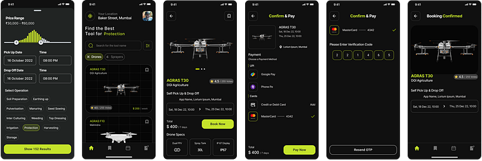
Once the main flow was sorted, I started making wireframes for other supporting tabs, such as Blogs, Bookings, Saved items and Profile section.

💡How Blogs will help to increase number of renters?
Blogs are detailed articles of success stories of farmers by using particular tool. At the end of every article, I have also provided a direct link of the tools’ description page, from where farmer can take it on rent for themselves. Articles can inspire them to rent the equipment.

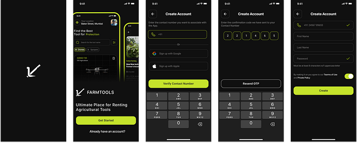
Finally it was time to create logo for the app. After spending a lot of time on brainstorming, I came to a conclusion to make it about something historic and simple. The logo I have chose to represent this amazing app is a “Plough”. Plough is the first farming equipment humans have ever created. After finalising that, I gave it a name “Farmtools” as this app is all about that. Below are the screens for onboarding of new user.
Style Guide 🎨
- Design Tool: Figma
- Frame: iphone 13
- Typography Style: Inter Tight (Headings), Inter (Body)
- Color Style:

Future Opportunities 🤩
After testing the app’s final prototype with a couple of farmers and students, I believe it has the potential to solve the problem and make their life easier. Here are a couple of changes I would make If I get a chance to make it for real.
- The Language: To maximize the chance of success of the app, our users must understand that language. The availability of the user’s regional language would be an important factor for the app’s success.
- New Concept: An opportunity for those who have any equipment and wants to earn by giving them on rent. All they will need to do is give their equipment to us, and we will take care of the rest.
Learnings 🧑🎓
- Empathy is a skill, not an emotion. To learn it and to be able to do it well, you need to practice it every day. And it is also perhaps one of the most invaluable skills you’ll ever learn.
- Things which seem the simplest were the toughest to build. It’s easy to complicate things. To simplify takes tons of effort and patience.
- I’ve started appreciating the fact that the smallest of things taken someone’s thought and effort to come into existence.
💝…And it’s a Wrap
Thanks for taking the time out and reaching the very end of my case study. If you have any feedback to give, please leave a comment and I will surely look into it.
Before you go!
👏 Click 50 if you like it.
🙂 Click follow on Shrey Trivedi
📸 Find me on Linkedin
Feel free to get in touch with me at: 📭 shreyntrivedi@gmail.com


