SOMA Rebrand

We’ve announced we’re going to rebrand. And now we’ve done so. SOMA began life with an ICO, a capital-raising mechanism that strongly identifies the company as a member of the ‘altcoin’ crowd within the cryptocurrency space. But we’re much, much more than that.
In fact, we’re rolling out an ecommerce platform based on blockchain, but with an entire suite of features and benefits that the industry desperately needs. These include the ability of buyers and sellers to socially connect, the ability of folks to monetize social influence and resell products; and, of course, SOMA’s Heimdall Protocol to secure verification and authentication information on the blockchain. This latter functionality aims to thwart counterfeiting, fraud, and other forms of malfeasance via immutable and verifiable proofs.
So here we have it. A new look, just in time for the ramp-up to our pilot program.
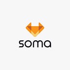
The SOMA logo
The old logo served its purpose. It came about during the turbulent ICO period, when portions of the SOMA vision were consolidated, and other portions were still quite nascent. The fox has a cultural meaning in Scandinavian culture that fit certain aspects of the SOMA vision, and so we adapted the circular “dollar-sign fox” logo for which we’ve been known to date
However, we began to hear from our community that our logo too closely resembled that of the Firefox browser, leading to some confusion. Additionally, the fox in Anglo culture tends to bring associations of cunning and trickery (here at SOMA, we like to be as clever as we can, but do keep things on the up-and-up). Finally, there was no clear-cut connection between the creature itself and SOMA’s business model (contrast to the Twitter ‘bird’ logo, which clearly references the platform).

The new logo dials back the ‘fox factor’ while keeping a more muted reference for the sake of continuity. The geometric design derives from origami — our designer folded it from paper before rendering it in digital form — which has associations of emergent complexity from simple constituent parts. By being abstract, the logo and its component shapes suggest arrows, movement, and a diamond (clarity, purpose, cutting-edge).

Color and font
The new color scheme keeps faith with the original while introducing important shifts. The primary orange moves further from the red spectrum than the original orange; this shift enables greater complementarity with the black and gold palettes of luxury ecommerce (our initial target sector) and works well with our secondary colors.
Our new font is Maven, which is more stylistically distinctive than Roboto (our previous font), and is simultaneously easy to read.


Remember the content competition
SOMA is currently running a large crowdsourced content competition with $10,000 equivalent in $SCT staked as prizes. All those participating will want to have a look at our rebranding thesis as well as our new brand guidelines.
About SOMA
On legacy ecommerce platforms, anonymous usernames and depersonalized storefronts strip trade interactions of an important social element. Additionally, buyers lack a definitive way to ensure the authenticity of items. Enter SOMA. Our Heimdall Protocol stops forgeries and counterfeiting by validating ownership and provenance history on the blockchain. Social media elements bring personalization and interaction to trade, and allow users to monetize social influence, while a rewards system incentivizes beneficial collaboration and ensures that value-adding services are compensated. Soma is a free-market ecosystem — free of market manipulation, price-fixing, gouging, and bloat.
SOMA links
Website
Telegram
Discord
Twitter
Facebook
LinkedIn
Medium
BitcoinTalk
GitHub
Reddit