Data Experiments & Design Exploration about Place
‘‘Exploratory experiment is the probing, playful activity by which we get a feel for things. It succeeds when it leads to the discovery of something there’’
— Donald Schön

This is a post about how I learned to have fun while doing analysis of city neighborhoods using real-time, urban media and data. I’ll discuss how creative and playful analysis of city data can inform design and planning decisions.
This is a post expanded from my talk at Data by the Bay. I’ll cover the following:
- How I used open city data and user-generated media to explore neighborhoods.
- How to produce creative experiments and have fun, when daunted by layer upon and layer of data.
- How to move from art to analysis and from experimentation to design.
Exploration
“The city is a point where all the paths meet”
— Friedrich Kittler
I enjoy exploring neighborhoods, both newly discovered and well-trodden. I started to wonder if I could write software to help me find pockets of activity, vibrance, and new things. As I started this exploration process myself, I also pondered how people will find their way through the digital layers and mediums of future cities.
Last year I did a fellowship with Stamen Design and Gray Area Foundation for the Arts. I collaborated with Berlin-based artist Aurelia Friedland and joined a group of curious and creative people exploring climate change, neighborhood air quality, invasive plant species, weather balloons, computer-generated fashion, and other fascinating topics. These people inspired me to investigate and play with data sources on these same topics. It was an opportunity to artistically experiment with and visualize real-time urban data.

I started down this path of experimentation by participating in a do-it-yourself “remote sensing” project called Sense Your City. The project installed sensors around the world to collect hyper-local data about environmental conditions, such as noise, dust, and light, and pollutants. The resulting projects were creative expressions of the data that visualized what it feels like in a particular place and time. In a place like San Francisco, for example, you could see when the fog rolls in.
Learning Curves
“The more I learn, the more I realize how much I don’t know.”
— Albert Einstein
It took me too long to realize that analysis can be fun!
During the fellowship and over the past year I’ve continued experimenting. I’ve used data from DataSF, San Francisco Planning, SPUR, the City of Oakland, OpenOakland, and other sources to analyze housing and population density; transportation networks and frequency; stores, restaurants, and other places of interest.
I had a bunch of data to work with, but had little idea what I was doing.
The more I dug into multi-dimensional urban data, the more questions I had. As you map and research urban layers, you realize that the layers only go deeper. To dig deep enough would require literal digging, namely urban archeology.
As media theorist Friedrich Kittler writes in The City is a Medium, Cities are networks of networks and their surface is much deeper that it appears. The paths of urban networks and rhythms of a city have a aesthetic and structure that cajoles the observer into simplistic explanations and “representations of convenience”.
I was stymied by trying to find a significant, cumulative insight by cobbling together and analyzing all the data. Could I uncover a key insight about mobility, housing, or neighborhood change? Just this week, I was inspired by Eric Fischer’s discoveries about rental prices in the Bay Area. As Michael Andersen explains it, Fischer used data from the public library to uncover discover a model for predicting high rental prices based upon three variables. The data had to be manually collected and the findings show that tweaking levers of demand or rent control won’t solve the problem.
Too often when we talk about open data and data science, we forget about the institutions, i.e. libraries, and methods, i.e. statistical regressions, that have existed and worked for decades.
With encouragement of my fellow artists and friends, I instead conducted short and creative experiments. I also took time to admire other’s work in the domain, which lead me to the the excellent writings and work of Shannon Mattern, Till Nagel, Mortiz Stefaner, Geoff Boeing, giorgia lupi, Ekene Ijeoma,and many others. I wish I would have known about these folks’ inspired ideas and projects before I started my own project.
Here are some of my experiments with neighborhood data and media:
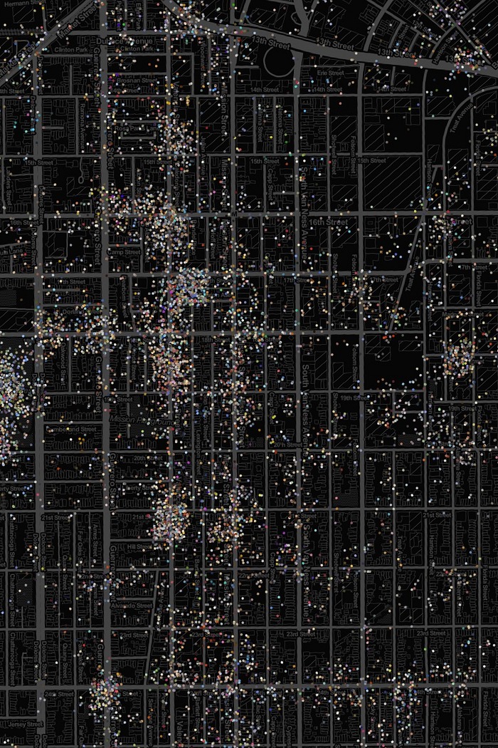
Street Movement Seen in Instagram Photos

Photos and Emojis
Colors from Photos
Painting Buildings with Social Color
The result of my work with Stamen and Gray Area was large, street-level screens displayed at the Grand Theater in San Francisco’s Mission District. These displays showed real-time traffic, weather, and social activity.


The artwork explored how citizens and passersby can interact with data about their neighborhood and arrive at their own discoveries. In the future, I’d like to extend this work to explore how screens with data can connect residents with resources to make decisions and create things from this information.

Art, Analysis, Design
A playful discovery process can still lead to more serious analysis and areas of inquiry.
Around this same time I started working with an urban design team at Perkins + Will architects on an innovation grant. We wanted to see how media and data about neighborhoods could be used in the urban design and citizen outreach process.
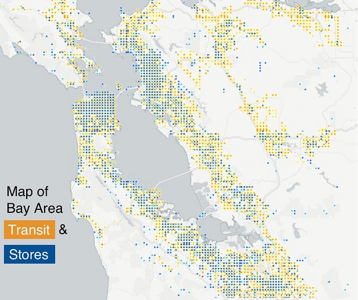
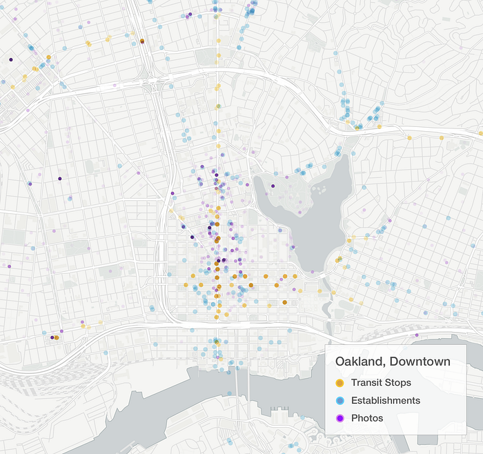
We explored the relationship between density of transit, housing, open spaces, amenities, restaurants, and social activity. We captured data at the regional level and looked a several neighborhoods in San Francisco and Oakland.
Real-time social media data allowed us to peak at people’s real-time activity in space. Our basics senses (sight and sound) allow us to identify neighborhoods and pockets of cities that are full of life, activity, and energy. Our team asked if urban analysts and designers could use digital tools to find reflections of the same vibrance in the data:
- We can analyze data to discover where activities happens and what people say about these places.
- From user-generated social media, we can identity media that characterize these places.
- Using mapping tools we can create plans for connecting hotspots of activity.
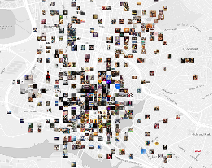
Hotspots in Downtown
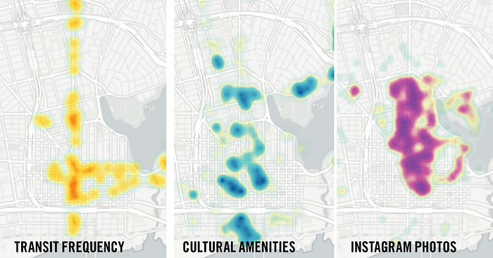
From heat maps we immediately gain insights into the neighborhoods of Downtown Oakland. Jack London Square for example is transit accessible and has many restaurant and places to live. However, there is drastically less social activity there in contrast to Uptown.
From this insight, the design team can explore why. Maybe it’s because the freeway deters pedestrians? Maybe there are fewer cultural events?
The data alone cannot answer these questions, but it helps people to focus their inquiry. Designer can use tools to investigate particular neighborhoods in detail. It’s information that allows people to make better design decisions.
In the coming weeks I’ll be writing more about how artists, analysts, and architects can use data to improve neighborhoods. If you ♥ my experiments, I’d like to talk and learn about similar projects.