Triangles in shape theory graphic design

You see triangles in popular logos and background patterns. They often pop up in posters and infographics as subtle backgrounds. But, that does not mean every brand should go for triangles. Some brands never should. Some other brands should use triangles in a particular way. They should make the triangles to match their brand’s personality.
Collaboration
Triangles show how three distinct objects can come together to collaborate. Google Drive has a triangle for its logo. But, there is more to it in its colours. The green, yellow, blue, and red form primary colours. Google Drive is famous for its collaboration and versatility. This is why triangles should always come up in brands that help people collaborate.
Rounded corners make a triangle look more cheerful. They are a novel way to combine a curve and a triangle. Curves represent grace and femininity. Triangles represent strength and stability. But, triangles can be unstable or look aggressive as well. Keep reading to learn about this versatile but unique shape.
Monochromatic background

You can use a range of colours to make it. You can also use gradients. The purple colour is fashionable. Triangles relate to masculinity. So, men’s fashion brands can use such a background for their posters.
You can replace the purple with a brown colour. It will represent the tastes of classical and sophisticated men’s wear. Pink will represent a festive or playful mood in men’s wear.
Mosaic background

Asymmetry and mosaic patterns are youthful and creative. Brands of youthful brand personality look gorgeous with such backgrounds.
A wise choice of colours can help to convey the message with more ease. These colours are dark and look classic. Lighter colours can look the most youthful.
Here is a blog about how shade and tint matter in colour theory.
Inverted triangles

Inverted triangles look unstable. They represent violence ad tragedy. Inverted triangles in red colours look too violent. So, designers should try to avoid a red inverted triangle in logos. It can have negative vibes. If you must use an inverted triangle, go for a lighter and cooler colour.
Here is why colour temperature matters in graphic design
If you must use a warm colour in it then go for a warm colour with a cool bias.
Biased colours allow you to express better than pure hues. Here’s why.
But, why at all do you need to use inverted triangles? Inverted triangles do not always carry negative emotions. They also represent the female reproductive system. Medical brands making relevant products can use such logos.
Automobile brands
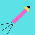
A great place to use the triangles is the automobile brands. A triangle that points forward represents speed. Remember the YouTube icon and its play button? Car and automobile brands targeting male customers can use them.
Organic shapes

Waves, pyramids, mountains, and pizza slices are triangular. A yellow slice of pizza can make a cute logo for a restaurant. The yellow colour is an appetizer.
Yes, colour theory too can help you make your customers drool.

Pet shops can have a fish as their logo. Waves fit well with tourism brands.
Wrapping up
Triangles are not too versatile like circles. But, they are indispensable where they fit well. So, it is important to understand various aspects of a design like its shape. This is one of my many blogs for graphic designers. Follow me for more.
Email me at subarnacreative@gmail.com.