Dunzo, Grocery Shopping App — a heuristic evaluation case study
Dunzo is an Indian company that delivers groceries and essentials, fruits and vegetables, meat, pet supplies, food, and medicines in major cities. It also has a separate service to pick up and deliver packages within the same city.

I performed heuristic evaluation for Dunzo (Android Version) using Jakob Nielsen’s 10 general principles for interaction design.
Let’s see the evaluation according to the 10 principles-
1) Visibility of system status
Users must know where they are and what is the result of the action they took with appropriate feedback in a reasonable time.

- When clicking on certain actions, the loading screen shows how the next page will look like.
- When adding any items, it shows the cart has been updated.
2) Match between the system and the real world
The system should speak the user’s language and follow real world conventions.

- All the icons are well supported by labels.
- The app speaks in simple and everyday language.
3) User control and freedom
The users should be able to reverse their actions if done by mistake.
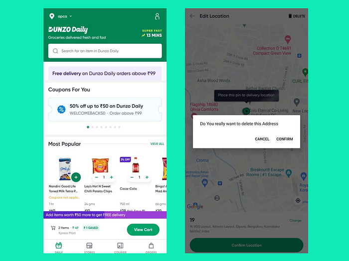
- In order to remove an item from the cart, there is no need to go to the review items page.
- The app asks for confirmation before deleting an address.
4) Consistency and standards
Users should not have to wonder whether different words, situations, or actions mean the same thing. Follow platform and industry conventions.
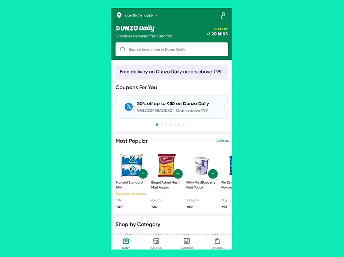
- The images and symbols used are simple to understand and consistent throughout
5) Error Prevention
Good error messages are important, but the best designs carefully prevent problems from occurring in the first place. Either eliminate error-prone conditions or check for them and present users with a confirmation option before they commit to the action.
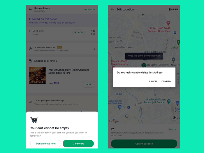
- The app gives a confirmation before deleting.
6) Recognition rather than recall
Minimise the user’s memory load by making elements, actions, and options visible. The user should not have to remember information from one part of the interface to another. Information required to use the design should be visible or easily retrievable when needed.

- The search box displays recent searches below it and provides suggestions as we start typing in the box.
- The Repeat Order option helps the user reorder the same items as before without the hassle of going through the option of adding items to the cart.
7) Flexibility and efficiency of use
Both new and experienced users should be able to efficiently use or navigate through the system.
- The Repeat Order option helps the user reorder the same items as before without the hassle of going through the option of adding items to the cart.
- For new users, a walkthrough of the app is not provided.
8) Aesthetic and minimalist design
Interfaces should not contain information that is irrelevant or rarely needed. Every extra unit of information in an interface competes with the relevant units of information and diminishes their relative visibility
- The design is simple.
- Not much irrelevant information.
9) Help users recognize, diagnose, and recover from errors
Make error messages understandable and suggest ways to fix an error.

- While entering the wrong details, the users are not made aware of it. Only after clicking on the ‘Update’ option is the error indicated.
10) Help and documentation
It’s best if the system doesn’t need any additional explanation. However, it may be necessary to provide documentation to help users understand how to complete their tasks.
- The app has a support section but limited options. Also, no easy way to reach customer support.


