Visual Study Of Album Covers
The Important Role of the Back Cover
Preface
First thing I did while preparing to write this piece — I went back to my notes. To me, the most striking thing from the lecture on Album Cover Art was the image of an opened cover of Quatermass’ LP (designed by Hipgnosis). The camera angle, the vast space, the unusual combination of modern-day megapolis architecture and prehistoric creatures really stuck in my memory.

But then I noticed something. Somehow the image lost some of its power when viewed as a closed record sleeve.
The striking angle, the vast space… It all just wasn’t really there any more!

Huh… Sometimes the back cover really matters, doesn’t it?
Introduction
For the main part of my study I chose three LPs which had some sort of imagery on the back side of the record sleeve that somehow contributed to our perception of the album as a whole. I thought it would be an interesting thing to dig into.
However, before I start my analysis I need to state a few of my findings regarding the history of back covers.


It looks like initially, cover art designers didn’t seem to show much interest towards the back cover. If used at all (meaning not just left blank), it was mostly regarded as a solely practical thing and only printed in monochromatic palettes. Publishers would fill it with tracklists, small texts about the music of the album (sometimes accompanied by a photographic portrait of the artist) and various small ads.
While it wasn’t very common to print the lyrics to the songs on the sleeve, some issues did do that: Lambert, Hendricks & Ross had the lyrics on the back of their 1958 Sing A Song Of Basie even before The Beatles made it cool with Sgt. Pepper.
My dive into Discogs.com showed that publishers finally decided to put some real artistic creativity into designing back covers approximately around 1960s.
According to my findings, there were several ways one would go about arranging the back cover:
- Add an image (photographic/collage/painted):
- Use one long image that stretches from the front to the back of the record sleeve;
- Show the other side of the object from the front cover;
- Use an altered version of the front cover;
- Use a totally different image for the back cover all together; - Add a text:
- A text over the image;
- A text within the image;
Now that the founding points have been mentioned, I will continue with the main part of my work — analysing three specific album covers.
(All the covers depicted below will be shown as open record sleeves: back cover on the left, front cover on the right.)
1. “Strange Days” by The Doors, 1967

The cover to The Doors’ second psychedelic rock album “Strange Days” is a vivid example of the one-long-image formula. It also combines both the text-over-image and text-as-part-of-the-image approaches. The musicians themselves are only present in the picture in the form of two rather unnoticeable posters hanging on the walls on both sides of the image. The posters are accompanied by the band’s name and the album’s title. There is also a tracklist written over the image in a small font and the band’s logo situated conveniently in the bottom left part of the back cover.
The overall impression the cover makes is a bit unsettling which plays along very well with the mood of this album. The photographic image that stretches through both sides of the sleeve depicts a group of characters who seem to be members of a small traveling circus performing on a narrow stone-paved street as a woman steps out of a door to watch them.
The motif of traveling can be traced in some of the the lyrics:
“Love me two times girl
I’m goin’ away
Love me two times girl
One for tomorrow
One just for today”
The weird unsettling feeling that the cover art gives off is also in part created by the cool bluish tones of the image.
The characters in the picture seem to be rather out of place, otherworldly, strange. They obviously do not belong to the world where the woman lives: the puzzled look on her face tells the viewer that the whole thing that is taking place in front of her is something extraordinary. That is what makes the woman’s character so crucial. And that is also why it is so important to look at the whole picture here and not just the front cover!
Some sources say that the photographer who created the image for the album cover was inspired by Federico Fellini’s 1954 film “La Strada” (“The Road”). The film follows the story of estranged traveling circus actors. These same motifs of aloofness and strangeness that the cover art conveys are certainly present in the film. However, — not to disregard the complexity and dramatism of the film’s plot — there is nothing spooky or uncanny about “La Strada”. (Personally, I was rather surprised by how “normal” and not surreal this film’s structure and overall impression were as compared to such Fillini’s works as, say, “8½”.) It is tense, but not uncanny or psychedelic, unlike this album cover.
Well, that’s when the music comes in!
The whole “Strange Days” album has a dark and sinister, haunting mood (with the track “Horse Latitudes” being, well, straight up creepy).
Although this album seems to generally be seen as a not so good follow up to The Doors’ iconic debut album, I would argue that, maybe, it’s not necessarily worse, but just different. It may not be as exciting with its energy as the first one, but it allows more experimentation (still looking at you, “Horse Latitudes”!) and the creepy mood, in my opinion, makes it quite remarkable.
(I’d also bet it’s more fun to listen to while high on psychedelics than the first album!)
1. Strange Days
2. You’re Lost Little Girl
3. Love Me Two Times
4. Unhappy Girl
5. Horse Latitudes
6. Moonlight Drive
7. People Are Strange
8. My Eyes Have Seen You
9. I Can’t See Your Face In My Mind
10. When The Music’s Over
2. ”Foxtrot” by Genesis, 1972
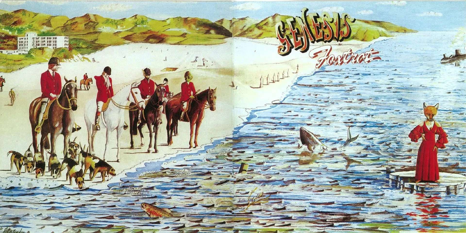
Another album the back cover of which cannot be disregarded is Genesis’ iconic fourth studio album “Foxtrot”. The cover art to this album was created by Paul Whitehead (an artist who had also worked with the group on their previous album “Nursery Cryme”).
Foxtrot’s cover is a complex work that accommodates a great number of direct and allegorical references.
The image is a far-stretching landscape of a seashore that is filled with a number of meaningful characters and objects.
On the front cover we can see a woman with a fox head in a red dress standing on an ice floe. This character alone already makes the cover rather interesting. The viewer might presume that the fox head has something to do with the name of the album. However, without the back cover we can’t see the full picture! As we open the sleeve revealing the back cover image, it becomes clear that the fox is just one of the characters in the bigger scene which depicts a group of people engaged in fox hunting. The act of fox hunting is important here as it represents an activity associated with the British High Society (similarly to the game of croquet on the cover of “Nursery Cryme”).
Other elements of the picture reference various socio political themes of the time, biblical subjects and the lyrics (to both the songs on this album and earlier albums). Here are just a few of them:
- The submarine in the top right corner of the cover and the fish coming out of the water reference the presence of the U.S. Naval Fleet (which included nuclear submarines) off the coast of Scotland and the burning issue of water pollution of the time;
- The horsemen represent the Four Horsemen of the Apocalypse, which is a reference to the epic 23-minute-long final track of the album “Supper’s Ready” which in its turn references several scenes from Revelation in the Bible;
- The seven hooded figures walking along the shore are a direct reference to characters from “Supper’s Ready”:
“Six saintly shrouded men move across the lawn slowly
The seventh walks in front with a cross held high in hand”
1. Watcher Of The Skies
2. Time Table
3. Get ’Em Out By Friday
4. Can-Utility And The Coastliners
5. Horizons
6. Supper’s Ready
3. “Dirty Mind” by Prince, 1980

The cover design for Prince’s “Dirty Mind” takes a different approach to the usage of the back cover. Here the front cover image doesn’t stretch all the way to the back. Instead, the back cover is made up entirely by a different photographic image.
The now iconic front cover is very upfront. It depicts Prince in an opened trench coat, a scarf and small black underwear looking directly into the camera. It is explicit and outrageous (just like most of the tracks on the album!) but still comparatively simple.
The back cover however is much more intimate and complex. It also doesn’t look as staged as the front cover. In this picture we see Prince in the same outfit lying down, his gaze wandering away from the camera. The tracklist is written on the wall beside him with spray paint (text-within-the-image!).
Here Prince’s full body is visible which allows him to show off his black thigh-high socks which weren’t visible in the front cover picture. The thigh-highs and the pose that he is taking give him a more delicate feminine silhouette which contrasts with the in-your-face chest-forward attitude of the front cover. The shadowing in the scene also almost makes it look as if the artist is nude under his coat which creates an even more vulnerable image.
While the front cover represents the album’s “Do It All Night” or “Head”, the back cover allows us to see a different side of Prince representing the album’s “When You Were Mine” and “Gotta Broken Heart Again”.
Dirty Mind’s back cover also works to saturate our perception of the album. But, unlike the ones for “Strange Days” and “Foxtrot”, it doesn’t have to be viewed simultaneously with the front cover, which also allows it to be perceived as a separate standalone piece of art.
1. Dirty Mind
2. When You Were Mine
3. Do It All Night
4. Gotta Broken Heart Again
5. Uptown
6. Head
7. Sister
8. Partyup
Afterword
When choosing a theme for my visual study, I wanted to pick something unusual, not obvious, something we haven’t really talked much about.
I wanted to somehow turn this whole thing around… (See what I did there?)
And I wasn’t disappointed. I watched artists turn the back covers from a boring official space into an artistic medium of its own which allowed them to tell a bigger story with their art. Now it surprises me that not everyone is using this opportunity!

I was originally going to also include the cover to Miles Davis’ “Bitches Brew” in my analysis but then had to, unfortunately, give up on that idea due to my work getting excessively long at that point. However I’d like to still briefly mention it here as a truly remarkable example of a back cover.
Now, when everything is said and done, I am glad that I took my time to write this piece. Not only did it give me a chance to dive into a new subject, it also resulted in me widening my musical knowledge by yet another bit, got me to watch another Federico Fellini film and led me to discover just how surprisingly dirty Prince’s songs could be (which was a genuine surprise, even though I’ve seen the “Get Off” MV before!).
But most importantly, I am glad that for once I took the time to approach the process of listening to music not just as a recreational activity, but as an aesthetic experience. It was genuinely thrilling to dig into the lyrics to the songs on “Foxtrot” for instance! It truly was.
I am glad I got to do it and I feel like I should really do it more often.
