Example of analyzing a multi-timeframe indicator (Bollinger Bands)

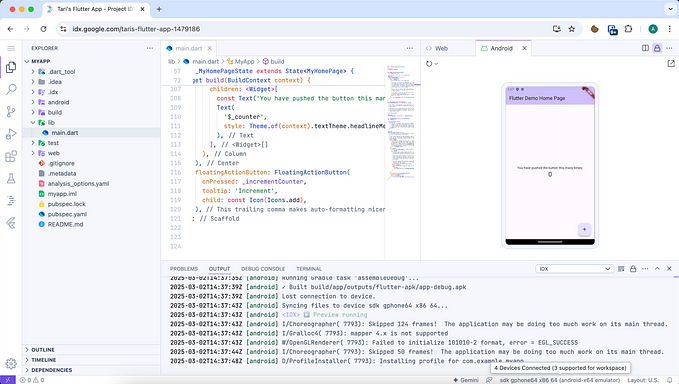
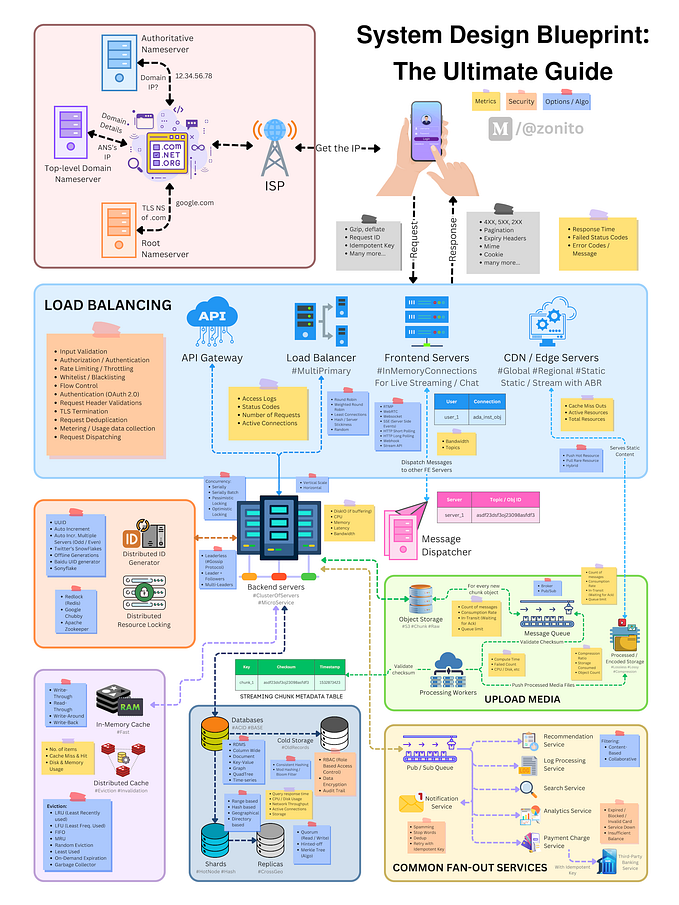
Bollinger Bands are a very good idea to utilize standard deviation in trading, not only treating the sigma line as a simple resistance line, but also visualizing the pressure it exerts on price movements as an oscillator. I personally use it from time to time as a tool to reinforce the accuracy of my judgment of a situation. Although not limited to Bollinger Bands, there are few cases where the indicator is used only for a single time leg. Most people use multiple windows of indicators for the upper leg on the screen (Fig. 1) or depict them all together on a single chart.
Even if you use a single indicator, the amount of information increases when you use it on multiple legs. With this increased amount of information, it is not appropriate to make decisions based on intuition. In order to convince yourself why you made the decision you did when you look back on it later, proper visualization is one solution. This article will show you how to evaluate multiple legs of Bollinger Bands with scatter plots. Since we need to obtain trade results to evaluate, we build a simple strategy using Bollinger Bands and fractal patterns.
The results of this article are as follows
- Shrinking bandwidth increased the odds of winning.
- Small risk reward and need to maintain a consistently high win rate to be profitable
- When the trend occurs in H1, the bandwalk causes a series of losses and a large loss of profit
- If you want to improve using the trend direction of the upper leg, you can refer to D1
This article is a cookbook to show examples of indicator use and analysis. It is also intended to explore how I personally write articles and how to include the results of my analysis. As in this article, trading only with indicators without looking at actual price changes, or overconfidently using a particular indicator without sufficient evaluation, can lead to unpredictable losses. If you wish to use an indicator as a reference, please do so at your own risk after having thoroughly evaluated it. Also, results may differ depending on the trade server from which the data is obtained. For more information, click here.
1. Build a strategy
Trade results are required to confirm the multiple leg Bollinger Bands with a scatter plot. Here we will build a strategy using simple Bollinger Bands. The strategy uses 1. Bollinger Bands and 2. Fractal Patterns to 3. construct the strategy.
1. 1. Bollinger Bands
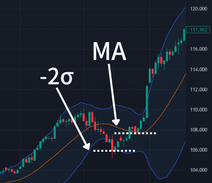
This indicator depicts a band with a multiple of the standard deviation (σ) centered on the moving average (MA). 90% of price movements occur between +/- 2σ, making it easier to understand consolidations and trend conditions where price movements are lost. In addition, the multiple of σ and MA function as resistance, making it easy to create a strategy such as entering at -1σ and exiting at +2σ.
A state in which the standard deviation decreases and the band width shrinks is a squeeze. In the market, there is always a period of time when price changes settle down, and below H1, the market tends to squeeze in a fixed cycle. Unless there is an unexpected event, a squeeze always occurs before a trend occurs. The trend will then break out and enter a trend while forming a range zone with flags and wedges.
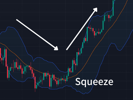
During a squeeze, it is standard practice to enter the market in the direction of the pre-squeeze trend, based on the idea that the trend will continue. In reality, however, it is not that simple. Which direction the breakout will be depends on the trend status of the upper leg. For example, when there is no trend in the upper leg as in Fig. 3, the breakout direction often reverses the trend.
1. 2. Fractal Pattern
In recognizing price movements, fractal patterns are a simple and easy-to-use technique. In general, the term fractal pattern refers to a geometric concept. The timeframe of a currency exchange is also a fractal pattern, and unless clearly stated, it is not possible to distinguish between different timeframes (Fig. 4).
On the other hand, when we talk about indicator-related fractal patterns, we are referring to specific chart patterns: in Fig. 5, five candles are marked with a marker at the position where the middle candle is the largest (green) and the smallest (red). Prices detected in this way have a special meaning on the chart.
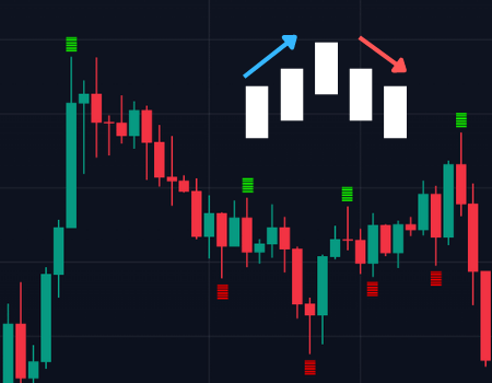
For example, if two or more fractal patterns are connected horizontally, they function as a resistance or range zone, and if they are connected diagonally, they function as a channel. If there is a resistance zone that the market considers important, as shown in Fig. 6, several fractal patterns will be generated around the resistance zone. As a result, support-register transitions that are somehow recognized visually can be detected mechanically.
Resistance bands and indicators, not just Bollinger Bands, do not always react. This is similar to the question “What are the best parameters for SMAs and EMAs?” Even major parameters cannot be relied upon at all during periods when the market is not aware of them.Resistance bands and indicators, not just Bollinger Bands, do not always react. This is similar to the question "What are the best parameters for SMAs and EMAs?" Even major parameters cannot be relied upon at all during periods when the market is not aware of them.
However, if the price moves with at least 2σ in mind, a fractal pattern should occur around it. when the HL of the candlestick crosses 2σ (Fig. 7), a signal should be issued.
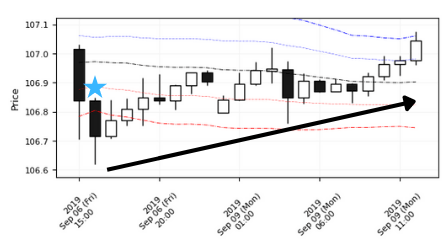
Of course, fractal patterns have the non-negligible problems of time lag before detection and inadequate accuracy in detecting reversals. In addition to fractal patterns, there are many other options for entry methods. These include formations such as double tops and triple tops, push-buy using indicators such as stochastics, and the use of Fibonacci retracements. However, since the purpose of this article is to obtain trading information, we have chosen a method that is as simple and easy to visualize as possible.
1. 3. Building Strategies
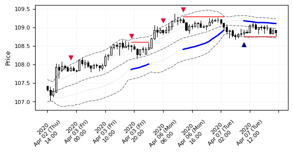
The strategy was constructed by combining the methods introduced in 1 and 2. The Fractal Pattern is a Sell if the candlestick touches the 2σ line and is convex to the upside, and a Buy if the candlestick touches the -2σ line and is convex to the downside. The USJPY is used as the issue, the time leg is H1, StopLoss is the 3σ line, TakeProfit is the 1σ line, and entry is made only when the 1σ of TakeProfit is more than 10 pips above the 1σ line. For simplicity, the lot size is always 1 lot, the initial balance is 1 million yen, and the verification interval is 3 years from June 2019 to June 2022. Fig. 8 shows how the behavior was verified for a short interval as a test.
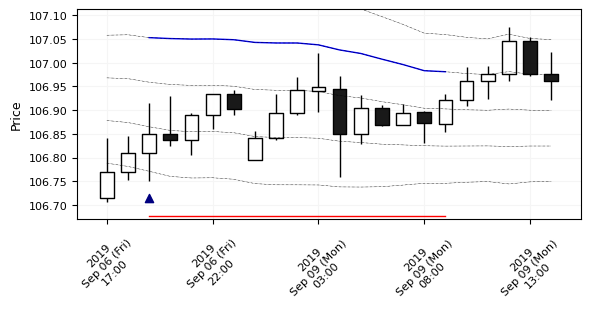
It works as imagined in the no-trend situation as shown in Fig. 8, but when it starts to bandwalk along the 2σ, the results are likely to be severe. It works as expected until halfway through and starts to lose when the downtrend begins. Also, when it touches 2σ, the MA turns in the opposite direction from the entry and TakeProfit narrows. Thus, there are many issues in terms of risk reward.
But at least in terms of generating a sample of trade data, it looks fine, so let’s take the evaluation as it is.But at least in terms of generating a sample of trade data, it looks fine, so let's take the evaluation as it is.

2. Evaluate simulation results
The results are shown in Fig. 10, with 543 trades, a RiskReward of 0.8 with a win rate of 51.2%, and a loss of 2.21 pips per trade. The z-score, which decreases with consecutive losses, was -11. As expected, the results were unstoppable once the losing started.
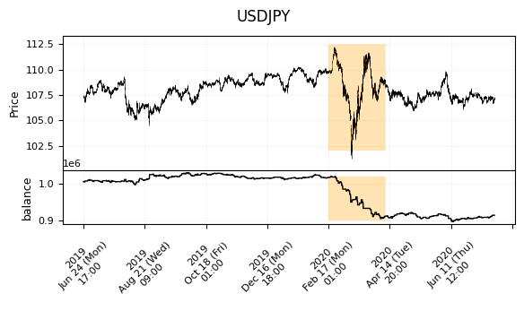
Fig. 11 depicts the results of the USDJPY price changes and balance changes. The area highlighted in orange is the period of market turmoil following the spread of the coronavirus infection. In the early part of the period, the spread of infection in the U.S. caused the yen to strengthen for risk-off purposes (USDJPY falling), while in the latter part of the period, the global turmoil spread and conversely, dollar demand increased (USDJPY rising). As a result of other compounding factors, the strong trend turned into a long-lasting V-shape and a series of losses. Other areas are neither possible nor impossible.
As can be seen in Fig. 9, we can see how the losses in the bandwalk are fatal. In a more extreme bandwalk condition (Fig. 12), the results are even more disastrous. The uptrend touches 2σ many times, so we have a series of Sells and StopLosses.
The best way to deal with this is 1. to enter the market when the MA matches the entry direction. 2. change the entry policy depending on the bandwidth expansion.
Another method of entering immediately after a breakout from the range seems to be effective, but it is slightly different from the entry policy we have established, so we will not use it this time. If we focus on this method of entering at 2σ (H1), we can think of a policy of aiming at H1 when the upper leg trend is about to resume after a lull.
3. Follow the trend of the upper timeframe
While the general statement “don’t buck the trend” is intuitively true, it is essential to assume that the trend is being captured by the appropriate means for the strategy in use. To capture the trend, what happens if you enter when the moving average (MA) of the Bollinger Band coincides with the direction of entry?While the general statement "don't buck the trend" is intuitively true, it is essential to assume that the trend is being captured by the appropriate means for the strategy in use. To capture the trend, what happens if you enter when the moving average (MA) of the Bollinger Band coincides with the direction of entry?
If we consider the H1 time frame, a. the MA must stay in an uptrend and b. it must fall sharply and touch -2σ. It is unlikely that a and b will occur simultaneously, and even if they do, the downward pressure will be too strong and the price will enter a downtrend. Normally, when we talk about following a trend, we choose the upper leg to follow on an appropriate scale. In this article, we will focus on H4 and D1 as the upper legs to check the MAs.
First, let’s look at the relationship between the trade result and the slope of the MA in Fig. 13 the slope of the MA (Diff in the figure) is calculated as the difference from the most recent MA. of the four figures, the upper row shows the Buy result and the lower row shows the Sell result. In all figures, the horizontal axis is H1 and the vertical axis is the upper leg. In situations where trade results are available, scatter plots are useful to determine if the multi-timeframe (MTF) indicator is capturing the edge.
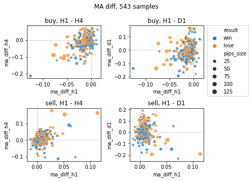
Buy trades with H1 below -0.05 are less likely to be winners, and Sell trades are more likely to be losers when H1 and H4 are rising steadily. In addition, H4 has many trades pulled in the direction of the MA of H1, while D1 has nothing to do with the direction of the MA of H1, meaning that after H1 falls to touch the -2σ, H4 often falls with it. In this strategy, H4 tends to fall when you buy. So, D1 seems to be scale-appropriate for a design that follows the upper trend.
It would be easier if winning trades and losing trades were more clearly separated, but it is not that simple. Many trades are mixed regardless of whether they are winners or losers. This kind of indescribable result occurs when the strategy is wrong to begin with, the edge is not captured, or the noise factor is not fully removed. In many cases, simply filtering with an indicator is not enough. If you want to use the indicator in actual trading, you may want to consider rethinking your strategy.
4. Check the band width of the upper leg
Let’s check the scatterplot for MTF information other than the MA direction as well. What we see here is the band width of the Bollinger Bands. Since the bands only depict the standard deviation (Std), we are actually checking the Std of the closing price. Although there are ways to check the band width with fixed values, we will look at the amount of increase or decrease in the band width, which makes it easier to determine the entry timing.
Incidentally, many people use squeezes and expansions, but these are relative evaluations based on the most recent bandwidth. In this case, the evaluation is different from a squeeze because it is an absolute change from the most recent bandwidth.
Fig.14 compares the amount of change in bandwidth; similar to Fig13, it does not seem to be an easy result to understand. Somehow, it does not look like there are more winning trades when the bandwidth of H1 shrinks (Stdev_diff_h1 is negative).
Common sense dictates that you should enter the market when the bandwidth is expanding, but in this case, you need a band parallel (Stdev_diff is 0) or a band contraction (Stdev_diff is negative) to increase your chances of winning. Conversely, an expanding band (positive Stdev_diff) will increase the number of losing trades because a band walk will occur.
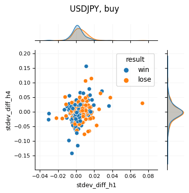
The results, with the distribution added for clarity, are shown in Fig. 15. This figure is exactly the same as the upper left panel of Fig. 14, depicting the distributions for the horizontal and vertical axes, respectively. On the horizontal axis, H1 shows that losing trades (red) are distributed around positive values, while winning trades (blue) are distributed around zero values. On the other hand, H4 shows a uniform distribution regardless of winners and losers. Considering only from the aspect of win rate, it can be expressed as a strategy that works when there is no price movement in H1, regardless of the situation of the upper timeframe.
Conclusion
In this article we used scatter plots as a way to check the MTF indicator. To prepare the trade data, we built a strategy using Bollinger Bands and Fractal Patterns. The results of the indicator were checked against the top legs, yielding the following results
- Shrinking bandwidth increased the odds of winning.
- Small risk reward and need to maintain a consistently high win rate to be profitable
- When the trend occurs in H1, the bandwalk causes a series of losses and a large loss of profit
- If you want to improve using the trend direction of the upper leg, you can refer to D1
Although we could not obtain results that could be understood at a glance this time, there are opportunities to obtain clear results if multiple methods such as time of day and chart patterns are used to create them. When this happens, multiple methods such as the scatter plots used in this case may provide a more detailed understanding.


