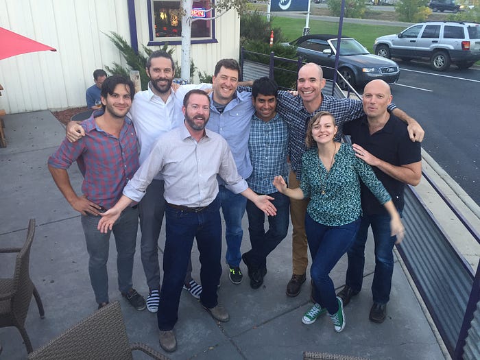
When we started Timbr two years ago we wanted to make data science more accessible and collaborative. The majority of what powers data science is in the public domain — academic articles with the latest methods, open source libraries for algorithm implementations and a burgeoning open data ecosystem. Yet these assets remain largely disconnected. We saw an oportunity to marry algorithms and data in a platform where users can discover each other’s work and build upon it.
In the process of building the platform we started using DigitalGlobe’s GBDX platform to deploy algorithms against their massive store of satellite imagery. GBDX had done the heavy lifting of figuring out how to scale algorithms against petabytes of data. Allowing us to have a field day running numerous methods against their playground of data. The two went together like peas and carrots.
Quickly we realized our focus on creating a collaborative studio to build algorithms fit perfectly with GBDX’s mission to enable data scientists to dive into their data. Our team had tackeld several hard problems on the UI/UX of creating algorithms and integrating into existing tools like Jupyter, while the GBDX team had nailed scaling the infrastructure to enable arbitrary algorithms to run across petabytes of data. Inevitably we started talking about integration, which then catapulted us to joining forces. We are psyched to say Timbr is now part of the DigitalGlobe family.
It is an exciting time with GBDX hitting its stride, and the Radiant Group — including our friends HumanGeo — joining the DigitalGlobe team. One big thing we’ve learned building a data science platform is that great work requires a powerful platform and brilliant data scientists. It is super exciting to see DigitalGlobe bringing both sides of the equation together.
To help illustrate why we are so enthusiastic to join the awesomeness of GBDX we thought a little demo would help. A core part of Timbr has been simple pipelines for dynamically updating data, so we were particularily happy to discover a powerful new multispectral tile service in GBDX.
To power our demo we’ve created a couple of open-source libraries (called jupyter-react and jupyter-react-js) to enable integration of full ReactJS user interfaces that can call and respond to Python code in the Jupyter notebook. We’ve also created a simple proof-of-concept REST streaming API for GBDX data called idaho-streamer. Together, these elements allow us to construct a small “live” data collection interface that let’s us browse, select, and stitch data together that we can further analyze in a Jupyter notebook.
We thought it would be fun to go back to our first Timbr.io work on satellite imagery counting ships in San Diego. That work was a one off batch analysis, but we talked about a future of streaming data where ships counts could be dynamically updated. One of the most exciting aspects of being part of DigitalGlobe is now we can make that future happen. Using the Idaho stream of DigitalGlobe imagery above we can run our ship counter and immediately get results against all the data available.
First we’ll stream the data onto our GBDX Map widget for Jupyter. This allows us to see a visual representation of all the DigitalGlobe imagery as a grid based choropleth map (lighter colors = more imagery) with a histogram based time slider to explore it.

Think of the GBDX stream as a historical+current firehose of all the recent data that DigitalGlobe has collected. We can use the selection tool to designate our area of interest and select which time periods we’d like to process image chips from. The code then stitches the selected imagery into 8 Band, TOA reflectance/radiance in 32-bit float TIF chips — that are custom built for analytics. From here you can go to town running any algorithms of interest and get immediate results right in your notebook.
To test this out we took our simple ship counter and ran it against a selection of imagery to build up an analysis of ship traffic in the Port of San Diego. We won’t repeat the technical details, but below you can see the output of running the ship counter against our selected DigitalGlobe data.

You can check out the whole workflow in this quick video:
To change the analysis all we need to do is go back to our GBDX Map and select new imagery from other time periods or a new area of interest, and re-execute our analysis. Since this a GBDX stream we don’t have to stop with historical analysis. Using our soon to be released Timbr-machine extention to Jupyter we have a live pipeline in our notebook, which will update our analysis every time DigitalGlobe has new imagery available. If we want an alert to email us the new ship count output instantly — that is just another quick snippet of code. The team is psyched to see the original vision come to fruition and couldn’t be happier about doing that with DigitalGlobe.
To play with the demo yourself just check out the instructions and Jupyter notebook here. Next you can run it locally, or go to http://juno.timbr.io and sign up with your Github credentials and request access to the hosted DigitalGlobe Jupyter kernel.

Also be sure to leave your email on the Juno page if you’d like to be notified when we launch! Lastly a big thank you to everyone who supported us on this amazing trip.

