Republicans Are “Clustered” By County, Democrats Are “Clustered” By State And District, Because “Clustering” Is Not Well-Defined.
Both before and after the 2016 election, there’s been a lot of discussion over how inconvenienced the Democratic party is by “clustering” and “geography”. A party that is strongest in urban areas, the “argument” goes, will and/or should always have trouble winning a majority of the country’s districts or electoral votes.
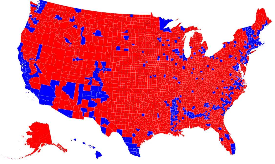
Sometimes this “argument” is illustrated with maps, like this one I made off of Mike Bostock’s block showing the 2016 presidential winner by county:
Or this map I threw together using Daily Kos Elections calculations showing the Presidential winner by Congressional District — Clinton won only 205 districts to Trump’s 235, despite winning the popular vote.

These two maps look, and are, very very similar: Major urban areas, California, the Northeast, the Acela Corridor, and majority-nonwhite areas are mostly blue, the rest are mostly red. It’s easy to think that it’s self-evident how the first map proves that these kinds of Democratic regions can never cover a majority of the country, thus justifying the second map.
This is not a great argument, though, which is why I sometimes put “argument” in sarcastic quotes.
The Democratic regions on the first map, the county map, actually do cover a majority of the country: About 55% of the U.S. population lives in a county that voted for Hillary Clinton over Donald Trump.
The Democratic regions on the second map, the Congressional District map, do not cover a majority of the country: Only about 47% of the U.S. population lives in a Congressional District that voted for Hillary Clinton over Donald Trump.
(States are even less favorable: Only about 44% of the U.S. population lives in a state that voted for Clinton over Trump.)
In other words, whatever makes the second map the second map — whatever let Trump win a majority of the districts without even a plurality of the vote — lies in the rather subtle differences with the first map, not in the rather obvious similarities, like having a few blue dots in a sea of red. “Of course Clinton only won 47% of the Congressional Districts, her voters were concentrated in urban areas” is therefore not an explanation, or at the very least not a complete explanation, however intuitively appealing it might be.
This is a challenge for mapmakers and for analysts. The more you know about political geography, the more your eye might be drawn to the similarities between the two maps (“oh, I recognize that, that’s the Eastern Shore of Maryland!”) when it’s the differences that are important, maybe very important. That Salt Lake County, Utah, Bucks County, Pennsylvania, Gwinnett County, Georgia, Guilford and Forsyth Counties, North Carolina, Hamilton County, Ohio are all blue in the first map but mostly red in the second map might be hard to see, but those differences add up.
More generally, I don’t see how county-level analysis, on its own, can identify any “clustering” or “geographic disadvantage” that Democrats might or might not have. You have to look within counties, or how counties split, or how counties are combined, because counties on their own would seem to be a favorable geography for Democrats.
The “Tipping Point Counties” Of The 2016 Election.
Even though Clinton only won the national popular vote 48.0–45.9, about 55% of the country lives in a county that voted for her. In fact, the median American lives in a county that voted for Clinton by about 5 or 6 points, which is of course stronger than Clinton’s 2.1 point national win.
This somewhat complicates the question of whether Trump voters or Clinton voters are more likely to be “in a bubble” (whatever the hell that means). Depending on what you sort by, I believe you can get Boone County, Missouri, Riverside County, California, or Nassau County, New York to be the so-called “tipping point county”, but these were all very close to each other.
The following table sorts counties by Clinton’s percentage margin:

(Note that this includes Washington, D.C., which is the most Democratic “county” but which doesn’t get a House seat — it only has ~0.2% of the country’s population, though, so removing it would only shift the above list slightly.)
How is that possible, when Donald Trump won the Electoral College and when 56% or 57% of the country lives in a Trump state? It’s not that complicated if you think about it: There are a lot more people in Clinton counties in Trump states than in Trump counties in Clinton states.
33.5% of the population is in Clinton Counties and Clinton States.
21.3% of the population is in Clinton Counties and Trump States.
10.0% of the population is in Trump Counties and Clinton States.
35.1% of the population is in Trump Counties and Trump States.
In 2016, Clinton voters were not “clustered” at the county level but they were “clustered” at the state level and probably at the precinct or municipality level as well. (According to my Twitter friend Neil, only about 45% of Ohio voters were in Obama precincts in 2012, even as Obama carried the state.)
This is all because “clustering” is not an inherent property of populations, but a relationship between populations and particular choices of boundaries and scales. Under one set of lines, Democrats might be “clustered”, under another set of lines applied to the same population, Republicans might be “clustered”. If every district had exactly one person, it would be impossible for any party to be “clustered”. There might be some way to define a “clustering” metric that doesn’t rely on particular boundaries, but as far as I know the nobody’s really defined one.
Why Do Districts Favor Republicans When Counties Favor Democrats?
So if Republicans were “clustered” at a county level, why exactly were Democrats “clustered” at a Congressional District level?
There are a few answers. First of all, some counties are quite large, and you wouldn’t necessarily expect the party that wins a large county by three points to also win every single district in it, especially if districts are divided into fractional parts — parties can be “clustered” within counties. Second, on the other hand, some counties are quite small, and too scattered across a state to combine into a district. Finally, quite a lot of current Congressional Districts are drawn to benefit one party (as of now, mostly to benefit Republicans), and sometimes slice and dice counties in odd ways to accomplish that.
If you look at the states where the Clinton/Trump Congressional District spli t is different from the “expected” split by county population — the states which make the first map different from the second map — all three factors seem to be relevant.

Clinton won every county in Southern California, for example, but these are large and diverse counties, so it’s not surprising that some of their districts voted for Trump. Arizona and Nevada are dominated by Maricopa County and Clark County, respectively, so it’s not surprising their districts didn’t all vote the same way either.
Some of that is also in play in Texas, Georgia, North Carolina, Pennsylvania, and Ohio, but they also all have rather notoriously Republican maps, even if Trump won all five states (and even if some of North Carolina’s map was redrawn for 2016). Guilford/Forsyth in North Carolina and Hamilton in Ohio could easily be Clinton districts, for example.
Finally, I should note that Democrats wouldn’t necessarily have control of the House even if the Congressional District map was closer to the county map. Clinton won 205 Congressional Districts but Democrats will only have 194 seats in the House; there were more seats that voted Clinton/Republican Congress seats than voted Trump/Democratic Congress. Adding more suburban Clinton districts in North Carolina, Texas, Pennsylvania, Georgia, Ohio, and so on might conceivably just be adding more of those Clinton/Republican seats.
Notes And Sources:
County population numbers are vintage 2015 Current Population Estimates from the Census. I used the sum of the population across all counties as the “population of the country”, although some of the country lives abroad. County vote totals are mostly from Dave Leip’s U.S. Elections Atlas, except for Kansas, which is from the Kansas Secretary of State, and for a few very small edits in New Mexico and Utah. Clinton and Trump totals by state equal what’s on Wikipedia, (except for some votes in Maine and Rhode Island that are officially unallocated by county), although total vote by state has some disagreement, probably due to write-in votes being counted differently in different places. Presidential results by Congressional District are from Daily Kos Elections; North Carolina hasn’t been released yet but I’m trusting Stephen Wolf that it will end up with 10 Trump districts to 3 Clinton districts. 2016 Congressional District shapefiles used in the second map are from the @unitedstates project.
Alaska and the District of Columbia were treated as one “county” each, while I merged tiny Kalawao County with Maui County in Hawaii (since Kalawao does not report its own election results).