David Carson: Surfing the Unconventional Waves of Zapfs Dingbats
A short review of the famous or infamous 1994 issue of Ray Gun magazine design spread of the interview with Bryan Ferry — 26 years later.

In the 1990s an accomplished professional surfer turned designer named David Carson changed the landscape of graphic design much like Nirvana, Pearl Jam and the grunge genre changed the face of music during that decade. He revolutionized, not just editorial design but typography and graphic design for the next generation by eschewing the objective sensibilities and logic of modernism, using intuition, and bending the grid or throwing it all out as he saw fit. His designs rejected hierarchy, formal layouts and conventional typography — essentially designing with a blank canvas. With no formal training and background in graphic design, Carson was primarily self-taught. His lack of formal training is perhaps a blessing in disguise as it gave him the freedom to create that was free from the shackles of design rules. This creative freedom is evident in his highly expressive work that connects to the audience at an emotional level. Free from the rigidity of grids, Carson said “The fact that you can create a lot of reaction just based on the way you arranged things shows that design is such a powerful language.”

He began his graphic design career in the 1980s as a designer and art director for Transworld Skateboarding, Musician, Beach Culture, and Surfer magazines. He was art director for Ray Gun, a magazine dedicated to the alternative music scene which saw the publication continuously pushed the boundaries of the of possibilities of design. In a 1994 issue of Ray Gun — that would become famous or infamous (depending on who you ask) — David Carson found the interview with English singer Bryan Ferry boring after reading it and decided to do what perhaps no credible designer would’ve ever done, typesetting the interview to an illegible font: Zapf Dingbats.
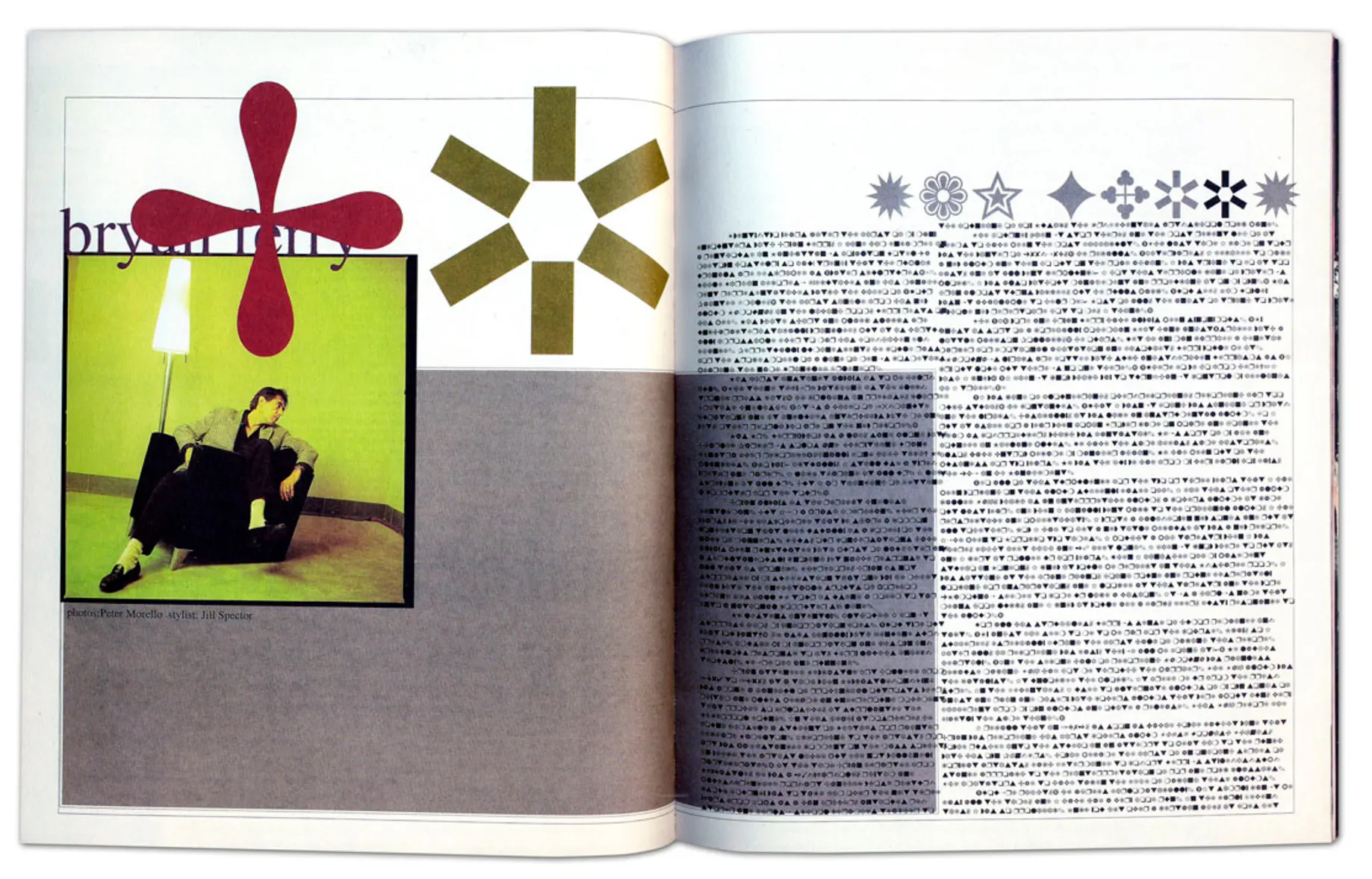
Setting aside the fact that Egyptian hieroglyphs is more decipherable than the font he used for this spread, this design is fascinating and amusing in many ways. That sense is perfectly captured in the image of Bryan Ferry’s facial expression staring in the direction of the text. There is a sense of simplistic balance between order and chaos to this design compared to his other work. It is typical to see Carson’s work continously redefining the criteria for legibility often using reverse leading, text columns rotated horizontally or even crammed and overlapping with one another, extreme letterspacing, and other unusual layout techniques that challenges a reader to enagage and decipher the message. Despite all that, his design layout is harmoniously balanced between its subject, typography, images, textual content and context in unconventional but more expressive ways that is just as meaningful as as a modern Swiss style designed layout. While the interview text is available to read as a magazine supplement (I have never read it), that’s besides the point. This particular spread design was not in any way his best design — with Carson calling it average. However, what this design represent was David Carson’s willingness to risk and destroy design conventions when few (maybe the likes of Neville Brody), or perhaps none would have during that time.
In today’s age of information where people have short attention span and everyone is a critic, would he pull something like this today? Absolutely! It would be shocking if he wouldn’t. Whether this design evokes a sense of confusion, fascination, excitement, meh, or downright outrage is exactly the kind of engagement and emotions that Carson never fails to conjure out of his audience. While the Futurists and Dadaists in the early 20th century proved the effectiveness of the expressive power of typography, and postmodernists took it a step further, David Carson was one of the few who took it to a whole new level. Many of his designs were, on the surface, pushed to the point of illegibility, however, his ability to create that invites the viewers to willingly and enthusiastically engage and discover a design was a turning point of visual communication design innovation during the digital revolution. He once said, “Don’t mistake legibility for communication.” Just because you can clearly read a message, it doesn’t necessarily mean it can speak to you beyond words. Attracting, challenging, provoking, and engaging a design is communicating, and no one does it better than David Carson even as crazy as using Zapf Dingbats. This is the kind of pushing-the-limits-of-design philosophy that has made David Carson so influential and his thought-provoking work the stuff of legends.
“I’m a big believer in the emotion of design, and the message that’s sent before somebody begins to read, before they get the rest of the information; what is the emotional response they get to the product, to the story, to the painting — whatever it is.” David Carson: Design and Discovery, TED 2003

The late great Paul Rand said “To function creatively the artist must have the courage to fight for what he believes.” Carson is certainly an embodiment of that statement in his path as a designer in spite of the face of those who believed that he had crossed the line between order and disorder. Growing up in the 90s, I’ve always admired and have been inspired by David Carson not just by the aesthetics of his work but more importantly in his ability to connect emotionally to his audience—intended or not. While it is important for a message of a design to be clear, whether it can hold any meaning, create a conncection, or even attract an audience is a question that designers have consider answering in their designs. The most significant contribution and lessons that designers like David Carson inspire others is to continuously challenge not just design norms and trends but to invent them by challenging ones self and the audience.
