A novel Covid-19 hypothesis: Previous ancestor virus
This is a work in progress. I plan on updating this article as I gather more facts relating to this hypothesis, including facts that might contradict it. If you, dear reader, know of any facts that contradict or disprove this hypothesis please let me know what you’ve found. Disclaimer: I consider myself to be a decent data analyst, but I’m not a virologist or medical practitioner of any kind, so I base this hypothesis just on the public data I have access to.
The hypothesis
I don’t make any claim about this hypothesis being original, so if you have heard this before I’m fine with it not being mine, and I hope to contribute a few more facts that you might not have been aware of before.
I think there is a good chance that Covid-19 did not just appear in its current form in humans without there being a previous ancestor virus also hosted in humans.
Let me now define what I mean by previous ancestor virus.
I mean a very closely related virus, close enough for the human immune system to be “fooled” into recognizing the current Covid-19 virus as if it were the previous ancestor virus most of the time. As anybody can gather from the effectiveness figures for different Covid-19 vaccines and their modified effectiveness figures for different variants of the Covid-19 virus, the immune system doesn’t have an on/off switch for recognizing viruses, is not a system that produces binary yes-or-no results, and most of the time produces results that are of the “kind of recognizes”, “kind of not really recognizes”, “recognizes rather well”, and other non-binary varieties.
Also, I’m not postulating the inconsequential version of there was a previous ancestor virus. By this I mean the fact that whatever you consider the currently agreed upon patient zero of Covid-19 to be, it’s probably non controversial to postulate there might have been a few dozens or hundreds or even a few thousands of previous cases of the current Covid-19 that went undetected in Wuhan. I’m not postulating that.
What I’m postulating is that there were millions of cases (that’s not a typo, bear with me) of the previous ancestor virus. That of course means the previous ancestor virus should be close enough to the current Covid-19 virus to meet the criteria I previously mentioned (recognized most of the time), but different enough to be orders of magnitude less lethal than the current Covid-19 virus. It also means the previous ancestor virus must have been infecting humans for months if not years before Covid-19 became known. I will not address how did the previous virus mutated/became/changed into the current virus. I’ll leave that to people with actual knowledge in virology and stick to the data I see and can analyze.
I came to believe that this hypothesis might be true after examining the very different outcomes that different countries have experienced during the Covid-19 pandemic, and finding the most common explanations for those differences lacking.
The data
Here’s a world map of Covid-19 deaths per 100,000 inhabitants.

Apart from some particular countries (Iceland, Finland, etc…) the most obvious pattern in that map seems to be the fact that there are two geographic areas with much lower death rates than the rest of the world: one comprises most of the African continent (except for southern Africa and most of northern Africa); the other comprises the Asia-Pacific region.
I’m mostly going to talk about the Asia-Pacific region. For starters you can see from this map that the Asia-Pacific region also has much lower Covid-19 cases per million people.

To a large degree those two measures, cases per capita and deaths per capita, are related to each other. First, you cannot have more deaths than cases and everything we’ve seen indicates that deaths are a small fraction of cases. Second, as far as I know there are no really good treatments (high percentage of hospitalized Covid-19 patients recover by applying treatment X regardless of risk factors) being used, which means that the fraction of cases that become fatal in country C1 and country C2 should be similar, assuming that risk factors are similar for the general population in countries C1 and C2.
The ratio between deaths per capita and cases per capita is called the Case fatality rate (CFR), and as of today it varies between 0.10% in Singapore to 19.70% in Yemen. You might think that is a rather large range, but keep in mind that four out of the highest seven CFR belong to countries that are or have recently been at war. Also, countries that have done less testing for Covid-19, for whatever reason that might be, will have on average higher CFR rates simply because it’s easier to overlook thousands or millions of mild Covid-19 cases than it is to overlook Covid-19 deaths. A case in point is Mainland China which despite having some of the lowest death rates per capita and case rates per capita has a CFR of 4.7% (ninth highest in the world) simply because most of it’s cases and deaths occurred at the beginning of the pandemic when deploying massive testing was much harder than it was later on.
The next map of the world shows countries with a very low CFR. Red means 0.10% to 0.50% and pink means 0.60% to 0.70%.

Notice how the Asia-Pacific region again has a large part of the countries with very low CFR, especially Southeast Asia. There’s also a cluster of countries in the Persian Gulf, a few countries in Europe, a few in Africa, and a couple of Indian Ocean countries.
A good question about those low CFR values is: are those just relatively low CFR values, or are they absolutely low values?
By just relatively low values I mean relative to most other countries. By absolutely low values I mean values lower than we would expect given what we know about Covid-19. From the data I’ve seen any CFR lower than 0.40% seems suspiciously low… unless there is some factor not being taken into account yet, or the data from that very low CFR country cannot be trusted. For a detailed argument of why I think CFR that are so low can’t be explained away based on what we know as of today about Covid-19, you can read this extract from a previous article.
For some of the countries in the previous map I suspect it is actually the case that their data cannot be trusted. But some countries in that map I do trust to do a good job of counting deaths, do proper massive testing, and report their data truthfully. According to Transparency International’s Corruption Perceptions Index three of those countries are in the top 20, and 6 of them are in top 30 countries for transparency.
That makes me posit there is some factor not being taken into account, and that factor is, I think, a previous ancestor virus that should have infected a large part of the populations of such countries conferring immunity (partial, good enough to make Covid-19 less lethal, or some such) to a large part of their infected populations.
Can this hypothesis be wrong?
I’m going to address the first obvious rebuttal to this hypothesis: China is not red or pink in that map. As I said before, the case for China can be easily explained by the circumstances in which most of their cases happened, and my intention with this hypothesis is not just to see if it fits with the red/pink map but also see if it fits the first (deaths per capita) and second (cases per capita) maps.
I will not try to explain how the previous ancestor virus appeared (zoonotic spillover?) in humans, in China or in one of it’s southern neighbours, Laos and Vietnam who happen to have very low values for the 3 rates (deaths, cases, CFR) previously presented, but assuming that it did then it’s easy to explain how those countries and others close by (Taiwan, Malaysia, Thailand, Mongolia, etc…) have very low values for 2 or 3 of the Covid-19 rates previously presented. People infected might cross the border into the neighbouring countries in that general area and spread the virus there. Many Covid-19 policies are based in this same fact: closing of borders, suspension of flights between countries, internal roadblocks inside countries, etc… and as previously mentioned even if the previous virus is less infectious, maybe much less infectious than Covid-19, it must have had months or even years to spread from village to village, from city to city and from country to country. I’m also assuming that under normal circumstances (no lockdowns, no clossed borders) a virus moves faster inside a country than between countries.
By the way, if you’ve read enough about the Covid-19 virus then you’ve probably heard about the Chinese province of Yunnan, bordering Laos, Vietnam and Myanmar. And you’ve probably heard about Rhinolophus bats in relation to Yunnan. For this hypothesis to be true or false I don’t need to establish whether the previous virus appeared in Yunnan or somewhere close to Yunnan, that’s why I’m talking about a general area. From now on I’ll use the acronym YGA for Yunnan General Area, because I think it’ll make this article more readable.
I’m not going to compare this hypothesis with alternative hypothesis for how several countries with very low rates clustered in the same part of the world, at least not yet. But I need to explain, or at least try to, how for this hypothesis those countries that seem to refute the hypothesis (being far from YGA) actually fit with the hypothesis for the most part.
First I’ll start with the Asia-Pacific region, given that Singapore is not so close to YGA, Australia and New Zealand seem to be far away from YGA, etc…
For that I’ll introduce a Chinese Tourism Index (CTI) from each country X measuring the number of Chinese visitors (visitors in general: tourism, business, family) who visit country X in a given year, divided by the population of country X. If country X has 10 million inhabitants and receives 1 million Chinese visitors per year then the probability of someone in country X being infected by a virus that has spread in China but is not present in country X, is twice as much as the probability if country X has 20 million inhabitants. And half as much as the probability if country X only has 5 million inhabitants. If the amount of Chinese visitors varies the opposite effect happens: twice as many Chinese visitors means twice the probability, and half as many Chinese visitors means half the probability of infection.
Chinese visitors should be considered as a proxy variable for visitors from the YGA, which is the variable I would ideally like to use for these analyses. The number of yearly Chinese visitors to a country is usually (but not always, see Persian Gulf below) easy to find, and it’s certainly much easier to find than the number of yearly Vietnamese visitors to a country.
This is a table of CTI values for the Asia-Pacific region.

Most countries in the region have a high or very high CTI value except for Myanmar, Indonesia and The Philippines. Myanmar’s death rate seems low compared to Indonesia and The Philippines but its CFR seems high compared with all other countries.
Regarding Indonesia and The Philippines, they have by far the highest rate of per capita deaths in the region. The only other countries in the region with a death rate close to Indonesia and The Philippines are Japan and Malaysia, yet Japan should have a much higher Expected Fatality Rate than almost any other country in the world due to it’s old population (I wrote about EFR in a previous article), and Malaysia has a CFR one third that of The Philippines and one fourth that of Indonesia.
The correlation coefficient r is -0.53 for the death rate and -0.44 for CFR, meaning an inverse correlation between CTI value and Covid-19 rates for these countries. This means more Chinese visitors to a country in the Asia-Pacific region seems (moderately) correlated with lower Covid-19 death rate, and the same for lower CFR.
You might be wondering whether it makes sense to speak of high or low CTI for these countries like I’ve been doing in the previous paragraphs. So for comparison I calculated the CTI of two countries from two regions of the world that don’t see many visitors from China: Latin America and Africa. Costa Rica and South Africa were the first countries for which I could find the data needed to calculate their CTI.

The CTI values for both those countries are one or two orders of magnitude lower than those for countries in the Asia-Pacific region. And both these countries are considered touristic countries in their respective regions of the world.
Europe and Persian Gulf
Now that we have a good idea of what high and low CTI look like let’s have a look into European countries. Most countries I included in the following table are Western European countries, and I made sure to include all nordic countries so that Norway and Iceland can be compared to similar countries.

The previous table shows clearly that Iceland has a very high CTI, and the other two European countries that looked like anomalies also have a high CTI: Norway and Finland.
The correlation coefficient r is -0.53 for the death rate and -0.52 for CFR. I decided to include Turkey even though it’s not a Western European country and it’s a clear outlier. Taking Turkey out raises the values of both correlation coefficients close to 0.6. So it’s not a spectacularly good correlation - I would be very surprised if the only factor affecting Covid-19 rates would have been CTI or more properly what it stands for - but it’s a good correlation none the less.
Now about the Persian Gulf region, for several countries in the Persian Gulf I couldn’t find the actual number of Chinese visitors, and so I had to come up with estimates based in the number of direct flights from China, number of Chinese passengers passing by airports, and comparisons between countries and airports. I’ll call the CTI based on these (less reliable) estimations ECTI, Estimated CTI. Here’s the table of ECTI values for several Persian Gulf countries, including CFR and death rates for all of them as of today.

I have created an addendum with all the sources and calculations made to arrive at those values of ECTI. If those calculations are correct then it seems there is an inverse correlation for all Persian Gulf countries between ECTI and Covid-19 rates, and it seems that for the UAE and Qatar (less so) their exceptionally low rates could be explained by their ECTI values. The correlation coefficients are -0.54 for the death rate and -0.51 for CFR, and as explained in the addendum those values of r could be higher.
Indian Ocean
In this section I’ll talk about Seychelles, Maldives and some of their neighbours, and for that I need another table.

I also added the French islands of Réunion and Mayotte to the table even though I have no data to calculate their CTI. There are several weekly flights between Mayotte and Réunion, and many flights connecting Réunion, Mauritius and Seychelles which might have helped in spreading the virus between them. I also added France in order to make it easier to see how Réunion and Mayotte look more like their Indian Ocean neighbours in terms of CFR and deaths per capita, and less like metropolitan France. To have a general idea of how much air connectivity there is between these islands I’ve made a map with flights between them and to/from China.

It’s easy to see that Seychelles and Maldives have high CTI values (though not as high as some Asia-Pacific countries) and some of the lowest CFR values in the world, and also how Réunion and Mayotte have much lower CTI and CFR values than would be expected for two territories that have so much regular contact with France.
About the correlation coefficients for these Indian Ocean countries, the value of r for CFR is -0.95 so that is a very good correlation which is to be expected according to the hypothesis. But r for the death rate is 0.70, not good. This I think, is a consequence of Maldives and Seychelles having much higher rates of cases per million people than the other countries, both countries being in the top 7 highest rates of cases per million people in the world as of today.
Another problem
Even if we accept that there is clear correlation between low CFR and low death rates on the one hand and being a part of the YGA or having a high CTI on the other, that still leaves a very important unresolved problem with this hypothesis. If a previous virus spread to millions of people in the YGA and then to millions more people in countries that have lots of visits from people from the YGA, then it should have left some trace of its spread and its existence.
I might argue that the low rates are proof of millions of infections because those infections would explain the low rates, but the previous ancestor virus should be a living organism, with it’s own genome, and it should be possible to test for it’s existence in a human host. Even if most most other viruses that cause respiratory disease (Influenza, common cold Coronaviruses) have become less prevalent due to the Covid-19 pandemic they have not disappeared, and so it should be expected that this previous ancestor virus did infect millions of people months or years before December 2019 and is still infecting people at the present time
I don’t have access to the kind of data that would definitely prove or refute the existence of the previous ancestor virus, so I’ll just try to infer its existence from the data I do have.
Even if the previous ancestor virus was much milder and much less lethal than the current Covid-19 virus, infected people should have had at least some milder symptoms in a large fraction of infection cases, and health systems should have experienced at least somewhat higher loads than usual.
Since I can’t directly know the symptoms experienced by the general population of different countries during the year 2019 I’ll use Google Trends as a proxy for symptoms experienced and medicines bought/used by the general population of different countries. One limitation of this approach is the fact that Google is blocked in China, so Google Trends results for China are useless.
Tamiflu
Tamiflu is the brand name for the antiviral medication Oseltamivir, a very commonly prescribed medication for Influenza. These are the Google Trends graphs for the word “tamiflu” or its equivalent for some countries from the Asia-Pacific region.


Notice that for the Vietnam Google Trends graph the peak occurs in the week of 22 December to 28 December, before 31 December 2019. And during four weeks of December 2019 the number of searches is higher than anywhere in the previous four years.
Influenza/flu
These are the Google Trends graphs for the word “flu” or its equivalent for some countries from the Asia-Pacific region.


ILI Surveillance systems
For the last few decades the most worrying and deadly respiratory infection year after year has been Influenza, which explains why the WHO has prioritized it above other respiratory infections when it comes to control, vaccination and surveillance measures. In fact the WHO recommends all its members put in place a surveillance system for Influenza cases and at the same time use this system to monitor respiratory infections in general, with these diseases being described as Severe Acute Respiratory Infections (SARI) or Influenza Like Illnesses (ILI) depending on its severity. The data collected by these surveillance systems must then be sent to the WHO, who integrates and publishes this data into several software systems, some of them only working with Influenza data and some of them with ILI/SARI data.
The degree of compliance with these WHO recommendations varies a lot from country to country. Some countries breakdown their data by sub-national entities (state, province, etc…) and some don’t. Some countries only report during their flu season and some countries report during the whole year (52 data points for 52 weeks).
If this data is publicly available in the WHO website then what are the reasons why I looked for patterns in Google Trends? The WHO weekly data for ILI cases and SARI cases should be enough as a proxy for checking whether the consequences and spread of the previous ancestor virus, if it indeed existed, can be seen in the data or not.
The first reason is that I didn’t see this data in the WHO website when I started researching this hypothesis. I don’t know if I just missed it, or it just wasn’t there at the time. I do know that FluNet (only flu data) was publicly available but wasn’t useful for proving or refuting the hypothesis. And I do know that the WHO website had some kind of revamping recently, because I keep getting a “We have revamped our website” page for some links from the search engine I regularly use.
The second reason is that, as I said before, the data in the WHO website is not complete enough for some countries or some sub-national entities, and in those cases I’ll use the Google Trends data as a proxy.
How good or bad is the Google Trends data as a proxy?
When Google has enough searches data Google Trends seems to be a rather good proxy for the ILI surveillance data, not a perfect match but peaks seem to align, and growing and diminishing trends seem to match. These are Google Trends (for “tamiflu”) and ILI surveillance graphs for the four flu seasons from 2016–2017 to 2019–2020, for the state of Washington, US.


Because the state of Washington is a sub-national entity, it’s ILI surveillance data cannot be downloaded or seen in the WHO website. As an example of a country that seems to have reported very inconsistent and/or very incomplete SARI and ILI data to the WHO here I show the data for Vietnam published in the WHO website.

In a case like that I trust Google Trends more than I trust the WHO data, and Google Trends seems to imply there was a widespread respiratory infection in Vietnam in the weeks prior to 31 December 2019.
It’s also important to notice that I didn’t come up with this idea. This same approach is being used by researchers to currently monitor and estimate ILI rates.
Australian Healthdirect data
Healthdirect is an Australian 24 hour health advice service by phone. The Australian Department of Health includes data from the calls received by Healthdirect related to ILI into the ILI surveillance report published in their website. Not all data in the reports published by the Australian Department of Health (or other national health authorities) is available in the WHO website, probably because some data may be considered important or interesting enough to be published by a certain national health authority, but that data doesn’t necessarily exist for every country or can’t be normalized between countries, and so it seems reasonable that the WHO doesn’t publish it. This is precisely the case for the Healthdirect data from Australia.
Looking at the Australian ILI surveillance data that is published in the WHO website it doesn’t seem to be anything wrong or unusual with the ILI data for 2019. It does look like 2019 had a higher peak of cases than 2018, but not higher than preceding years. And it does look like the high season for ILI cases lasted longer than other years, but not by much.
On the other hand, looking at the Healthdirect data for 2019 reveals that 2019 was an unusual year in terms of the number of calls received by Healthdirect compared to the preceding years (you can also check data for 2013 here).

If the 2019 Healthdirect data is evidence of more ILI activity than usual, then it would seem to be evidence of more activity for mild ILI, the kind of ILI that doesn’t require a visit to the doctor, otherwise it would show in the data for General Practice sentinel sites.
China ILI Surveillance data
China does not report ILI or SARI surveillance data to the WHO, but the Chinese National Influenza Center does publish ILI surveillance data in its website, breaking it down for Southern China and Northern China.
I was able to find data starting with the 2011–2012 season, continuing with the next seasons, and up to the 2019–2020 season. As can be seen in those reports, the percentage of ILI visits at sentinel sites in Southern China reached a peak of around 6.5% for the 2017–2018 and 2018–2019 seasons, higher than for all preceding seasons (around 4.5%). The percentage of ILI visits at sentinel sites in Northern China also reached higher peaks during the 2017–2018 and 2018–2019 seasons than all preceding seasons.
The 2017–2018 season in China doesn’t seem to be an outlier when compared to the same season in other large northern hemisphere countries (Canada, US, Germany, UK, Poland). That season was the most severe of the last years, and so it’s only logical that ILI activity in all those countries was higher than in other years.
But China is an outlier when it comes to ILI activity for the 2018–2019 season, and the 2019–2020 season in which China had even higher ILI activity up until the second week of 2020, when I presume that the policies implemented in China against Covid-19 begun to have an effect in all respiratory infections.

Is Taiwan not a country?
Another case of ILI surveillance data that can’t be found in the WHO website but would be interesting to analyze is the data for Taiwan. Whether you think Taiwan is a country or a sub-national entity, Taiwan is not allowed to be a member of the WHO which means that the WHO doesn’t publish ILI surveillance or Influenza data for Taiwan, but that data can still be found in the site of Taiwan’s Centers for Disease Control.
These are the graphs for percentage for ER visits for ILI (red line) and outpatient visits for ILI (blue line) for the years 2014 to 2019 as a proportion of all visits. I’ve added green lines to try to estimate the minimum and maximum percentages for out-of-season ILI visits for each year.

The last graph tries to give an idea of how those minimum and maximum percentages change from year to year, and how year 2019 compares with other years starting from 2014. And again 2019 looks like it had a higher percentage of ILI visits.
That same data compiled from the Taiwan’s Centers for Disease Control PDF reports shows that 2017 was an exceptionally high year for ER ILI visits (same as for other countries), 2019 was higher than average, and the last few weeks of 2019 and first weeks of 2020 were exceptionally high.

The data for the 2015–2016 season is missing from the reports, and exceptionally for the year 2017 there is data for the middle of the year, out of season. All other data in that graph corresponds to the flu season.
Because that last graph isn’t clear enough I’ll present now a table with the weekly average of ER visits for ILI (flu season, not out-of-season), showing again that season 2018–2019 was higher than average and season 2019–2020 was the highest of the last few years.

Another thing about Taiwan. According to the hypothesis countries close to the YGA area should have low Covid-19 rates, including a low CFR, and yet Taiwan as of today has a 4.6% CFR which is higher than average. This seems to be a consequence of a lack of capacity for testing:
In and around Taipei, labs have been working overtime in recent weeks but are still struggling to process all the samples.
Tim Tsai said on just a single day last week his lab in New Taipei city received 400 samples from hospitals to test. He said his lab was only able to process about 120 samples a day.
The government’s Central Epidemic Command Center said in a statement that all 141 government designated labs have the capacity to process 30,000 PCR tests a day. However, it declined to provide the actual number of tests being processed.
Outliers in the United States?
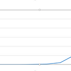
This is a bit outdated (1 May) map of Covid-19 cases per 100,000 people by US state.

I drew a circle around the US states of Oregon and Washington both of them having some of the lowest 7 rates of Covid-19 cases per population in the United States. Also, as of now the death rate is 56 per 100,000 population for the state of Oregon and 68 per 100,000 for the state of Washington as compared to 184 for the United States as a whole, and their CFR are 1.44% and 1.43% respectively as compared to 1.80% for the United States as a whole.
These are graphs of ILI surveillance data for Oregon and Washington for the 2018–19 season and previous seasons.

Again, the 2018–19 season seems to have been exceptionally high especially in the case of Washington state (higher than 2017–18), and a little less so for the state of Oregon (comparable to 2017–18).
A larger YGA?
Like I said when defining the Yunnan General Area (YGA), I would expect the previous ancestor virus to have spread slowly (relative to Covid-19) from village to village, from city to city and from country to country starting from that general area. Thailand being so close to the YGA and sharing a long border with Laos, it could be expected that the previous virus reached the country not through the Bangkok airport first, but through its border with Laos.
If that were the case then the areas of Thailand closer to its border with Laos should have lower Covid-19 rates than the rest of the country. And that is precisely what the following maps of Thailand show.

Out of the 6 regions of Thailand, Northeast Thailand has by far the lowest rates of cases per million people (CR in the map) and of deaths per 100,000 population (DR in the map). The map on the left is not normalized by population but it helps to understand how cases are distributed geographically. And the rates for the map on the right are based on statistics from 25 May.
Do many people have pre-existing immunity?
That is not just my question, it’s also the question posed by this article published in the BMJ journal on 17 September 2020. That article comments on the evidence from studies done in various countries (regrettably various small studies, not one big study on several countries that could help to compare those countries to each other), all showing evidence of T cell reactivity in a significant percentage of people.
That fact does not directly support the hypothesis of the previous ancestor virus, because that T cell reactivity could just be the consequence of previous exposure to some common cold Coronavirus like some of the researchers quoted in that article clearly state. This seems to have been proven for the Sars-Cov-1 virus (2002 SARS), and so it seems like a reasonable supposition.
On the other hand, that T cell reactivity could be partially the consequence of exposure to a previous ancestor virus of the Covid-19 virus.
Why nobody has sequenced the previous virus?
This is another clear problem with this hypothesis. If there is a previous ancestor virus, why haven’t we heard about any researchers sequencing the genome of that virus?
Although the common cold is usually caused by rhinoviruses, in about 15% of cases the cause is a coronavirus. The human coronaviruses HCoV-OC43, HCoV-HKU1, HCoV-229E, and HCoV-NL63 continually circulate in the human population in adults and children worldwide and produce the generally mild symptoms of the common cold.
Two of those four common cold coronaviruses were identified not long after April 2003: HCoV-HKU1 in January 2004 and HCoV-NL63 in late 2004. Why does it matter that it was not long after April 2003? Because April 2003 is when the Sars-Cov-1 virus was identified and sequenced, meaning that the most obvious explanation for the identification and sequencing of those viruses was the SARS epidemic of 2002-2003 and the motivation of trying to find more coronaviruses that might present a danger to the human population.
The most likely reason that no researchers have sequenced the previous ancestor virus, if it exists, is that every research team that has the capacity to do it is probably too busy right now sequencing variants of the Covid-19 virus, and they don’t have the motivation to do anything else. This is not an argument in favor of this hypothesis, but it is an argument against dismissing it just because no one has identified the previous virus.
Conclusion
This is not really a conclusion because I don’t think it’s currently possible to prove this hypothesis is correct or is wrong. If you’ve read this far then I hope I have convinced you that this is a testable hypothesis and a refutable hypothesis. There are many predictions that can be made based in this hypothesis and if most of those predictions don’t come true, then it should be clear that this hypothesis is wrong.
On the other hand it is a testable hypothesis. If the previous ancestor virus exists, then it must be possible to sequence it’s genome.
Changelog
2021–07–03: Added first version of Taiwan.
2021–07–04: First version of Oregon and Washington states. First version of “Why nobody has sequenced the previous virus?”. Added Indian Ocean map.
2021–07–06: First version of Persian Gulf.
2021–07–07: Moving the ECTI calculations to its own addendum.
2021–07–09: Second version of Taiwan. Compiled all data.
2021–07–10: Moving Very low CFR extract to it’s own addendum.
2021–07–11: First version of Conclusion
2021–07–17: Added weekly average table for Taiwan.