⚕️ Breast Cancer Wisconsin [Diagnostic] - EDA 📊📈
Breast Cancer Wisconsin (Diagnostic) Dataset — Exploratory Data Analysis
Data Set Information:
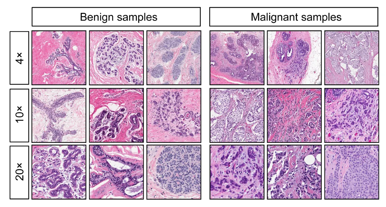
Features are computed from a digitized image of a fine needle aspirate (FNA) of a breast mass. They describe characteristics of the cell nuclei.
Separating plane described above was obtained using Multi-surface Method-Tree (MSM-T) [K. P. Bennett, “Decision Tree Construction Via Linear Programming.” Proceedings of the 4th Midwest Artificial Intelligence and Cognitive Science Society, pp. 97–101, 1992], a classification method which uses linear programming to construct a decision tree. Relevant features were selected using an exhaustive search in the space of 1–4 features and 1–3 separating planes.
The actual linear program used to get the separating plane in the 3-dimensional space is that described in: [K. P. Bennett and O. L. Mangasarian: “Robust Linear Programming Discrimination of Two Linearly Inseparable Sets”, Optimization Methods and Software 1, 1992, 23–34].
Cite at Dua, D. and Graff, C. (2019). UCI Machine Learning Repository [http://archive.ics.uci.edu/ml]. Irvine, CA: University of California, School of Information and Computer Science.
Importing Necessary libraries
import pandas as pd
import numpy as np
import matplotlib.pyplot as plt
import seaborn as sns
Loading Dataset into Pandas Data frame
df = pd.read_csv("../input/breast-cancer-prediction/data.csv")
df.head()
Attribute Information:
- ID number
- Diagnosis (M = malignant, B = benign)
Ten real-valued features are computed for each cell nucleus (3–32):
a) radius (mean of distances from the center to points on the perimeter)
b) texture (standard deviation of gray-scale values)
c) perimeter
d) area
e) smoothness (local variation in radius lengths)
f) compactness (perimeter² / area — 1.0)
g) concavity (severity of concave portions of the contour)
h) concave points (number of concave portions of the contour)
i) symmetry
j) fractal dimension (“coastline approximation” — 1)
- I have uploaded clean and ready-to-use breast cancer diagnosis dataset on Kaggle (Link at the start). From the original dataset I remove unwanted columns (id number and unnamed 32). Remap values of diagnosis column (M: 1 and B: 0).
Checking Null and Missing Values
print("\nNull Values:\n", df.isnull().sum())
print("\nMissing Values:\n", df.isna().sum())Null Values:
 diagnosis                  0
radius_mean                0
texture_mean               0
perimeter_mean             0
area_mean                  0
smoothness_mean            0
compactness_mean           0
concavity_mean             0
concave points_mean        0
symmetry_mean              0
fractal_dimension_mean     0
radius_se                  0
texture_se                 0
perimeter_se               0
area_se                    0
smoothness_se              0
compactness_se             0
concavity_se               0
concave points_se          0
symmetry_se                0
fractal_dimension_se       0
radius_worst               0
texture_worst              0
perimeter_worst            0
area_worst                 0
smoothness_worst           0
compactness_worst          0
concavity_worst            0
concave points_worst       0
symmetry_worst             0
fractal_dimension_worst    0
dtype: int64

Missing Values:
 diagnosis                  0
radius_mean                0
texture_mean               0
perimeter_mean             0
area_mean                  0
smoothness_mean            0
compactness_mean           0
concavity_mean             0
concave points_mean        0
symmetry_mean              0
fractal_dimension_mean     0
radius_se                  0
texture_se                 0
perimeter_se               0
area_se                    0
smoothness_se              0
compactness_se             0
concavity_se               0
concave points_se          0
symmetry_se                0
fractal_dimension_se       0
radius_worst               0
texture_worst              0
perimeter_worst            0
area_worst                 0
smoothness_worst           0
compactness_worst          0
concavity_worst            0
concave points_worst       0
symmetry_worst             0
fractal_dimension_worst    0
dtype: int64
Information of dataset
df.info()
<class 'pandas.core.frame.DataFrame'>
RangeIndex: 569 entries, 0 to 568
Data columns (total 31 columns):
 #   Column                   Non-Null Count  Dtype
---  ------                   --------------  -----
 0   diagnosis                569 non-null    int64
 1   radius_mean              569 non-null    float64
 2   texture_mean             569 non-null    float64
 3   perimeter_mean           569 non-null    float64
 4   area_mean                569 non-null    float64
 5   smoothness_mean          569 non-null    float64
 6   compactness_mean         569 non-null    float64
 7   concavity_mean           569 non-null    float64
 8   concave points_mean      569 non-null    float64
 9   symmetry_mean            569 non-null    float64
 10  fractal_dimension_mean   569 non-null    float64
 11  radius_se                569 non-null    float64
 12  texture_se               569 non-null    float64
 13  perimeter_se             569 non-null    float64
 14  area_se                  569 non-null    float64
 15  smoothness_se            569 non-null    float64
 16  compactness_se           569 non-null    float64
 17  concavity_se             569 non-null    float64
 18  concave points_se        569 non-null    float64
 19  symmetry_se              569 non-null    float64
 20  fractal_dimension_se     569 non-null    float64
 21  radius_worst             569 non-null    float64
 22  texture_worst            569 non-null    float64
 23  perimeter_worst          569 non-null    float64
 24  area_worst               569 non-null    float64
 25  smoothness_worst         569 non-null    float64
 26  compactness_worst        569 non-null    float64
 27  concavity_worst          569 non-null    float64
 28  concave points_worst     569 non-null    float64
 29  symmetry_worst           569 non-null    float64
 30  fractal_dimension_worst  569 non-null    float64
dtypes: float64(30), int64(1)
memory usage: 137.9 KB- After checking various aspects like null values count, missing values count, and info. This dataset is perfect because of no Nul and missing values.
Statistical Description of Data
df.describe()
Extracting Mean, Squared Error, and Worst Features
df_mean = df[df.columns[:11]]
df_se = df.drop(df.columns[1:11], axis=1)
df_se = df_se.drop(df_se.columns[11:], axis=1)
df_worst = df.drop(df.columns[1:21], axis=1)
Count Based On Diagnosis:
df.diagnosis.value_counts() \
    .plot(kind="bar", width=0.1, color=["lightgreen", "cornflowerblue"], legend=1, figsize=(8, 5))
plt.xlabel("(0 = Benign) (1 = Malignant)", fontsize=12)
plt.ylabel("Count", fontsize=12)
plt.xticks(fontsize=12);
plt.yticks(fontsize=12)
plt.legend(["Benign"], fontsize=12)
plt.show()
Observation: We have 357 malignant cases and 212 benign cases so our dataset is Imbalanced, we can use various re-sampling algorithms like under-sampling, over-sampling, SMOTE, etc. Use the “adequate” correct algorithm.
Correlation with Diagnosis:
Correlation of Mean Features with Diagnosis:
plt.figure(figsize=(20, 8))
df_mean.drop('diagnosis', axis=1).corrwith(df_mean.diagnosis).plot(kind='bar', grid=True, title="Correlation of Mean Features with Diagnosis", color="cornflowerblue");
Observations:
- fractal_dimension_mean least correlated with the target variable.
- All other mean features have a significant correlation with the target variable.
Correlation of Squared Error Features with Diagnosis:
plt.figure(figsize=(20, 8))
df_se.drop('diagnosis', axis=1).corrwith(df_se.diagnosis).plot(kind='bar', grid=True, title="Correlation of Squared Error Features with Diagnosis", color="cornflowerblue");
Observations:
- texture_se, smoothness_se, symmetry_se, and fractal_dimension_se are least correlated with the target variable.
- All other squared error features have a significant correlation with the target variable.
Correlation of Worst Features with Diagnosis:
plt.figure(figsize=(20, 8))
df_worst.drop('diagnosis', axis=1).corrwith(df_worst.diagnosis).plot(kind='bar', grid=True, title="Correlation of Worst Error Features with Diagnosis", color="cornflowerblue");
Observation:
- All worst features have a significant correlation with the target variable.
Extracting Mean, Squared Error, and Worst Features columns
df_mean_cols = list(df.columns[1:11])
df_se_cols = list(df.columns[11:21])
df_worst_cols = list(df.columns[21:])
Split into two Parts Based on Diagnosis
dfM = df[df['diagnosis'] == 1]
dfB = df[df['diagnosis'] == 0]
Distribution based on Nucleus and Diagnosis:
Mean Features vs Diagnosis:
plt.rcParams.update({'font.size': 8})
fig, axes = plt.subplots(nrows=5, ncols=2, figsize=(8, 10))
axes = axes.ravel()
for idx, ax in enumerate(axes):
    ax.figure
    binwidth = (max(df[df_mean_cols[idx]]) - min(df[df_mean_cols[idx]])) / 50
    ax.hist([dfM[df_mean_cols[idx]], dfB[df_mean_cols[idx]]],
            bins=np.arange(min(df[df_mean_cols[idx]]), max(df[df_mean_cols[idx]]) + binwidth, binwidth), alpha=0.5,
            stacked=True, label=['M', 'B'], color=['b', 'g'])
    ax.legend(loc='upper right')
    ax.set_title(df_mean_cols[idx])
plt.tight_layout()
plt.show()
Squared Error Features vs Diagnosis:
plt.rcParams.update({'font.size': 8})
fig, axes = plt.subplots(nrows=5, ncols=2, figsize=(8, 10))
axes = axes.ravel()
for idx, ax in enumerate(axes):
    ax.figure
    binwidth = (max(df[df_se_cols[idx]]) - min(df[df_se_cols[idx]])) / 50
    ax.hist([dfM[df_se_cols[idx]], dfB[df_se_cols[idx]]],
            bins=np.arange(min(df[df_se_cols[idx]]), max(df[df_se_cols[idx]]) + binwidth, binwidth), alpha=0.5,
            stacked=True, label=['M', 'B'], color=['b', 'g'])
    ax.legend(loc='upper right')
    ax.set_title(df_se_cols[idx])
plt.tight_layout()
plt.show()
Worst Features vs Diagnosis:
plt.rcParams.update({'font.size': 8})
fig, axes = plt.subplots(nrows=5, ncols=2, figsize=(8, 10))
axes = axes.ravel()
for idx, ax in enumerate(axes):
    ax.figure
    binwidth = (max(df[df_worst_cols[idx]]) - min(df[df_worst_cols[idx]])) / 50
    ax.hist([dfM[df_worst_cols[idx]], dfB[df_worst_cols[idx]]],
            bins=np.arange(min(df[df_worst_cols[idx]]), max(df[df_worst_cols[idx]]) + binwidth, binwidth), alpha=0.5,
            stacked=True, label=['M', 'B'], color=['b', 'g'])
    ax.legend(loc='upper right')
    ax.set_title(df_worst_cols[idx])
plt.tight_layout()
plt.show()
Checking Multicollinearity Between Distinct Features:
def pairplot(dfx):
    import seaborn as sns
    name = str([x for x in globals() if globals()[x] is dfx][0])
    if name == 'df_mean':
        x = "Mean"
    elif name == 'df_se':
        x = "Squared Error"
    elif name == 'df_worst':
        x = "Worst"
    sns.pairplot(data=dfx, hue='diagnosis', palette='crest', corner=True).fig.suptitle('Pairplot for {} Featrues'.format(x), fontsize = 20)pairplot(df_mean)
Mean Features:

pairplot(df_se)Squared Error Features:

pairplot(df_worst)Worst Features:

Observations: Almost perfectly linear patterns between the radius, perimeter, and area attributes are hinting at the presence of multicollinearity between these variables. Another set of variables that possibly imply multicollinearity are the concavity, concave_points, and compactness.
Correlation Heatmap between Nucleus Feature:
corr_matrix = df.corr()  # Correlation Matrix

# Mask for Heatmap
mask = np.zeros_like(corr_matrix, dtype=np.bool)
mask[np.triu_indices_from(corr_matrix)] = True

# Correlation Matrix Heatmap including all features
fig, ax = plt.subplots(figsize=(22, 10))
ax = sns.heatmap(corr_matrix, mask=mask, annot=True, linewidths=0.5, fmt=".2f", cmap="YlGn");
bottom, top = ax.get_ylim()
ax.set_ylim(bottom + 0.5, top - 0.5);
ax.set_title("Correlation Matrix Heatmap including all features");
Observations: We can verify multicollinearity between some variables. This is because the three columns essentially contain the same information, which is the physical size of the observation (the cell). Therefore, we should only pick one of the three columns when we go into further analysis.
Problem with having Multicollinearity (refer to Analytics Vidhya)
Things to remember while working with this dataset:
- Slightly Imbalanced dataset (357 malignant cases and 212 benign cases). We have to select an adequate re-sampling algorithm for balancing.
- Multicollinearity between some features.
- As three columns essentially contain the same information, which is the physical size of the cell, we have to choose an appropriate feature selection method to eliminate unnecessary features.
Currently working on Comparative Analysis of Different Machine Learning Classification Algorithms for Breast Cancer Prediction. Check out my GitHub profile for more details.
If you find this story informative, please leave a comment. ✨
Thanks for reading! 🤗