The 15 Worst Hip-Hop Album Covers of All Time
These are really, really bad

I want to warn you that these album covers are exceedingly bad. But that is what makes them so enjoyable. Here goes.
15. The Alkaholiks — Likwidation (1997)

The manipulation of layers is on another level here. It’s all so seamless, isn’t it?
Call the guy on the right “HOOD TONY HAWK” because there’s no way that pose comes about from anything other than a skateboard trick.
And let me just point your attention to the letter styling, which — you’re gonna want to sit down for this — looks like it’s pure water.
Liquidation … water font … I mean, you get it, right?
14. Big Kuntry King — My Turn To Eat (2008)

ONLY “5 GUYS” THIS DUDE EATING IS BENJAMINS, JACKSONS, LINCOLNS, WASHINGTONS, AND GRANTS U FEEL ME???
13. Nas — Stillmatic (2001)

While the outrageousness here pales in comparison to some of the other selections on this list, Nas makes this list because he should know better.
The pigeon, the pose, the excessive No Limit Records-level jewelry, the terrible usage of the gradient effect to integrate “Nas” into the background — it’s all bad.
But worst of all is the jarring fact that while Illmatic has the greatest rap album cover of all time, the thematic follow-up, Stillmatic, has one of the worst.
12. TRU — Tru 2 Da Game (1997)

So, let me get this straight: They’re already dead? I mean, they’re wearing skee masks, but underneath they’re just skeletons, which would mean they’re dead, right?
If so, here’s the thing: It would mean that being TRU 2 DA GAME didn’t really pay off for them. Kinda led them down a wrong path, didn’t it?
Another wonderful aspect is C-Murder providing you with his nickname, “Da Killa.” I’m not sure someone named “C-Murder” needs that alternate name in order to communicate what he’s all about. He’s trying to clarify, trying to be helpful, and we shouldn’t discount that — but the choice of “C-Murder” already gives us the vibe he’s going for.
One last component here that simply must be noted: There is a guest appearance from “Mo B. Dick” that we’re promised. The fact that Mo B. Dick has chosen to grace such an allegorically rich album cover is too apropos for words.
11. The UMCs — Fruits of Nature (1991)

Why is one of the UMCs doing Daniel Larusso’s “crane kick” from the final scene of Karate Kid?
10. Ludacris — Chicken-n-Beer (2003)

Not since Seinfeld’s George Costanza has someone tried to mix sex and food to such disastrous effects.
The pose is so bad. The music is so bad. It’s a good thing Ludacris is largely forgotten.
9. Master P — Game Face (2001)

Over time, Master P and No Limit Records underwent a minimalist turn in their aesthetic approach to album covers. Gone were the flashy and ostentatious album sleeves associated with the No Limit label. But the new approach seemed to be just as terrible, just in the opposite direction.
In what world is a facial prosthetic a “game face”? What is it that makes it a “game face”? Why would anyone think this looks good?
Most importantly: How can anyone who has seen this avoid the several weeks’ worth of nightmares that will inevitably follow? I’m asking for myself and all my friends and all the readers of this post.
8. Vanilla Ice — Platinum Underground (2005)

There is so much wrong with this.
First there’s Vanilla Ice’s pose. In a way that is reminiscent of the artistic technique Leonardo Da Vinci deployed in Mona Lisa to create the effect that her eyes follow you no matter your vantage point, Vanilla Ice’s posture can be interpreted in an infinite number of ways.
He is either starting a grueling exercise set on his gym’s seated row machine; or he’s in mid-flight, superman-style, saving “the rap game” from evil; or he’s knocking down a sick, Curry-esque no-look trey; or he’s in a sniper position about to execute a head shot through the scope; or he’s swinging from one trapeze to the next, or…(the possibilities really are endless).
Then, there is the V-symbol flashed by Ice in the background. No one uses that symbol. It’s never been used by a non-Vanilla-Ice person.
Finally, what’s up with the eclipse happening on the top left? Tell me—please, please tell me—that Ice isn’t making the statement that he is so cold he blots away the sun. Tell me that’s not what is happening there.
7. Lil Milt — The Prophecy (1997)

The angel/devil duality here is a sight to behold.
The devil version of Lil Milt is a bit Jafaar-ish. But he’s got like a 36-pack so, fitness wise, it kinda worked out for Lil Milt to transfigure into Satan’s helper.
On the angel side, the sheepish look is unbecoming a TRILL AZZ G like Lil Milt. He knows the streets won’t allow such benevolence — hence, the dilemma.
Here’s a prophecy: Very few album covers will ever be as bad as this one.
6. New Recruits — Torpedo Alert (2008)

What’s most incredible about this cover is what it says about the New Recruits.
Here is a group that imposes a fascinating level of discipline on its public image. Every member looks like they’re the same person. I dare you to spot a difference between Trigger Man and Mr. Blazer.
I mean, they’re new recruits, and yet they’re already so assimilated into the collective aesthetic. I guess Spanky aka CYCLONE distinguishes himself the most via his facial tattoos.
MS-13 is more like PG-13 compared to the NEW RECRUITS.
Listen, what the New Recruits have offered is a TORPEDO ALERT. The only question left is: Will you heed it? Let’s be clear about one thing: A torpedo is coming. It’s up to you to decide whether to prepare for it or dismiss the warnings of the New Recruits.
5. Baby — Birdman (2002)

Do you think Baby aka The #1 Stunna would make it into Professor Xavier’s School for Gifted Youngsters? I think he deserves a place. As half-man, half-bird, he wields tremendous power. But will he use it for good?
His hit single should have been: “WHO GOT NEST?”
4. Cam’ron — Confessions of Fire (1998)

The best part of this album cover isn’t Cam’ron deciding on the Jesus Fish font style for his name. Nor is it the fact that he’s shirtless under the overalls. It’s the decision to portray Cam’ron as a blacksmith, hard at work in a foundry.
Good decision to bring that chain, bruh — that’s not gonna feel hot against your skin at all.
3. Criminal Elament — Hit ‘Em Where It Hurt (1994)

Criminal Elament — that’s the spelling, I kid you not — has decided to HIT EM WHERE IT HURT.
And do you want to know what that consists of? Take a guess.
Shooting you on the streets so that your operation is crippled? Yeah, but that’s not where it really HURT.
Siccing the attack dogs on you when you try to invade the stash house? Sure, but, again, that’s not where it HURT the most.
To hit you where it truly HURT, Criminal Elament is prepared to defeat you at the horsetrack.
Take a look at the cover. Is that the Kentucky Derby? Do you remember Secretariat? Do you even know what a Triple Crown is? No? Then you’re not on Criminal Elament’s level. You’re not ready for this life. You should probably take the first train out of town, which, helpfully, has been provided for you there on the cover.
2. Big Bear — Doin Thangs (1998)
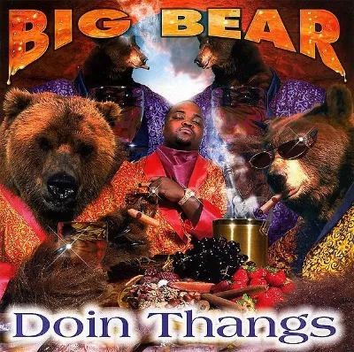
Cigar-smoking bears? Why not? Artist title in honey text? Yes, please. Bling so brilliant that there are multiple dazzle points on the cover? Yup. A plastic fruit arrangement? That’s what DOIN THANGS requires.
1. Trick Daddy — www.thug.com (1998)

Confession time: I have never used the browser “thugscape.” I stick to the safe browsers: Safari, Firefox, Chrome.
What Trick Daddy is suggesting — and I need you to understand the implications of this — is that in the hood they use a different kind of CHROME if you get my drift.
On my browser, I have tabs like “view” and “bookmarks.” But look at what Thugscape offers: THERE IS AN APP CALLED “DEATH.” Who is going to click on that?
Here are some other pressing questions: Why does Trick Daddy look like he just put a nickel in a wall socket? Why does he have a Nickelodeon slime halo?
Congrats, Trick Daddy, you receive top honors.