Building a Brand for Bees

When developing the visual identity for Bee Home, that launched this past spring, we seized the opportunity to explore the vital, yet fragile, ecosystem of solitary bees, and apply a playful approach to a serious matter.
→ May 20th, on World Bee Day, we launched Bee Home — a digital platform that allows anyone to design, customise and download their very own sanctuary for solitary bees. Learn more about Bee Home here.

One of the core values of the Bee Home project was that it had to be fun and engaging to use. To make people understand the problem, but at the same time provide a light-hearted way to co-create bee homes and help mitigate the crisis of vanishing bees, playfulness was embedded throughout. So also for the visual identity.
First, we had to really understand the world of solitary bees. We studied them from different angles, and looked at how they move. We were interested in what their favourite flora was and how their nests were shaped. We learned that bees can see through the ultraviolet colour spectrum, which helps them to identify nectar on flowers.
Through the use of microscopes we identified the shapes of pollen, and studied the inside of beehives, learning about round-shaped nesting tunnels containing baby bees. To add another element of playfulness to the process, and to uncover various new organic shapes, we arranged for a drawing assignment with kids.

All this informed the different parts of the Bee Home identity.
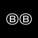
The logo mark is made of variable characters that change shapes. Inspired by the rounded forms of their nests and tunnels, this represents the many solitary bees. It’s also a reference to the three-step process of building your own Bee Home, and, in an abstract way, looks like a bee from above. The circles in the mark are informed by the golden ratio, just like the honey bee family tree and the petals of daisies.


We developed a custom typeface that also draws on the same heavy influence from the habitat of wild bees, especially arches and rounded corners. As an icon, it was supposed to accommodate for the personality of the service — a bold statement of what the product stood for. From the five letters in the logo, a new typeface emerged.


The colour palette is quite neutral, but has a hint of purple, taken from the ultraviolet spectrum to connect it to how bees see colours.
As part of the visual language, we also built a tool that generates lines corresponding to the bees’ flying patterns, as they go from flower to flower. We knew different bees are attracted to different and particular kinds of flowers, and we wanted to turn our findings into something systematic that could help us produce unexpected and playful results. This made us build a generative tool that could surprise us.
The process of developing the visual identity was both fun and educational. It was quick and iterative, thanks to an open dialogue between all collaborators, including close conversations between designers and developers.


In the end, after exploring multiple directions, we made a selection and refined the elements, making it a wholesome and unique identity that supports the good intentions of the project.