Linear Regression Model on Ecommerce data
Published in
4 min readMay 21, 2019
#import necessary libraries
import pandas as pd
import numpy as np
%matplotlib inline
import seaborn as sns
import matplotlib.pyplot as plt#load csv
df=pd.read_csv('Ecommerce Customers.csv')#Check Data
df.head()

#Get basic details about the dataset
df.info()<class 'pandas.core.frame.DataFrame'>
RangeIndex: 500 entries, 0 to 499
Data columns (total 8 columns):
Email                   500 non-null object
Address                 500 non-null object
Avatar                  500 non-null object
Avg. Session Length     500 non-null float64
Time on App             500 non-null float64
Time on Website         500 non-null float64
Length of Membership    500 non-null float64
Yearly Amount Spent     500 non-null float64
dtypes: float64(5), object(3)
memory usage: 31.3+ KB#Get statistical information about the data
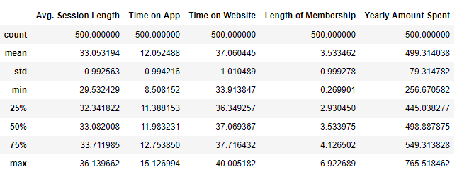
df.describe()
#Get Column names
df.columnsIndex(['Email', 'Address', 'Avatar', 'Avg. Session Length', 'Time on App',
       'Time on Website', 'Length of Membership', 'Yearly Amount Spent'],
      dtype='object')
Exploratory Data Analysis
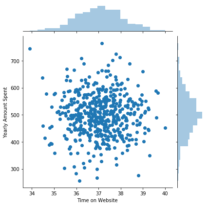
#Use Seaborn to create a joint plot to find correlation between time on website with yearly amount column
sns.jointplot(x='Time on Website',y='Yearly Amount Spent', data=df)
#doesn't show much of a trend between the two columns<seaborn.axisgrid.JointGrid at 0x1e64fb66470>
#Use Seaborn to create a joint plot to find corelation between time on App with yearly amount column
sns.jointplot(x='Time on App',y='Yearly Amount Spent', data=df)
# shows some corelation between 2 columns<seaborn.axisgrid.JointGrid at 0x1e64fc42ba8>

#Plot a Hex plot to find more corelationship between time on app and yearly amount
sns.jointplot(x='Time on App',y='Length of Membership', data=df,kind='hex')<seaborn.axisgrid.JointGrid at 0x1e64fd386a0>
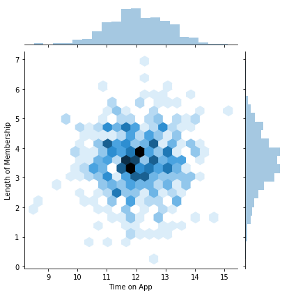
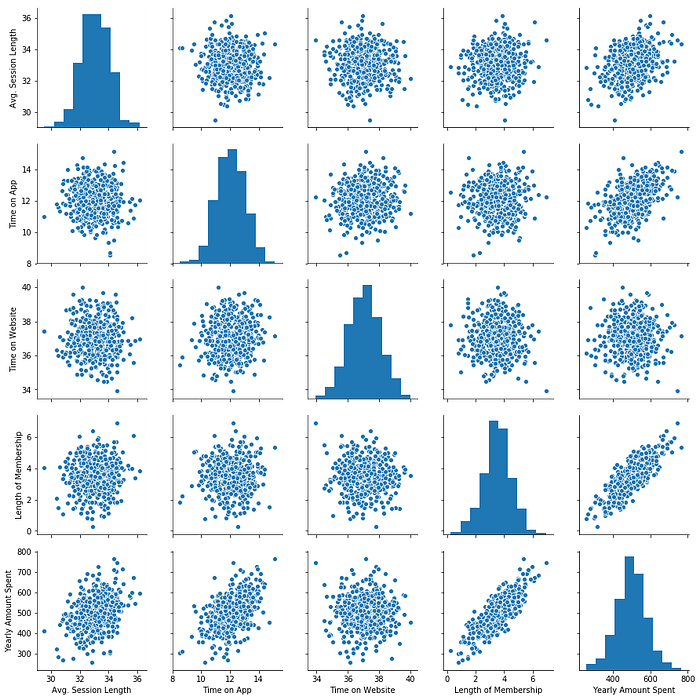
#Create a pairplot to find corelationship between all the columns
sns.pairplot(df)
#seems that the yealy amount spent has the most corelation with the years of membership<seaborn.axisgrid.PairGrid at 0x1e64fe085c0>
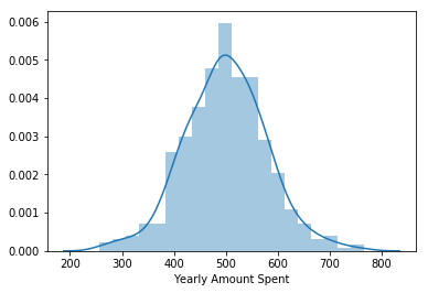
sns.distplot(df['Yearly Amount Spent'])<matplotlib.axes._subplots.AxesSubplot at 0x1e6506b9710>
#Create a linear plot also the error bars are really less which kind of shows that length of membership is directly propotional to the yealy amount spent
sns.lmplot(x='Length of Membership',y='Yearly Amount Spent',data=df)<seaborn.axisgrid.FacetGrid at 0x1e65096da90>

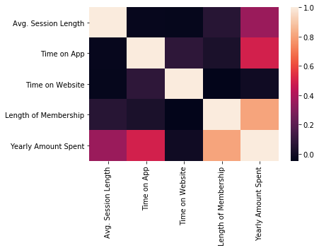
sns.heatmap(df.corr())<matplotlib.axes._subplots.AxesSubplot at 0x1e64fc19208>
Training & Testing Data
#mention all numeric columns
X=df[['Avg. Session Length','Time on App','Time on Website','Length of Membership']]#mention the columns which needs to be predicted
y=df[['Yearly Amount Spent']]#import the train test split
from sklearn.model_selection import train_test_split#Tuple Unpacking
X_train, X_test, y_train, y_test = train_test_split(X, y, test_size=0.3, random_state=101)
Train the Model
from sklearn.linear_model import LinearRegression#Create an instance of LinearRegression() Model
lm = LinearRegression()#Fit Data on lm
lm.fit(X_train,y_train)LinearRegression(copy_X=True, fit_intercept=True, n_jobs=None, normalize=False)#print out the intercepts
print (lm.intercept_)[-1047.93278225]#print coefficients
lm.coef_array([[25.98154972, 38.59015875,  0.19040528, 61.27909654]])
Predicting test Data
#predict x_test data
prediction=lm.predict(X_test)#compare real vs predicted values
plt.scatter(y_test, prediction)
plt.xlabel('true values')
plt.ylabel('predicted values')Text(0, 0.5, 'predicted values')

Evaluating the Model
from sklearn import metrics#mean_absolute_error
metrics.mean_absolute_error(y_test,prediction)7.22814865343082#mean_squared_error
metrics.mean_squared_error(y_test,prediction)79.81305165097419#Root mean_absolute_error
np.sqrt(metrics.mean_squared_error(y_test,prediction))8.93381506697862#Variance in Model How well does it fit
metrics.explained_variance_score(y_test,prediction)0.9890771231889607# Plot on residuals
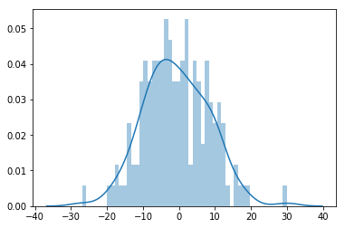
sns.distplot(y_test- prediction, bins=50)<matplotlib.axes._subplots.AxesSubplot at 0x1e652607128>
cdf = pd.DataFrame(lm.coef_.transpose(),X.columns, columns=['coeff'])
cdf


