Project 3: Type and Hierarchy
For this project we have to create a type specimen poster. I hope to use the variables I have experimented with like scale, weight, linespacing, and
indentation. I also want to use new ones such as color, tone, value, texture, and position.
I was assigned the typeface Times.

Who designed it and when?
It was conceived by Stanley Morison in collaboration with Victor Lardent. It was released in 1931.
What type classification does it fall under?
It falls under the Mixed type classification as it is Transitional and Old-Style. It is a serif font.
Was is created for a specific purpose or context?
It was commissioned by the British newspaper, The Times. It was designed for newspaper printing.
Are there any specific uses of it that led to its popularity?
This font is still very common in book and general printing. It has become one of the most popular and influential typefaces in history and is a standard typeface on most desktop computers. Times New Roman has became extremely successful, becoming Monotype’s best-selling typeface of all time in metal type.
Are there any features that set it apart?

The design was created as a transition from a spindly and somewhat dated nineteenth-century face to a more robust, solid design, returning to traditions of printing from the eighteenth century and before.
It was based off of an older monotype typeface named Plantin. The main change was that the contrast between strokes was enhanced to give a crisper image. As a typeface designed for newspaper printing, Times New Roman has a high x-height, short ascenders and descenders to allow tight linespacing, and a relatively condensed appearance. All of these effects save space and increase clarity.
Text that adequately expresses the character of the typeface:

The type specimen poster needs to include the designer name, year, typeface name, and one defining feature.
To start this project, I sketched out some of my first thoughts based on my research of Times New Roman. In my designs I wanted there to be a focal point where important things are highlighted in each design.

For example, in the first design to the left I was going to have a black background with a white box inside which is highlighted. I want to create text out of white space in the surrounding black box.
For the second design I was going to incorporate hierarchy by having a faded letter on the whole page but using the insides of the letter to place text. I think hierarchies and columns are very important especially because Times New Roman was made for the newspaper and is often used for important content. This is also why I want to use red as my accent color because red is often used in major headlines and to show “breaking news” or “top stories”. In terms of shapes, I would like to use something like a red ink splatter because it shows the dating of times and also creates and esthetic effect.

For this third design, I wanted to use the letter itself to show hierarchy. For example, I extended the ‘t’ to use it to construct the hierarchy in the poster. For example, I extended the horizontal line to incorporate the subheading of the poster and used the space created on the top to finish the rest of the title. I then used the space on the curved inside of the ‘t’ to place the body text.
In this fourth poster idea, I wanted to cut text off without letting it lose its meaning. I wanted there to be a lot of space and have a simple newspaper format with two columns at the bottom of the poster.

For the fifth design idea I wanted to use the shape of the ‘T’ to create a column to place the body text in and use the slot at the top for a title and sub header.
For the last design I wanted to cut out parts of text to fill it in with sub headers and numbers. I then wanted to use the remaining whitespace to fill in body text. I know that people tend to read from top left to right bottom so even though I want to break the title text I will put it in this layout order.
Overall I really like the shapes of ‘T’, ‘&’ , ‘“”’, ‘g’ , and ‘t’ in this font so I plan on using them to create the base of a lot of these posters.
These are my initial designs which I will now incorporate into Illustrator.

This is my first design idea on Illustrator. I changed it by not curving and cutting a part of the ‘t’ off. I like how the 90 degree angle creates a space to put a column of the body text in.

This is my fifth design idea. I also changed it by centering it ‘T’ and not cutting it off on the left side. I like how it creates symmetry and two edges to put text on. The shape of the ‘T’ almost reminds me of a balance scale like a see saw where one side can tip over. I would like to put opposing viewpoints on either side of the ‘T’ to show the balance of ideas. It seems like the ‘T’ is weighing both ideas and it will be up to the reader to decide which side to ‘choose’ or which side is right. News is opinionated so I wanted to highlight opposing polar views on either side of the ‘T’ to balance viewpoints and use the ‘T’ as a scale or medium between the points.

This is my first design idea. I used the background to create the main title and color to highlight important importation in a sea of letters. In the center I used quotes to highlight the important center. In the white space I used two columns of body text. Through this poster I wanted to highlight how important information is filtered in a clutter of things going on every day.

I like the shape of the ‘&’ symbol and would like to do something creative with it. I wanted to use simplicity and have this design be very simple as I continue to add to it.
Thursday: September 27, 2018
In class today we talked about how the typeface needs to be conveyed visually and with visual hierarchy and not with written content. I plan on removing a lot of the body text without removing the ‘column’ feel of the newspaper itself as that is a large part of this idea with the Times New Roman typeface.
After the desk critique from the teacher and the TA here are comments and edits recommended:

First Design: The professor said she liked how I used the structure of the text itself it highlight the author name and the year. She also liked the continuity aspect as the ‘t’ starts from the left and is continued to the other end of the paper. She also said I don’t need to use so much body text in every piece as it is not necessary to be on the poster.
Second Design: The professor said she liked the balance created by shape and structure of the letter ‘T’. The TA said she liked this design but it could be improved by not being so symmetrical. She said to maybe move the ‘T’ to the left side of the paper and continue the rest of the typeface name in smaller letters starting from there. This is like newspapers where the first letter is often bigger than the rest of the text.

Third Design: The TA said she really liked this design because of how its broken into two sections and how the text is used in the background. She also likes how some parts are highlighted in red. In terms of improvement she said to make the random letters in the background smaller than the title letters. This creates hierarchy and more black space in the background. An other thing said was to not use quotations marks unless there is a quote. A lot of text in quotation marks is confusing. Hence, I was said to find a quote to highlight instead.
Fourth Design: I was still working on this design in class. After explaining my ideas and showing them my sketches they said they like how it would be implemented.
Monday: October 1, 2018

I made heavy edits on this design. I played around a lot with the letters on the edges. After a lot of edits I decided to make the surrounding letters smaller to size 125. I increased the size of the red digits to 180. This increases the overall black space and allows the title and author in the center to stand out. It also emphasizes the 1931 over the surrounding letters more. Additionally, I changed the quotation marks to red with an opacity of 20. This makes less contrast inside the box. I thought there was already heavy contrast between black, white, and red in the surrounding elements so I wanted to make the inside white box flow more smoothly. Additionally, I changed the heavy wording inside to a small quote so the quotation marks make sense. I made the font of the quote to 30, the kerning to optimal, and the tracking to 40. This makes the quote stand out more in the center of the poster.

I edited this design a lot. I added continuity by extending the cross on the t to the edge of the paper. I also changed the body text a lot. I thought it looked significantly better when we increase the size to 14. I also changed the kerning to optimal. I increased the leading to 21 and the tracking to 4. This gives a cleaner less cluttered feel. I also changed the lines that each word is on to make it more aesthetically appealing.

I changed the text on each side of the ‘T’ to balance it out more. Now there are two paragraphs on each side. I also removed the character set to add to the balance. I changed the size of the text on each side to 13, the kerning to optimal, the leading to 20, and the tracking to 8. This made all the letters more spaced out and more neat while reading.

I felt like the background of this design was too contrasted so I changed the surrounding letters to have an opacity of 20. This makes the actual title stand out more and increases contrast where it is supposed to exist.
Tuesday: October 2, 2018

I thought this poster was very simple in terms of the colors so I started to use a shade of red that had less orange tones and used the three colors in different ways to try to get a more aesthetic poster.

I played around with the colors of this poster to make it more interesting. For example, I outlined the ‘t’ in the second design in white. For the last two designs I wrote the rest of the title in capital letters to see if this variation is better.

I changed the contrast a lot in this poster. For example, I made the opacity of the surrounding letters to 10%. This allows them to still be visible but not standing out as they are not supposed to be the focal point. I heavily played around with the colors of the quotations — I tried different shades of red and black in multiple opacities. At the end, I decided to go with black apostrophe’s with 90% opacity because they make the most sense and are the least awkward. In terms of color I changed the word ‘truth’ to red as that is the focal point within the quote itself. I also made the tracking for the word ‘truth’ higher than the rest of the quote to make it more highlighted.

I changed the rest of this title of uppercase and like this design. I’d like to change the body text proportions and experiment with the colors more.

I added the authors full name. I currently really like this piece and the piece with the small ‘t’ in black and white and will print these out for the first draft tomorrow.
Thursday: October 4, 2018
Today is the interim critique. Here are the two posters I have printed.


This is what my classmates had to say about them. For the first poster they said it reminded them of the Times Magazine cover. The opacity of the A through Z was even lower after it printed so they could not see these letters. Hence, they said the ‘1931’ should be placed differently as it seems to be floating randomly. They said they liked the quote and how the ‘times’ is in red. They also said the middle white part can have more content in it as it currently has a lot of white spaced but do not have ideas on what could be added.
They really liked the second design and how it showed continuation. They liked how I used the letter to create the structure of the poster. I was concerned about how to implement color into this poster but they said that Black and White was a good choice and color does not have to be added. Additionally, for improvements they said to change it to an uppercase ‘T’ as some people like the structure of that more. I will be working on these changes for the next class.
Friday: October 5th, 2018 to Sunday: October 7th, 2018
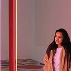
This week I am working on making the second design better and implementing the ideas of my classmates. To start off I decided to play with shadows. I was inspired by this typography poster I found online.

I like how the red is incorporated and how it emphasizes the design and curvature of the actual letter S.

I started off by adding shadows to the black and white T design. I thought red was a good color to use for times so I added a red shadow. However, I felt the red was disturbing the text inside in the bottom of the left column. Hence I decided to go with a more neutral color and used white and lowered the opacity.

I really liked how this looked but as I used a rectangle to extend the ‘T’ the change in the opacity caused disturbances in the color of the design as shown behind the ‘IMES’ text in the title. I now tried to fix this problem but also decided to make the ‘t’ capital and see how that would look.

As I made the ‘T’ capital the structure of the ‘T’ did the good job of showing the elements of the Times Typeface so I removed a lot of the additional text and decided to focus on the ‘T’ and only include the typeface name, designer, and the year it was created. I used a black background and used the red shadows to really emphasize the curves and the serif part of the font. I made the actual ‘T’ the same as the background so the shadows create the text. I used the whitespace and shadows to create the letter ‘T’. I then used white for the rest of the information and tried to create hierarchy by sizing the Times New Roman larger than the author and date on the left side.
When I showed this to the Teacher Assistant, she said she really liked this design and how I use the white space and the shadows to create the letter ‘T’. She said the complete back and white contrast is very intense and that I should work on this to make it contrast and clash less.
Monday: October 8th, 2018

After a lot of edits, I learned how to change opacity but still have the main ‘T’ the same color as the background. I used 4 different ‘T’s’ to create the shadows and the base of the large ‘T’ in this piece. I had to play around with the layers a lot to create this effect. Additionally, I thought the left bar was very crowded so I moved the year to the bottom right and changed ‘Stanley Morison’ to capital letters in the left bar. To make the black and white clash less I changed the opacity of the black and made it lower so it is more grey. As this font is used a lot in writing i added a period for an effect at the end of the year. I also added the shadow to the bottom right serif part of the ‘T’ and changed the structure of the shadows to accentuate all the curves and straight lines in the ‘T’. I adjusted a lot of the tracking, leading, and kerning in the “IMES NEW ROMAN’ and in the name of the creator.

I wanted more feedback on this design so I sent it to the professor. She said it looked really interesting and she likes how I outlined the capital T to show the essence of the typeface (the bracketed serif style). However, she said I should restate the ‘T’ before the ‘imes’ to clarify the name of the typeface. She also said to play with the scaling of ‘Stanley Morison’ and the year to show better hierarchy. As they both were the same weight she said it is unclear which to read first and that I should try changing the weight to regular or the size of the year and make it smaller.
I first added the ‘T’ into the title as well. I then adjusted the shadows to make the large ‘T’ more clear and visible to the user. Next, I played with the weights and made the ‘Stanley Morison’ bold and the year regular in weight. Next, to make the hierarchy even clearer, I changed the opacities and made the opacity of the year slightly lower than ‘Stanley Morison’ so the viewers read it after. I thoroughly adjusted the font size, kerning, and tracking to make the creator and year more visually appealing. I also changed the leading of the ‘Times New Roman’ to make it easier on the eyes and to make the overall poster less clustered. I found that gridlines were very useful throughout this process as they allowed me to align ‘Stanley Morison’ to the ‘Roman’ part of ‘Times new Roman’. It also helped with aligning the period at the end of the year to the y-axis of the ending of ‘Times New Roman’.

Tuesday: October 9th, 2018
After a lot of minor edits I finalized the poster. At the ending I shifted the whole ‘T’ down to add balance to the poster. I made it look less cluttered overall by adjusting the font size, leading, kerning, and tracking multiple times. I also adjusted the placement of the three additional elements (typeface name, creator name, and year). By the middle of the day this was my final poster.

I adjusted the bleed and trim parks and it was ready for printing and looked like this.

Tartan Ink ran out of the right sized papers so when I received my poster the edges were a lot thinner so I had a harder time trimming out the thin white strips. When I was done trimming it my final poster looked like this:
During the final critique I received a lot of comments on my final project. People said they like the colors used and the use of negative space and shadows to create the ‘T’ was really cool. When people could see the ‘T’ they were amazed and thought it was really cool. I also received comments on how the colors are very fitting as they match the Times magazine colors.
I am proud of this poster because I used a lot of the techniques we have learned from this and the past two projects. This project was really interesting as I learned about aspects of typography I did not even consider before. Now, in the future I know what each type of typography is trying to convey and will choose accordingly. I also liked how I highlighted the bracketed serif style of types using whitespace and shadows. I also used continuation for the large ‘T’. I learned a lot about layers and creative ways you can use them while creating this large ‘T’. Additionally, I changed opacity, size, weight, and color of all the text to create various levels of hierarchy. In general, the gridlines I used to align the text were also very useful and easy. I also used kerning, leading, and tracking a lot to make the whole project more visually appealing and less cluttered. When I started, I thought ‘Times New Roman’ was a really common and plain typeface but now I have a newfound appreciation for it. It was interesting to see how the other person in our class with Times New Roman had a completely different approach.

Overall, I had a great experience working on this project and now have a novel appreciation for the different types of typography and how they communicate ideas differently.