Project 5: Grids, Style, and Format
Updates have been made on every class day for the time period until then.
Tuesday: November 13, 2018
Introduction — For this project we can choose or create any piece and with it create a bound book with text and imagery that matches and enhances the context. It must have at least 16 pages and be divisible by 4. An appropriately sized book (the exact dimensions are my choice), printed and bound, with care given to every element including text, illustration, paper type, and binding is needed. The audience is both the class and possibly a future employer.
In class we looked at examples of other people’s work. I also looked online and these are some ideas I have or that caught my eye that I am considering for my book:
- drinks (ex. cocktails, smoothies, juices, coffees, from around the world, etc.)
- easy to make food recipes
- tourist places (ex. cities, or locations in cities, landmarks, etc.)
- dictionary of obscure sorrows
- dogs (ex. breeds, my dog, how to take care of dogs, etc.)
- hip-hop artists (ex. multiple, detail about one particular, etc.)
- shower thoughts
- how-to (ex. make-up, skincare routine, healthy lifestyle, etc.)
- brands
- color palettes
- zodiac signs
- months
- a book about color in black and white → express color through words and images without use of color

Thursday: November 15, 2018

I have decided to implement the idea with the Dictionary of Obscure Sorrows. The dictionary of obscure sorrows is a website and youtube channel that defines neologisms for emotions that do not have a descriptive term. The terms are often based on “feelings of existentialism” and are meant to “fill a hole in the language”, often from reader contributions of specific emotions.
Structure & Overall Design:
- glossy modern pages (like high quality magazine); soft feeling cover
- smaller side — like a pocket dictionary or a mini-book → words in alphabetical order because it is a dictionary
- dont want a spine that interferes with images — want some type of binding that keeps book open on its own
- abstract image for artwork or black and white photo illustrations
- no color or small sparks of color
-TITLE PAGE: Glossy words and ‘obscure’ in a different color or texture
- n. or (n.)


Content:
Page 1 — Dictionary of Obscure Sorrows
Page 2 & 3 —Ambedo n. a moment you experience for its own sake / n. a kind of melancholic trance in which you become completely absorbed in vivid sensory details — raindrops skittering down a window, tall trees leaning in the wind, clouds of cream swirling in your coffee — which leads to a dawning awareness of the haunting fragility of life, a mood whose only known cure is the vuvuzela.
Page 4 & 5 — Olēka n. The awareness of how few days are memorable / Our lives are built of the same few notes, repeated over and over. It’s not a grand symphony, full of surprises. It’s a song sung in canon, that simply carries on, until the tune gets stuck in your head. But then the verse changes over, and for the life of you, you can’t remember how it’s supposed to go.
Page 6 & 7— Onism n. the awareness of how little of the world you’ll experience / n. the frustration of being stuck in just one body, that inhabits only one place at a time, which is like standing in front of the departures screen at an airport, flickering over with strange place names like other people’s passwords, each representing one more thing you’ll never get to see before you die — and all because, as the arrow on the map helpfully points out, you are here.
Page 8 & 9—Sonder n. the realization that everyone has a story / n. the realization that each random passerby is living a life as vivid and complex as your own—populated with their own ambitions, friends, routines, worries and inherited craziness—an epic story that continues invisibly around you like an anthill sprawling deep underground, with elaborate passageways to thousands of other lives that you’ll never know existed, in which you might appear only once, as an extra sipping coffee in the background, as a blur of traffic passing on the highway, as a lighted window at dusk.
Page 10 & 11 — Vemödalen n. the fear that everything has already been done / n.the frustration of photographing something amazing when thousands of identical photos already exist — the same sunset, the same waterfall, the same curve of a hip, the same closeup of an eye — which can turn a unique subject into something hollow and pulpy and cheap, like a mass-produced piece of furniture you happen to have assembled yourself .
Page 12 & 13 — Yù Yī n. the desire to feel intensely again / “In my experience, it’s easy to chuckle at the many extravagant dramas of youth, but hard to admit how much you miss them.”
Page 14 & 15— Zenosyne n. the sense that time keeps going faster / “Life is short. And life is long. But not in that order.”
Page 16 — n. creating our own meaning, each word explores newly invented words for strangely powerful emotions, so we can better define what it feels like to be alive, and what it means to be a human being.
Tuesday: November 20, 2018

I have decided to start coming up with initial sketches of what I want my book to look like.
I want my front cover to have the name of the dictionary on it. I think it would be cool to have the word “Obscure” in a different color like red. If I can play around with texture I would like the text to be in different textures. I was thinking of having the whole book have a soft feel to it and be a black color and have glossy text in black or white on top of it.
I want the back cover to be the definition of the book. This would be cool because it is a dictionary that is defined by the dictionary. This part should have a black background with white text which has the definition.
For the front cover idea I am inspired by my friends laptop case:


On the inside, I think the left top should have a long description of the definition in faded text.
The whole background should have photos. I am thinking of having black and white photos with doodles that add pops of colors. If I do not use my own photos, I would like to draw my own doodles that convey the meaning of the worlds.
Photo Ideas:
1. Ambedo — a picture of raindrops because they show sensory detail and sadness too
2. Olēka — a picture of a laughing person because it shows a good moment that is memorable
3. Onism — a room or a classroom because they are places that take so much of your time and prevent you from exploring the whole world
4. Sonder — a crowd of busy people because even though they are all doing the same things and are in a big group they each have a unique story like noone else → or for the doodles idea an empty room with doodles of people in it
5. Vemödalen — a sunset because it is a moment that is so commonly captured by thousands of people
6. Yù Yī — goosebumps because they occur when you feel something intensely and have texture
7. Zenosyne — a watch because it represents time
Thursday: November 22, 2018

I created the layout of my spread on InDesign. After researching the size of regular pocket sized books and dictionaries I found that they are usually 4 by 6 inches and I think this will fit the format of my photos.
I also made an Illustrator document to decide what text, colors, and format to use. I have 16 artboards on Illustrator.
Now I will start looking for photos I have taken that will fit the words.
Tuesday: November 27, 2018
I am looking through photos I have taken so I know how to edit them to match the book and/or what photos I still need to take. Over the past week after looking through a lot of old pictures here are some ideas I have for each word.


I edited the pictures and made them black and white to see if they look good and I can add colored doodles to them (there are two different types of black and white edits I tried on some pictures but I went with one of the filter settings for all of them [I put the other time of black and white in ‘Sonder’ for reference]) I also had a square ready crop for a lot of these which I took out with edits after the color edits:


Onism was the only word I did not have a picture for yet so I was going to take a picture of my room to convey how I cant explore a lot of the world because of my time in there but then I found this picture of my old room with the sunset which would be nice to use.


Although, I like the black and white I think the colors in these pictures are really nice so I tried a different type of edit where I faded the pictures instead of making them black and white to decide which I like better. Here are the cropped versions after the fading edits.


Thursday: November 29, 2018
I am getting the book ready for the interim critique so here are some of the things I have worked on in Illustrator.
For the cover, I chose to write the text in white and change the color of the word “Obscure” in the title. Additionally, I wanted the back cover to be the definition of the book as a play on the book being a dictionary. Additionally, for the inside pages, I put in the pictures I thought represented the word best and added in the text above. I formatted the text to be white. The dictionary definitions are in the font that is used in typical dictionaries. The name of the word is in the font used by the brand, Oswald. The descriptions are in a sans serif font, Avenir Next to contrast the serif font definitions. The text is placed on black rectangles in which the opacity has been reduced so it is easier to read. Here are some examples I have prepared for the interim critique.


Now I am ready to print these spreads for the interim critique. After my initial print I realized I need to work with grid lines to fix the margins.
After I fixed the margins this is what I had to present for the interim critique:


Tuesday: December 4th, 2018
I received a lot of insightful critique during the interim critique, some of which are below:


In summary the advice I got in common was to:
- put the words on the left side and the descriptions on the right
- leave the color in and to not make it black and white
- change the pine cone photo → non thematic
- the ‘Obscure’ in red looks a bit ominous
I worked on incorporating these changes. First I fixed the order of the work and then made the grid-work okay so everything aligns well. I then tried out the three options I had for Ambedo to try to decide which one I like the best.


Then, for the title I was not a fan of the red ‘Obscure’ along with my peers so I tried to create my friend’s laptop case in above pictures and made this the new cover:

After deeper analysis, I decided the faded black box behind the word definition seems unncessary and it still readable and cleaner without that box.


This is my work on illustrator so far with the pictures I am testing out.

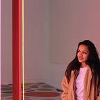
For Ambedo, I have decided to go or the night sky picture because the colors flow smoothly with the rest of the book and make it more cohesive and connected. I also made some minor edits to the title page and like how it contrasts with the colorful inside of the book. I also change the background of the boxes on the right to shades of the most important color in the picture instead of black. Hence, below the box behind the description is a purple shade to blend in with the photo more well.


I also like the ideas of how the pictures are all connected to the definitions of the word without being too literal. Hence, for ‘Zenosyne’ I am trying to find a different picture that is not a watch. Here is a picture that edited and tested. I think they match because it shows people going through life in different times. The sunset on the second one has a dispersed group of people in different areas and shows change and movement.


I was not satisfied with the flow of this picture to the different pages so then I found this picture I took a couple years ago. I think this does a great job of connecting to the word because it shows movement and shows long and short gaps between the lines in the picture.

After many edits, I faded the picture and made it warmer so it connects to the rest of the pictures.


I decided to test print these to see how the colors would print. I am also concerned about how the title page would show with the colors so close to each other because I remember this was an issue for me for a spread in the typeface project. After testing out many different opacities I think the two in the second picture are good to try out in the final print.


The inside of the book looked fine and the colors showed up accurately in the test print.
Thursday: December 6th, 2018
I got some dictionary ideas from Professor Choi that I really liked.


I like the second picture where the front cover is words with ‘Mini Graphic Design Visual Dictionary’ is highlighted in a different color. I decided to try this for my front cover. After multiple iterations the third picture below is the one I decided to go with.


Now it was time for me to transfer everything from Illustrator to InDesign as I was happy with how the dictionary looks.


This process was not that bad as I was able to select elements from the Illustrator file that were a set and put it in the creative cloud library. Once it was in there I simply just dragged the whole artboard of pieces I selected and dropped it in the respective page in InDesign.
For the binding session on Monday, I decided to print out the pages inside based on the instructions in class but print three different iterations of the cover so I can ask about it before binding the book finally.
The three covers I printed out to test in the binding are below and I printed out the rest of the pages once.


Once I printed them out at Tartan Ink the color show up was better. I did not want one with an opacity that was too contrasted so I asked the professor between the brand new cover and the one where the text is closer to the background. She liked the new cover where the text of the title is in white surrounded with a sentence about the book so I decided to go with this one and bind it. I decided to go with the string binding because I felt like it fit the aesthetic of the pocket dictionary and the theme of my book the best.
Tuesday: December 11th, 2018
Here are some pictures of my final book in the pdf followed by pictures after it was completed:


Final Reflections:
I think I learned a lot about connecting the design concepts we have learned so far to create a finished outcome in the process of creating this pocket dictionary. I learned to utilize Illustrator and connect it to different Adobe Apps like InDesign. It was interesting to see how far I have come with Illustrator from the beginning of this semester and how it is easier for me to utilize it more smoothly. I used a lot of the shape, pen, color, opacity, layering, grids, and lock tools to create this book. I also found the creative cloud library to be a very useful took where I can make edits and transfer between the apps pretty fast. I appreciated all the feedback I got in the interim critiques and the design inspirations sent to me over Slack as they had a big influence on my new designs. I appreciate how I was able to use photos I have taken in the past and the editing tools I could use to change them to fit with this book. Thinking about which photos to use and connecting them to the words was an interesting design thought process as well because it was more thinking than using the tools. Overall, this project was a great learning experience and fun to do! I realized how much I have learned through this class over the semester and am excited to apply these skills to other aspects of my life :)