
Business Intelligence 101 — Pivot Tables
Getting Results For More Than Three Decades
BI Madness 2018 is underway. Check it out here. Here on Charting Ahead, we are stepping through an inventory of Business Intelligence solutions that just might be able to compete with our big three — Power BI, Qlik, and Tableau. Yesterday’s article examined a few options that focused on dashboards and integration. Today’s article has more humble roots — pivot tables.
Pivot tables are one of the earliest tools in the Business Intelligence arena. Invented in 1986, they began on Lotus’ Improv (see cover art). In the decades that followed, pivot tables have been declared obsolete a few times and yet they remain. It is hard to keep a great tool down.

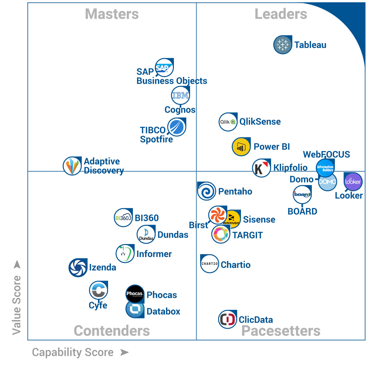
Two solutions from the BIMadness2018 cover art, the magic quadrant (from Software Advice), are prime examples of modern pivot table powered Business Intelligence solutions. Informer by Entrinsik and Chart.io both rely heavily on pivot tables to empower data investigation and discovery. They each do so quite nimbly.
Let’s start with Chart.io. You can download it free from their site. It features plenty of dashboards and integration, but it also focuses on data discovery and visualization. Chart.io supports a number of different ways to connect with and investigate data. It supports both SQL and non-SQL options for working with data. But most of all, it features pivot tables.
Dimensions and measures, filters and drop downs, they are all there. It is a lean and effective interface. It makes data exploration easier, at a price that feels quite easy and lean. The visualization components are solid as well.
Informer by Entrinsik is not as easy to download or trial. Perhaps that is why I had never heard of it until recently? Or perhaps it is simply that I work in the wrong industry? Their case studies focus on Non-profits and Colleges. A little time with their demo videos reveals what might be a very sweet tool for easy data discovery and exploration.
You can check out their YouTube channel to see what I am referring to. As someone who teaches a lot of young analysts the basics of data exploration, this tool feels exceedingly intuitive. I also appreciated the discrete references to dashboards and integration. Unfortunately, I can’t provide much more insight than this. I am still working to get some deeper access.
Look for more on Charting Ahead and our sister magazine Circa Navigate about the virtues and history of pivot tables in the coming weeks. Feel free to check out the links above to investigate these two solutions. If you have your own experience with either or would like to recommend something entirely different, leave it in the comments below. Or vote in the original article here:
To see prior years:
