MOBILE FRIENDLY VS RESPONSIVE DESIGN
Almost every company wants a mobile version of its website nowadays. The use of mobile devices such as smartphones and tablets is increasing and this is one of the reasons why Responsive Web Design plays a key role in the field of web design and development. There is no doubt that this process provides a solution to the current online challenge: adapting a company’s sites to a multitude of different screen sizes across a market that is constantly changing.
The purpose of this article is to explain in a simple and visual way the principles of responsive web design, and its importance when it comes to succeeding in the online market.
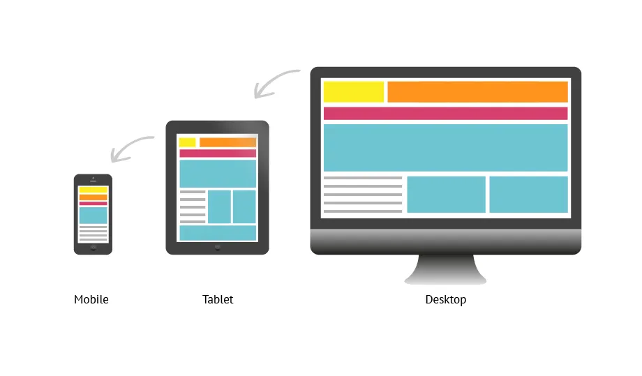
Responsive Design
A responsive website is one that changes based on the screen size of the device. It has dynamic content that changes, optimized images, correct spacing based on device, and is reliant on mobile operating systems for functionality. With a responsive design, texts and images change from a three-column layout to one that fits your device’s screen perfectly. If you’re on a website on desktop and want to see if it’s responsive, simply shrink the window and observe whether or not the display changes to match the window size. Responsive websites react with the user in mind, and enhance usability no matter what the device is.
Mobile-Friendly Design
A mobile friendly site functions the exact same way regardless of the device. In other words, mobile-friendly designs do not change based on the device being used. Nothing changes in the functionality other than the scale of the site. Many great features of the website, like navigation drop-downs, are limited, as they can be difficult to use on mobile.
Which One Should I Choose?
In order to build a winning brand, you need to reach your customers on their phones. Period. One of the most important things to keep in mind is the fact that Google now ranks mobile sites above desktop sites for SEO ranking. This means when someone searches from a mobile device, websites that are optimized for mobile viewing will rank higher than websites that aren’t. I would recommend asking yourself a few questions before deciding between responsive and mobile-friendly:
1. What is the purpose of my website?
2. What is the end goal of visitors to my website?
3. On what device do I expect my visitors to visit my site?
Should Brands Shift Towards Responsive
While it’s good to source out your options, I feel pretty strongly that the best course of action to take would be to develop a responsive site. Regardless of your brand or your industry, you know that a large percentage of your website traffic is coming from mobile. You simply cannot lose that much of your audience because your site looks awful on a phone! It’s time to graduate from mobile-friendly. At the bare minimum, we should shift towards the responsive design, and ideally start making plans to transition to a Progressive Web App (PWA). A PWA will allow a company to take the rich functionality of a native app and combine it with the discoverability and speed of the internet to produce an incredible mobile experience for the user.
Mobile web usage will continue to grow as more and more people use smartphones. Today, while 4 out of 5 consumers use smartphones to shop, businesses are having to choose how their website appears on a phone. The mobile market is huge, and creating a user-friendly web experience that works across devices will provide exponential value to any company.
What Are PWA’s?
Progressive Web Apps are user experiences that have the reach of the web, and are:
· Reliable — Load instantly and never show the dinosaur, even in uncertain network conditions.
· Fast — Respond quickly to user interactions with silky smooth animations
· Engaging — Feel like a natural app on the device, with an immersive user experience.
This new level of quality allows Progressive Web Apps to earn a place on the user’s home screen.
Reliable
When launched from the user’s home screen, service workers enable a Progressive Web App to load instantly, regardless of the network state.
A service worker, written in JavaScript, is like a client-side proxy and puts you in control of the cache and how to respond to resource requests. By pre-caching key resources, you can eliminate the dependence on the network, ensuring an instant and reliable experience for your users.
Fast
53% of users will abandon a site if it takes longer than 3 seconds to load! And once loaded, users expect them to be fast
Engaging
Progressive Web Apps are install-able and live on the user’s home screen, without the need for an app store. They offer an immersive full screen experience with help from a web app manifest file and can even re-engage users with web push notifications.
The Web App Manifest allows you to control how your app appears and how it’s launched. You can specify home screen icons, the page to load when the app is launched, screen orientation, and even whether or not to show the browser chrome.
Why build a Progressive Web App?
Building a high-quality Progressive Web App has incredible benefits, making it easy to delight your users, grow engagement and increase conversions.
· Worthy of being on the home screen
When the Progressive Web App criteria are met, Chrome prompts users to add the Progressive Web App to their home screen.
· Work reliably, no matter the network conditions
Service workers enabled Konga to send 63% less data for initial page loads, and 84% less data to complete the first transaction!
· Increased engagement
Web push notifications helped eXtra Electronics increase engagement by 4X. And those users spend twice as much time on the site.
· Improved conversions
The ability to deliver an amazing user experience helped AliExpress improve conversions for new users across all browsers by 104% and on iOS by 82%.
Baseline Progressive Web App Checklist
The Lighthouse tool is able to automatically verify many items on the this list and may prove helpful in easily testing sites.
· Site is served over HTTPS
· Pages are responsive on Tablets and mobile phones
· All app URL’s present some content even when the device is offline
· First Load is Fast
· Site works Cross Browser platform
· Page transitions don’t feel like they block/slow down the network
· Site uses Cache first networking
· Site appropriately informs the user when they’re offline
· Site dims the screen when permission request is showing
· Provides control to enable and disable notifications
There are many more baselines that must be covered for your app to be progressive, but these are basic ground rules to be covered.
