Triangle using CSS clip-path — polygon
I was working on a custom popup component that I was planning to use as a Callout, the other day and, I needed a simple arrow head to be shown on it.
My first go-to solution was using an svg and exporting it from Adobe XD. However, I thought a little more about it to see if this can be achieved purely using CSS as it is quite a simple shape.
After a little bit of snooping around at MDN Docs, I realised how easy it was using the clip-path property.
It’s a simple one-liner!
clip-path: polygon(50% 0, 100% 100%, 100% 0);Let me explain how this works:
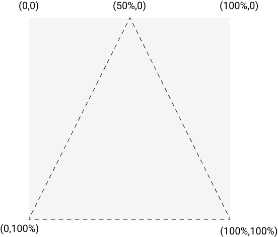
Consider the below diagram that I’ve used to represent a div(box) with co-ordinates (0,0), (100%,0), (100%,100%) and (0,100%).
Here, 100% of x/y means the width/height of the div element itself and it assumes those co-ordinates.

For clipping the triangular path, we start at a point mid-way between the top-edge x=50% (i.e. half the width of the div) and y being 0. We then plot our next point at x=100% (right edge of the div) and y=100% (i.e. bottom of the div which is the height of the div from top) and then move to our third point which has the co-ordinates of x = 0(i.e. left edge of the div) and y = 100%(height of the div from top).
This creates our triangular clipping path. Simple and easy!

