Designing Sales Pages that Convert

What is a sales page?
A sales page is a landing page, usually a longer page than a regular one with as much detail as necessary, created with one specific purpose, to secure sales for your product.
They do this by including page key elements that will make visitors take action. Your elements can be anything from social proof, explanation videos, a ton of customer testimonials, bonuses (a lot), CTA buttons, content that addresses the problems visitors face empathizing with the reader, and of course urgency triggers.
However, the purpose of your sales page remains constant — getting visitors to convert into customers.
With a sales page, you can perfectly explain your offer, and with the right mix of design elements and copy, you can win more customers from your sales pages.
In this text below, we’ll explain the design and copy essentials you need to make your product sales page irresistible to visitors.

To sell something by sales page, you’ll have to tell a great story
Focus on your customer. They’re here, right now, because they have a problem.
Write to one person, not a group of people. You want to consistently use the words like you instead of we. Establish a personal connection with the reader so they know that you understand what they are going through and have a solution to help them out.
By some statistics, messages delivered as stories can be 22 times more memorable than facts alone. The simple fact of the matter is that you can’t use storytelling effectively until you know who you’re speaking to. That’s because the most impactful stories resonate differently with different people.
If you’re going to incorporate narrative into your sales pages, you need buyer personas to help you understand your audience and what they’re struggling with.
The key elements to familiarize yourself with your persona in the process include:
- The pain points your buyer’s experience
- The language they use to communicate these challenges (as well as other issues they’re facing)
- Their role in the decision-making process
Once you know who you’re speaking to, you can begin constructing a story that’s custom-tailored to their needs. To do that, you need to understand the principles that underlie all great stories. Although there are multiple storytelling frameworks out there, “The 4 Principles of Storytelling” is a helpful starting place.
Bonus Tip: Transform positive customer experiences into stories. This should be your ultimate goal on the path of putting your customer first. To learn more we recommend some excellent literature on the subject.
The essential elements of a sales page
First, the sales pages can be built in two forms:
- Short-form sales page
- Long-form sales page
Both types of sales pages have the same purpose and are designed similarly.
Regardless of the product or service, you’re selling, both types of sales pages have the same key elements and convincing copy so the visitors can decide whether they want to click the call-to-action (CTA) or not.
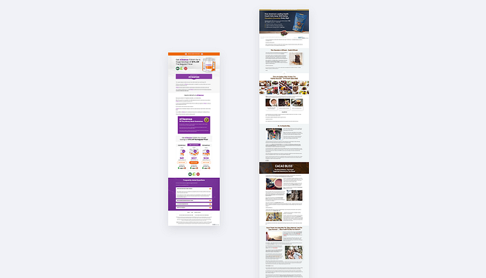
Short-form sales pages work really well for lower price products. You don’t need a ton of text to convince visitors to buy, they can convert into buyers quickly and simply.
But what if they have more questions, looking for answers they can’t find on this form, so you might need to leave a lot more words (information) about it.
Here is why the long sales pages give you more opportunities to convert visitors into buyers. They leave you plenty of room to share information about your product or service you provide, the more expensive or complicated your product is the more you need to convince.
And don’t worry about the possibility of boring and quickly leaving your page, with a combination of interesting copy, engaging stories, graphics, videos, multiple CTA sections, a lot of white space, you can keep the attention of your potential buyers.
We’re going to share our best tips/practices to help you get started based on our successful experience with designing sales pages.
1. Break your content into sections
Sections help you break your large text blocks into smaller paragraphs, and that’s the first step when designing a good sales page with visitors’ readability in mind.
Visually, it is difficult for people to stick to a paragraph that has no end. Dividing your text can help your visitors easily consume the information.
It’s important to have separate sections for:
- Call-to-action
- Product/service characteristics
- Product bundles, graphics, images
- Video explanation
- Bonuses
- Testimonials
- Social Proof
- Bio
- Guarantee
- FAQs
2. White space
Make your long-form sales page simple. With no breathing room, you are making it difficult to navigate, to focus on what’s important, to better understand the offer.
White space it’s an open space that makes all other sales page elements look more pronounced and draws focus to them. It’s important to note that white space does not necessarily have to be“white”, it can be any other natural color as long as it helps separate the different elements and contrasts with the element that it’s highlighting.

Also, white space enhances readability and can contribute to a better user experience.
3. Headlines that POP
Headlines should be clear and easy to understand, they need to attract the reader to read on. It should show some solution to an emotional problem that the visitor is facing.
Make it big and bold, make a combination of serif and sans serif font so it looks more catchy, underlines strong words, or make a contrast with colors.

4. Copy
- Simplify the grid and normalize the reading flow to one or max two columns.
- Bulleted copy — This kind of text presentation is easier to read, which makes readers happy. Use this unordered text form when displaying the benefits of the product you are selling, оr when you want to list the problems that visitors face, for which you have a solution. You can also separate this content in a box.

- Bolded text and italics help in making the text even more readable, make sure you emphasize the most important sentences, you can also highlight them with strong color.
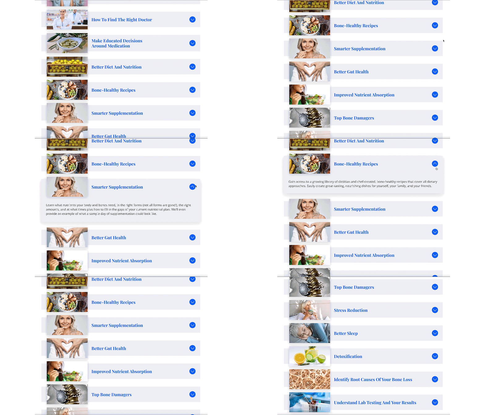
- Sometimes we have more complex text or copy that is not so mandatory for reading (for those with more time), this way of content can be presented in accordion, dropdown style, or separated in a lightbox.
5. Graphics and images
When using sections to break up your text, you should also be using eye-catching graphics, to be more digestible to readers.
Graphics can communicate information faster than they can read the text.

Providing images with the product or images with people using the product or while experiencing the service you provide, can help visitors start imaging themselves with the product and give them the idea of exactly what it is that you are selling.
Vary the placement of images, so they’re not all on the same side of the page.

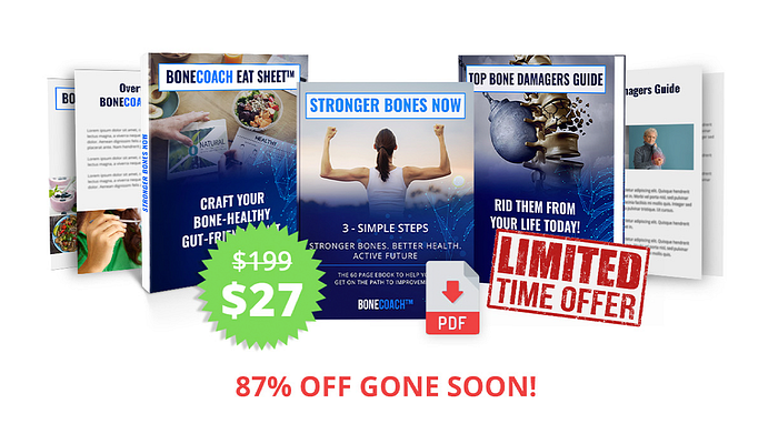
Make a big graphic product bundle so the users will be amazed by all the stuff they are getting when purchasing your offer. Add a little spice by adding contrast color badges all over it, like “FREE”, “TODAY ONLY”, “THE BEST VALUE”.. etc.
6. Strong Call-To-Action
All of the content on your page should lead to a powerful CTA, encouraging the visitor to take action and purchase.
The CTA button has to be shown several times throughout your sales page, the higher your price is the more call-to-action buttons you need because the people will need more convincing to purchase.
Make sure that the CTA button stands out against your graphics and color scheme on your page. Pick a color that is not repetitive, use a contrasting color and make the button big, bold, larger, that will differ from the usual beautiful and subtle buttons. And with crossing the regular price and highlighting the new one they can see how much discount will get if they purchase your offer.
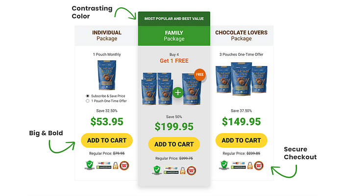
Support the action by adding secure checkout, accepted credit cards, shipping, etc. It is great for the visitor to know that you have their best interests in mind and don’t need to be afraid of some kind of scam. Make sure for them to think that they’re getting the best deal possible.
The CTA section should definitely be the last thing they see on your page.
7. Color scheme
Use a simple color scheme, do not overdo the design. It is necessary to have colors that will be used in terms of importance: primary color, secondary color, paragraph subtle black color, and natural background color that should act as a section separator.
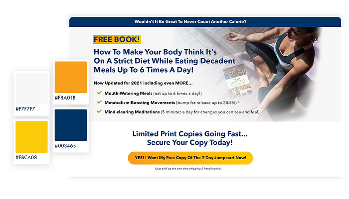
Never use #000000 black color for the copy. Pure black color can cause eye strain issues for the readers. White has 100% color brightness, and black has 0% color brightness. This causes the eyes to work harder to adapt to the brightness.
As designers, we need to pay attention to the balance of contrast between text and background color so that it is safe for the user’s eyes.
Choose dark grey to replace pure black. Our best solution is to take your primary color and darken it down until it comes to a dark shade of grey.
8. Add Urgency
The fact is that people are more interested in things that are running out, they hate missing out on anything. Adding urgency will make your sales page convert like crazy.
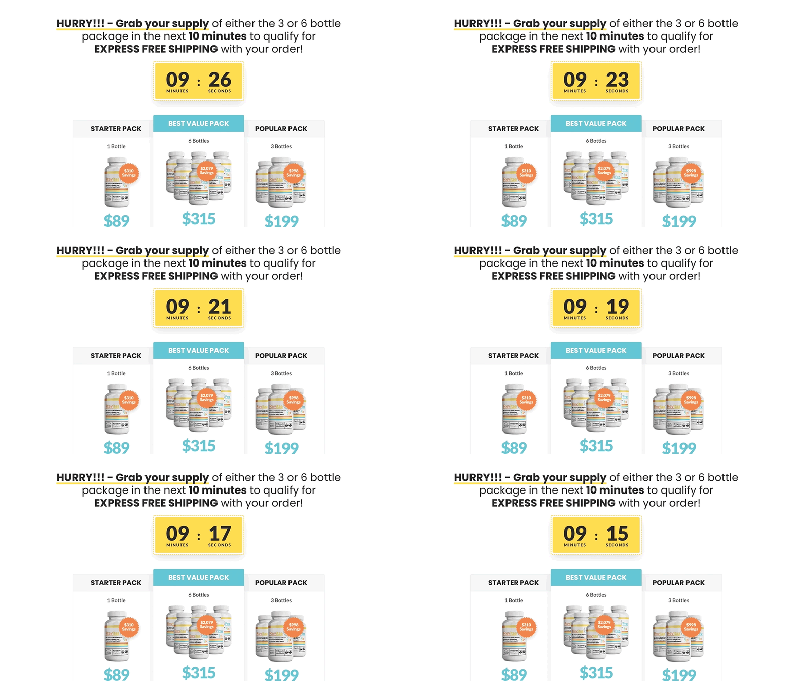
You can achieve that by adding a countdown timer when you have a discount on the offer that is only available for a short time period. Put it on the top of the page and make it sticky so whenever they scroll it is still there, you want buyers to make quick decisions.

Or there is another urgency when there is a limited supply. You can highlight words in red like “LIMITED OFFER”, “Only x products left in stock”, “SELLING FAST”. Add a red alert icon within to grab more attention.
9. Responsive design
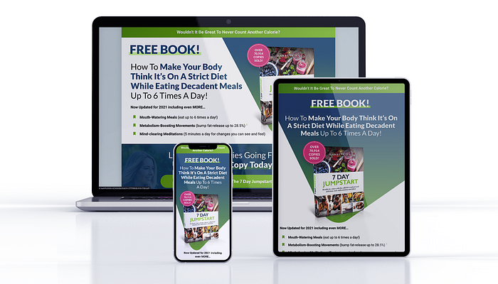
Over 60% of web traffic comes from mobile. Make sure to deliver all design elements you have designed for desktop, to be rendered correctly across all platforms. Proportion-based grids and flexible images ensure that your page will be optimized to deliver what your customers are looking for on any device.
If browsing your sales page on a phone or tablet results in a frustrating experience, visitors are likely to turn it off. You’ve got to make sure your sales page still works on small screens.
10. Guarantee
When you are selling products or some service online you need to expect people to have feelings of certain risks or doubts, they can’t see it, can’t touch it, or taste it, and that for sure kills sales. With a guarantee like total money refund or free product replacement, free repair, they will have more confidence and will believe that the offer is worth purchasing.
Make it more trustworthy by adding your personal sign and also include a badge that says “X Days Money Back Guarantee”, “100% Satisfied”, etc, to be more noticeable.

11. Frequently Asked Questions
Make your FAQ section answer the questions. Provide the customers with the information they need. Be clear and concise.
Save visitors time by separating questions, the perfect design choice for this is the accordion layout. Customers can expand or collapse only the answers they were questioning about. Customize it with interactive hover effects and colors that match your sales page look.

12. More design variations
If you aren’t sure about the design for your sales page, about the chosen typography or color scheme, even if the problem is only in the CTA button, you can make more variations. Because these little things can make a lot of difference in the conversion.
That’s why you need to test. A/B testing it’s important, you can continue adding new design elements so to be sure which one will perform the best.

Conclusion
We really hope you had fun reading this post and learning a few new things.
When designing your next sales page incorporate the tips we mentioned above. You can test long and short-form sales pages to figure out which will work best for you.
With interesting content and good visual design, you will definitely get more buyers.
