The A-Z of Coding Your Way Through Stock Market Analytics
A Python Series.
Extracting valuable financial insights to inform better investment decisions is the goal of every investor and stakeholder. More than analyzing data quickly, it’s also about reproducing that analysis over and over again with different assets. Having the same analytical starting point is crucial. And Python is the perfect tool for this kind of analysis.
In this article, we will go through a complete financial analytic Python script step by step. This script is designed to fetch, preprocess, analyze, and visualize stock data. We will understand how automated analyses can offer valuable and systematic insights to investors and stakeholders.
Our analysis will focus on the AI/tech industry from January 1, 2020, to January 1, 2023. The stocks analyzed include ‘GOOGL’ (Google), ‘NVDA’ (NVIDIA), ‘AMD’ (AMD), ‘INTC’ (Intel), ‘TSLA’ (Tesla), ‘IBM’ (IBM), ‘MSFT’ (Microsoft), and ‘ZM’ (Zoom). Each company presents a unique narrative within the AI/tech industry.
Of course, you can add more stocks to the analysis, look at stocks from another industry, compare two stocks, change the period… The possibilities are endless. The purpose of this Python script is that it can be reproduced. You can replicate the analysis with any stocks!
Outline
The Python script that we will create is divided into the following sections:
- Data Retrieval and Preprocessing Function
- Data Visualization Function
- Daily Returns Distribution Visualization Function
- Risk and Return Analysis Visualization Function
- Correlation Analysis Visualization Function
This is the final result.


Disclaimer: While this article uses real market data for demonstration purposes, it is imperative to note that the content is provided for informational and educational purposes only. This article (python script included) is not under any circumstances financial advice. This article and code aim to enhance financial knowledge and Python programming skills. Always seek advice from a qualified financial professional before making any investment decisions. Investing involves risks, including the potential loss of principal.
Part 1: Data Retrieval and Preprocessing Function
We first create the fetch_and_preprocess function. The data is from Yahoo Finance and you can add or remove stocks from the stocks list (see in the python script below). The fetch_and_preprocess function returns a dataframe with all the stock data. We thus get the OHLCV data and adjusted close price for all desired stocks.
“Adjusted close is the closing price after adjustments for all applicable splits and dividend distributions.” — Yahoo Finance.
import pandas as pd
import matplotlib.pyplot as plt
import seaborn as sns
import yfinance as yf
from scipy.stats import skew, kurtosis


def fetch_and_preprocess(ticker, start_date, end_date):
    """
    This function fetches stock data from Yahoo Finance and preprocess the stocks.

    Parameters:
    - ticker (str): The stock symbol.
    - start_date (str): The start date for fetching the data.
    - end_date (str): The end date for fetching the data.
    """
    data = yf.download(ticker, start=start_date, end=end_date)
    data.reset_index(inplace=True)
    data['Date'] = pd.to_datetime(data['Date'])
    data['Daily Return'] = data["Adj Close"].pct_change()
    return data
In this fetch_and_preprocess function, we reset the index, ensure our Date variable is in the correct datetime format, and calculate the Daily Return variable using the adjusted close variable fetched from Yahoo Finance.
Daily returns give us insights into the stock’s volatility and overall price movement. It can provide information about the stability and risk associated with a particular stock.
The fetch_and_preprocess function has the following parameters:
- ticker (str): The stock symbol.
- start_date (str): The start date for fetching the data.
- end_date (str): The end date for fetching the data.
In the script, we will call this function as follows:
list_of_dataframes = [fetch_and_preprocess(stock, ‘2018–01–01’, ‘2023–01–01’) for stock in stocks]
Where stock is the list of stocks with the tickers:
stocks = [‘GOOGL’, ‘NVDA’, ‘AMD’, ‘INTC’, ‘TSLA’, ‘IBM’, ‘MSFT’, ‘ZM’]
Part 2: Data Visualization Functions
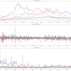
The plot_attributes function plots the following attributes: Adjusted Close, Daily Return, and Volume. This means it will plot these variables for all stocks. That is the first 3 graphs on our analysis.
def plot_attributes(list_of_dataframes, titles):
    """
    This function plots the following attributes: Adjusted Close, Daily Return, and Volume.

    Parameters:
    - list_of_dataframes (list): List of dataframes containing stock data.
    - titles (list): List of titles for the stocks.
    """
    attributes = ["Adj Close", "Daily Return", "Volume"]
    plt.figure(figsize=(25, 20))
    for idx, attribute in enumerate(attributes, 1):
        plt.subplot(3, 1, idx)
        for df, title in zip(list_of_dataframes, titles):
            plt.plot(df["Date"], df[attribute], label=title)
        plt.title(attribute + " Over Time")
        plt.xlabel("Date")
        plt.ylabel(attribute)
        plt.legend()
    plt.tight_layout()
The function’s parameters are:
- list_of_dataframes (list): List of dataframes containing stock data.
- titles (list): List of titles/labels for the stocks.
Where titles is the list of the stocks titles:
titles = [“Google”, “NVIDIA”, “AMD”, “Intel”, “Tesla”, “IBM”, “Microsoft”, “Zoom”]
Let’s take a moment to review the intricacies of the code.
Explaining enumerate
enumerate iterates over an iterable (like a list in our code) and access the index of the current item being processed.
The general syntax is the following:
for index, element in enumerate(iterable, start_index):- index: current index in the iteration, which starts from start_index.
- element: current element in the iteration.
- iterable: object to iterate over.
- start_index: starting index, default is 0.
This is what we have in our code:
for idx, attribute in enumerate(attributes, 1):- idx: The index, starting from 1 (for reading purposes we start with 1).
- attribute: The element, which will be each string in attributes on each iteration.
- attributes: our list of strings [“Adj Close”, “Daily Return”, “Volume”] that will be iterated.
Explaining zip
zip iterates over two or more iterables in parallel. With two iterables, zip groups the first elements of each iterable, then the second elements.
The general syntax is the following:
for element1, element2 in zip(iterable1, iterable2):- element1: current element from iterable1.
- element2: current element from iterable2.
This is what we have in our code:
for df, title in zip(list_of_dataframes, titles):- df: a “dataframe” from the list_of_dataframes list.
- title: its corresponding title from the titles list.
Breakdown of plot_attributes Function:
- Attributes List: These are the variables we want to plot.
attributes = ["Adj Close", "Daily Return", "Volume"]2. Figure Size: We initialize a new figure with a specified size (width 25, height 20) to plot.
plt.figure(figsize=(25, 20))3. First Loop: We iterate over each attribute with the index starting from 1.
for idx, attribute in enumerate(attributes, 1):4. Subplot: We create a subplot grid of 3 rows and 1 column.
plt.subplot(3, 1, idx)5. Second Loop: We iterate concurrently over list_of_dataframes and titles.
for df, title in zip(list_of_dataframes, titles):6. Plotting Line: We plot the attribute.
plt.plot(df["Date"], df[attribute], label=title)7. Title, Labels, and Legend: We define the title, the x and y-axis labels, and finally add a legend
plt.title(attribute + " Over Time")
plt.xlabel("Date")
plt.ylabel(attribute)
plt.legend()
8. Layout Adjustment: We make sure that the subplots fit
plt.tight_layout()When we call the plot_attributes function we generate a 3-row subplot. We get each attribute for all stocks “Adj Close”, “Daily Return”, and “Volume” over the time period that we defined.
Part 3: Daily Returns Distribution Visualization Function
The plot_daily_return_distribution function plots the distribution of daily returns for all stocks while also calculating the average expected return, the asymmetry of the returns distribution (skewness), and the “tailedness” of the returns distribution (kurtosis).
def plot_daily_return_distribution(list_of_dataframes, titles):
    """
    This function plots the distribution of daily returns along with the mean, skewness, and kurtosis.

    Parameters:
    - list_of_dataframes (list): List of dataframes containing stock data.
    - titles (list): List of titles for the stocks.
    """
    plt.figure(figsize=(20, 15))
    for idx, df in enumerate(list_of_dataframes):
        plt.subplot(4, 2, idx + 1)
        sns.histplot(df["Daily Return"].dropna(), color="blue", kde=True, bins=50)

        # We calculate the mean, skewness, and kurtosis
        mean_return = df["Daily Return"].mean()
        skewness_return = skew(df["Daily Return"].dropna())
        kurtosis_return = kurtosis(df["Daily Return"].dropna())

        # Then we add a vertical line for the mean
        plt.axvline(mean_return, color='r', linestyle='--', label=f'Mean: {mean_return:.6f}')

        # And we add text for the calculated statistics
        stats_text = f"Skewness: {skewness_return:.2f}\nKurtosis: {kurtosis_return:.2f}"
        plt.annotate(stats_text, xy=(0.05, 0.95), xycoords='axes fraction', fontsize=9, ha='left', va='top')

        plt.title(titles[idx] + ": Distribution of Daily Returns")
        plt.xlabel("Daily Return")
        plt.ylabel("Frequency")
        plt.legend()
    plt.tight_layout()
The function’s parameters are:
- list_of_dataframes (list): List of dataframes containing stock data.
- titles (list): List of titles for the stocks.
Financially, it’s interesting to visualize the distribution of daily returns for our set of stocks.
First of all, the histograms allow us to make a quick assessment of the risk and volatility of the given stocks by looking at their spreads and tendencies. Wider spreads indicate higher volatility, which is generally riskier.
Second, by visualizing the histograms’ distributions, we can quickly perform a normality check. Certain financial models, like the Black-Scholes model, assume that returns are normally distributed.
Third, we can calculate the mean of the distribution for each stock, which would give us the expected returns. Also, it’s important to look at the proportion of negative returns and get a sense of the risk of losses. The mean (i.e., the expected return) is a critical parameter for many financial models as it indicates the average expected return. A daily mean close to zero is common due to upward and downward movements.
We also calculate skewness, which measures the asymmetry of the returns distribution. Positive skew indicates that the distribution tail is skewed towards the right, while negative skew indicates a left tail. What does this mean financially? It provides insight into the asymmetry of returns. Investors might prefer positive skewness, indicating a higher probability of large positive returns. Skewness also indicates the likelihood of extreme returns on one side of the mean.
We also calculate kurtosis, measuring the “tailedness” of the distribution. High kurtosis indicates heavy tails and sharp peaks (more prone to outliers), while low kurtosis indicates light tails and a flatter peak. Financially, high kurtosis suggests a higher likelihood of extreme returns (either high or low). Understanding kurtosis helps in risk management, particularly in evaluating the risk of extreme movements.
Fourth, examining the histograms of our various stocks allows us to compare their risk-return profiles and make better-informed investment decisions. If some stocks have similar (or dissimilar) return distributions, identifying them could help us in our portfolio management decision: how do we diversify our portfolio and/or how do we optimize our asset allocation?
Finally, visualizing histograms allows us to identify outliers. Spotting the extreme values helps us understand the likelihood of extreme returns or losses.
Part 4: Risk and Return Analysis Visualization Function
The plot_risk_vs_expected_returns function plots a scatter plot where each point represents a stock.
def plot_risk_vs_expected_returns(returns, titles):
    """
    This function plots risk vs expected returns.

    Parameters:
    - returns (pd.DataFrame): Dataframe containing stock returns.
    - titles (list): List of titles for the stocks.
    """
    plt.figure(figsize=(20, 10))
    plt.scatter(returns.std(), returns.mean(), s=100)
    plt.ylabel('Expected Return')
    plt.xlabel('Risk')
    for label, x, y in zip(titles, returns.std(), returns.mean()):
        plt.annotate(label, xy=(x, y), xytext=(10, 0), textcoords='offset points')
    plt.title("Risk vs Expected Returns")
    plt.tight_layout()
The function has the following parameters:
- returns (pd.DataFrame): it is a DataFrame containing all stock returns (see below).
- titles (list): a list of titles for our chosen stocks.

This scatter plot is an interesting visualization because it allows us to visualize the trade-off between risk and returns for our chosen stocks.
On the x-axis, we have the standard deviation of the stocks’ returns, representing risk. The standard deviation of returns is a proxy for a stock’s risk; the higher the standard deviation, the higher the risk due to increased price volatility.
On the y-axis, we have the mean of returns, representing the expected/average return.
The interpretation of this scatter plot goes as follows: On the x-axis, the further right, the higher risk/volatility. On the y-axis, the higher up, the higher expected return.
While a higher standard deviation indicates higher ‘risk’, it does not necessarily mean ‘bad’ as it depends on an investor’s risk tolerance.
What kind of investment insights can we derive from this scatter plot?
First of all, this plot illustrates that seeking higher returns usually means accepting higher risk. The risk-reward trade-off is well depicted on this scatter plot.
Also, we can use this plot for our portfolio diversification. Here, we can identify stocks that could enhance our portfolio diversification by analyzing their return and risk in relation to existing investments. For instance, if you already own Google and Tesla stocks, it could be interesting to visualize the next ones you want to purchase on this particular plot to enhance diversification.
Finally, this plot aids us in our stock selection. It enables us to see which ones offer the highest returns with the lowest risk.
Note that investors should balance between risk and return based on their investment strategy and risk tolerance; some might prefer a low-risk, low-return strategy, while others might be comfortable with a high-risk, high-return approach.
Part 5. Correlation Analysis Visualization Function
The plot_correlations function creates a correlation heatmap and calculates the correlation matrix of the returns of our chosen stocks.
def plot_correlations(returns):
    """
    Plot correlations heatmap.

    Parameters:
    - returns (pd.DataFrame): Dataframe containing stock returns.
    """
    plt.figure(figsize=(12, 8))
    sns.heatmap(returns.corr(), annot=True, cmap="YlGnBu")
    plt.title("Correlation Matrix of Daily Returns")
    plt.tight_layout()
The function has the following parameter:
- returns (pd.DataFrame): it is a DataFrame containing all stock returns.
This correlation heatmap is interesting because it allows us to visualize the pairwise correlation between the returns of our chosen stocks.
Here, we calculate the correlation coefficients that have a range between -1 to 1. This is how we interpret them: a coefficient of -1 indicates a perfect negative correlation (one stock increases in value while the other decreases), 1 indicates a perfect positive correlation (stocks move in the same direction), and 0 indicates no correlation. Note that the darker the color, the stronger the correlation.
Correlation does not imply causation.
Financially, we can use this correlation heatmap for diversification. By identifying stocks that are less positively/negatively correlated, we can build a diversified portfolio. This strategic stock allocation can help us optimize returns while managing risk. Understanding correlations allows us to anticipate potential impacts on our portfolio when a particular stock (or sector, for example) increases or decreases in value. This visual summary of how the returns of different stocks move relative to each other is key for informed investment decisions. It goes without saying that other factors, like the companies’ financial health, macroeconomic indicators, and/or industry trends should be taken into account.
What Now?
Finance with Python is powerful. We’ve created a suite of visualization functions that highlight hidden patterns and intricate relationships between stocks from the tech industry.
What do we have exactly that could be reproduced for stock analysis:
- Time-series plots that chart stock prices and trading volumes, revealing trends and volatile periods that might be useful for investment decisions.
- Daily return distributions through histograms with the overlaying mean, skewness, and kurtosis. This statistical visualization illustrates the inherent risks and potential rewards of our chosen stocks.
- A risk-return scatter plot that serves as a guided investment decision tool by aligning stocks’ risk with return expectations.
- Lastly, the correlation heatmap allows us to detect how stocks might move relative to each other, thus helping us design diversified portfolios.
Please find below the full Python script
import pandas as pd
import matplotlib.pyplot as plt
import seaborn as sns
import yfinance as yf
from scipy.stats import skew, kurtosis


def fetch_and_preprocess(ticker, start_date, end_date):
    """
    This function fetches stock data from Yahoo Finance and preprocess the stocks.

    Parameters:
    - ticker (str): The stock symbol.
    - start_date (str): The start date for fetching the data.
    - end_date (str): The end date for fetching the data.
    """
    data = yf.download(ticker, start=start_date, end=end_date)
    data.reset_index(inplace=True)
    data['Date'] = pd.to_datetime(data['Date'])
    data['Daily Return'] = data["Adj Close"].pct_change()
    return data

def plot_attributes(list_of_dataframes, titles):
    """
    This function plots the following attributes: Adjusted Close, Daily Return, and Volume.

    Parameters:
    - list_of_dataframes (list): List of dataframes containing stock data.
    - titles (list): List of titles for the stocks.
    """
    attributes = ["Adj Close", "Daily Return", "Volume"]
    plt.figure(figsize=(25, 20))
    for idx, attribute in enumerate(attributes, 1):
        plt.subplot(3, 1, idx)
        for df, title in zip(list_of_dataframes, titles):
            plt.plot(df["Date"], df[attribute], label=title)
        plt.title(attribute + " Over Time")
        plt.xlabel("Date")
        plt.ylabel(attribute)
        plt.legend()
    plt.tight_layout()

def plot_daily_return_distribution(list_of_dataframes, titles):
    """
    This function plots the distribution of daily returns along with the mean, skewness, and kurtosis.

    Parameters:
    - list_of_dataframes (list): List of dataframes containing stock data.
    - titles (list): List of titles for the stocks.
    """
    plt.figure(figsize=(20, 15))
    for idx, df in enumerate(list_of_dataframes):
        plt.subplot(4, 2, idx + 1)
        sns.histplot(df["Daily Return"].dropna(), color="blue", kde=True, bins=50)

        # We calculate the mean, skewness, and kurtosis
        mean_return = df["Daily Return"].mean()
        skewness_return = skew(df["Daily Return"].dropna())
        kurtosis_return = kurtosis(df["Daily Return"].dropna())

        # Then we add a vertical line for the mean
        plt.axvline(mean_return, color='r', linestyle='--', label=f'Mean: {mean_return:.6f}')

        # And we add text for the calculated statistics
        stats_text = f"Skewness: {skewness_return:.2f}\nKurtosis: {kurtosis_return:.2f}"
        plt.annotate(stats_text, xy=(0.05, 0.95), xycoords='axes fraction', fontsize=9, ha='left', va='top')

        plt.title(titles[idx] + ": Distribution of Daily Returns")
        plt.xlabel("Daily Return")
        plt.ylabel("Frequency")
        plt.legend()
    plt.tight_layout()


def plot_risk_vs_expected_returns(returns, titles):
    """
    This function plots risk vs expected returns.

    Parameters:
    - returns (pd.DataFrame): Dataframe containing stock returns.
    - titles (list): List of titles for the stocks.
    """
    plt.figure(figsize=(20, 10))
    plt.scatter(returns.std(), returns.mean(), s=100)
    plt.ylabel('Expected Return')
    plt.xlabel('Risk')
    for label, x, y in zip(titles, returns.std(), returns.mean()):
        plt.annotate(label, xy=(x, y), xytext=(10, 0), textcoords='offset points')
    plt.title("Risk vs Expected Returns")
    plt.tight_layout()

def plot_correlations(returns):
    """
    Plot correlations heatmap.

    Parameters:
    - returns (pd.DataFrame): Dataframe containing stock returns.
    """
    plt.figure(figsize=(12, 8))
    sns.heatmap(returns.corr(), annot=True, cmap="YlGnBu")
    plt.title("Correlation Matrix of Daily Returns")
    plt.tight_layout()

# List of AI/Tech industry stocks and their names
stocks = ['GOOGL', 'NVDA', 'AMD', 'INTC', 'TSLA', 'IBM', 'MSFT', 'ZM']
titles = ["Google", "NVIDIA", "AMD", "Intel", "Tesla", "IBM", "Microsoft", "Zoom"]

# Fetch and preprocess data for each stock
list_of_dataframes = [fetch_and_preprocess(stock, '2020-01-01', '2023-01-01') for stock in stocks]

# Calculate returns for subsequent plots
returns = pd.DataFrame({title: df["Adj Close"] for title, df in zip(titles, list_of_dataframes)}).pct_change().dropna()

# Plotting
plot_attributes(list_of_dataframes, titles)
plot_daily_return_distribution(list_of_dataframes, titles)
plot_risk_vs_expected_returns(returns, titles)
plot_correlations(returns)

plt.show()
Conclusion
While our analysis provides valuable insights, we should acknowledge their limitations; macroeconomic indicators, companies’ fundamentals, and external market forces are not factored in. These metrics are essential when creating a comprehensive investment strategy.
Moreover, we could go further with our analysis by creating more advanced financial models like the Efficient Frontier one or by leveraging machine learning algorithms. These enhancements could help us uncover patterns and/or trends imperceptible to traditional financial analysis.
We now have a good starting point for stock market analysis. Reproduce, compare, change industries, build from this Python script. See you next time!
Thanks for reading and stay tuned for more articles! If you enjoyed reading this article, please follow and clap for more full Python scripts.
Follow us on Substack