Experiment 03: Typography
In this chapter, we are learning about typography. In the beginning, we are asked to do a series of exercises to warm-up. In the last part of this experiment, I will design a poster for the font assigned to me.
Warmup exercise
Poster design
For this assignment, I will design a 10” x 16” poster for a typeface. The poster needs to visually show the feature of the typeface and contains some important information about it.
Here are some other requirements and constraints:
For your poster, you may only use type and basic shapes. Avoid creating illustrations or literal imagery. Focus on the use of typography and hierarchy. Your poster should have a minimum of 3 levels of hierarchy. Use at least two weights of the typeface. Experiment with size, spacing, and indentation. You may use color in this project, but use it as an accent. Limit yourself to one color, or two if you feel you must.
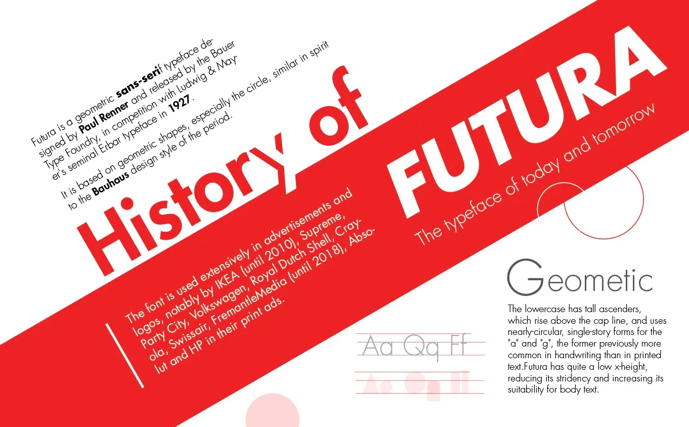
The typeface assigned to me is FUTURA. I started with some research about it
Research about FUTURA
Who designed it and when? Paul Renner, in 1927
What type of classification does it fall under? It is a geometric sans-serif typeface. The font is used on a daily basis for print and digital purposes as both a headline and body font. The uppercase characters present proportions similar to those of classical Roman capitals.
Was it created for a specific purpose or context? Futura is a geometric sans-serif typeface designed by Paul Renner and released by the Bauer Type Foundry, in competition with Ludwig & Mayer’s
seminal Erbar typeface in 1927.
Are there any specific uses of it that led to its popularity? It is a font survived from the Nazi and fly to the moon. In 1933, The Nazi regime determined Fraktur to be the true German type and rejected modern type styles like Futura while it became popular around the world. Later in 1941, The Nazi regime deemed blackletter typefaces to have Jewish heritage. Roman typography, which included Futura, became the new standard due to its superior legibility over blackletter typography.
In 1969, Nasa decided to use it for the plaque left by Apollo 11 astronauts. It is the first typeface on the moon.
The font is also used extensively in advertisements and logos, notably by IKEA (until 2010), Supreme, Party City, Volkswagen, Royal Dutch Shell, Crayola, Swissair, FremantleMedia (until 2018), Absolut and HP in their print ads.
Are there any features that set it apart? It is based on geometric shapes, especially the circle, similar in spirit to the Bauhaus design style of the period. The lowercase has tall ascenders, which rise above the cap line, and uses nearly-circular, single-story forms for the “a” and “g”, the former is previously more common in handwriting than in printed text.
The slogan of Futura “die Schrift unserer Zeit” (“the typeface of our time”) in German and in English “the typeface of today and tomorrow”.
Step 2 • Curating Content
Next, based on the research, it is time to assemble the following content for the poster.
- Name of typeface designer
- Year it was designed
- Identifiable characters or features — what sets this typeface apart?
- Some text that adequately expresses the character of the typeface. This may be a quote, word, phrase, or anything you think fits. This is open to your interpretation of your typeface now that you have come to know it. Be creative, and have fun with this!
Here are my very first attempts for the poster:


Because I just finish my resume design, so the posters look like resumes. They were too text-heavy. There are so many fun facts about Futura, but it is better to show they visually than verbally. I wanted to show the geometric feature of the letter, and I got feedback to work on it more.
Based on the feedback, I tried to ideate more ideas:
First, I played with the font in different weight, color, rotation degree and point size:


Then, I started to pick some cute pieces and assemble my poster:


I showed them to class and got more feedback from the class: The geometric shapes are good, especially the AGT shapes from the first poster; too many words on the last one; The whitespace could be more organized……
I tried to arrange the components in the portrait orientation.


I found that it is easier to manage the whitespace in the portrait orientation, so I moved on to this attempt. In the right poster, people like the iconic large triangle. But they cannot understand that the A is the final letter of the word ‘FUTURA’. So I made it more clear:

Now using the lines and the geometric shapes, the poster is easier to understand. However, every piece is too strong to have a strong entry point. Also, there are many shapes to express the ‘geometric’ concept. It is a little bit redundant. So I try to emphasize the triangle in the poster.

When I played with the triangle, I found that when rotated it, it looks like a beam of light and it is visually adorable. When I put ‘FUTURA’ in it, the right sides of the triangle and A are aligned. I tried to put a paragraph under it and it works. The only thing is the balance: The triangle hangs too high and the words below it are too heavy to attach to it.

I enlarge the title and add some more components. The circle and the rectangle around the ‘U’s give more clues to the ‘geometric’ concept. The label with the red background looks like an advertisement punchline, one popular usage of FUTURA in real life.

Finally, I adjust the position of the triangle and the title and the size of the label to have a clearer hierarchy.
