Creating a Visualization Platform for Prison Complaints — a Design Case Study
Team: Cornell Hack4Impact (Designers: Connie & Ishika, Developers: Shefali, Steve, Anika, Jiwoo, Amy, Tech Lead: Anusha, Project Manager: Priya)
Timeline: Fall 2020 (6 weeks Design, 10 weeks overall)
The Problem
There is a huge lack of transparency about conditions inside prisons and three supreme court cases (Branzburg v. Hayes, Pell v. Procunier, and Saxby v. Washington Post Co.) make it difficult for journalists to access these prisons.
Currently, the Correctional Association of New York (CANY) is the only organization with access to that data. CANY wants to surface the data and use it to form an argument as to why it's important to increase transparency about conditions inside prisons.
The Solution
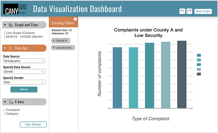
We created a dynamic data visualization platform for CANY to easily create graphs that use real-time prison complaint data.
Competitive Analysis
First, we did market research on similar platforms that involved editing custom visuals. What we noticed from each of these is:
- Not all options are immediately available, and options are broken off by distinct aspects of the graph, artboard, or use-case
- Shifting from action to action should require a one-click transition
- Most of the detailed options are concentrated on the sidebar and rarely on the top bar

Information Architecture
Based on the initial prompt, we went through several rounds of the information architecture. We chose to iterate on information architecture first paired with low-fidelity sketches because we didn’t want to create the mid-fidelity until all the details were concretely defined.
Iteration 1
My initial mental model was that all kinds of graphs with different x and y axis’s were possible.
However, after talking with the client, we learned that they were mainly interested in complaints as the dependent variable.
From our meeting with the client, we also learned they wanted features such as a way to save the graph, undo and redo, and reset.
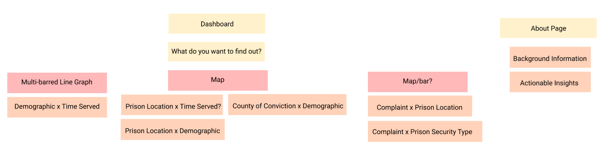
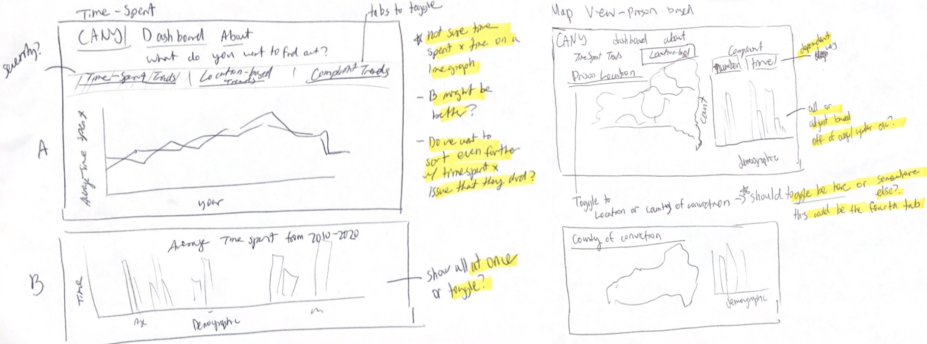
Iteration 2
In the second iteration, complaints were pre-assigned as the y axis. We had it so the user could limit the data set from both the x and y.
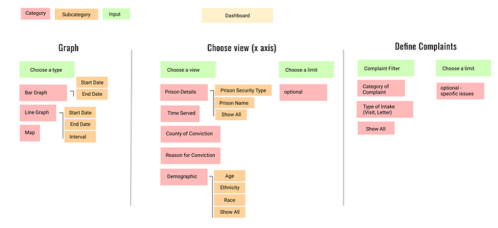
In the next user testing review with the client, we focused on asking questions to define what the client envisioned the y and x axis being, and what actions they wanted to take in customizing the data.
User Testing
During our meeting, we tested our prototypes with the client, two CANY employees, and two non-CANY affiliated students for both functionality and visual design. As a side note, the flows below have been abridged.
Visual Feedback
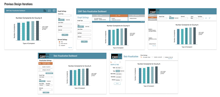
We had an array of options visually but settled on two final options to test because they either echoed previous design patterns (eg google sheets) or seemed the clearest based on internal team feedback.
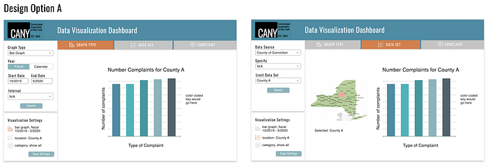
✓ Nice visually and usable after users played around with controls
✗ Unclear at first the correlation between tabs and sidebar content, the active color placement in visualization settings was unnoticed
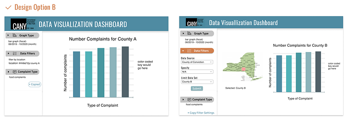
✓ Able to quickly toggle between different actions, similar to Google Sheets UI
✓ Clear relation between the settings summary, edit summary, and the task-action
✗ Unclear the settings co-related to the filters above, needs to be fixed visually
Ultimately, user testing revealed users preferred Option B. We decided to freshen up the UI and optimized the spacing. We also added more visual hierarchy to the sidebar.

Function Feedback
We tested for the usefulness of our product by asking people at CANY to walk us through how they would use our tool to construct visualizations they would use from day-to-day.
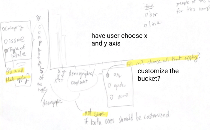
We discovered that it was hard to distinguish the difference in action between defining complaints (third option) and limiting the data-set (second option). Both were limiting the data set and defining the x-axis at the same time, but they were separated as if they were performing two separate actions.
Figuring out the 3 Core Actions
After talking with the client some more to figure out the three core actions, we learned that the y axis would always be the number of complaints and that would never change. That meant the only axis to be altered would be the x axis. The client agreed they still wanted to limit the data set and change the graph type — which meant an easy fix would be to replace changing Complaint Type to Setting X Axis.
Final Iteration
The new information architecture and design reflected the changes in the three actions.
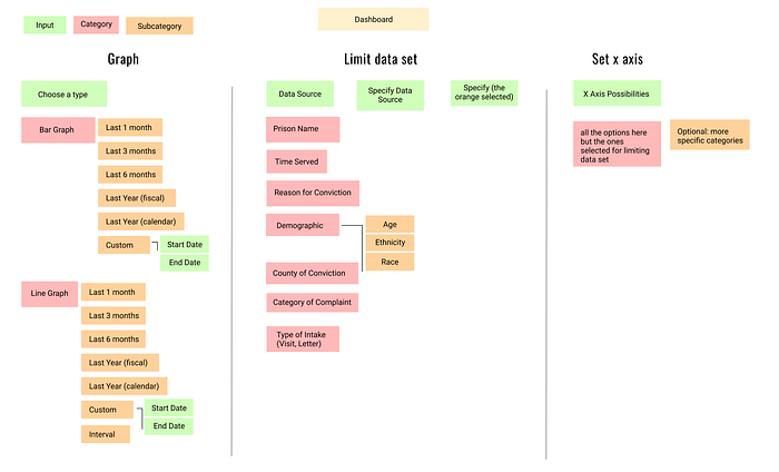
We also realized that the user would need a way to keep track of the multiple limits placed under the ‘limit data set’ option which we added visually via a sidebar.
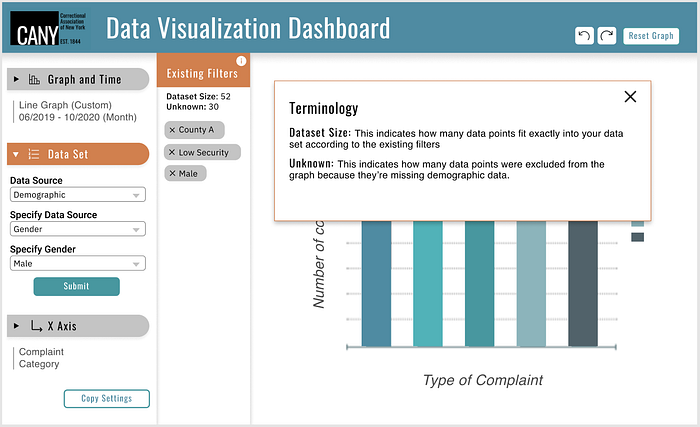
We also learned that the dataset was incomplete and there would be entries without demographic data. We added the explanation via a popup and placed it under the ‘limit data set’ sidebar.
Design System
The final visual design system was heavily based off of CANY’s existing brand to maintain consistency, even though it was an internal tool. That meant using brand fonts, Oswald and Helvetica, as well as brand colors.

Results
View a walkthrough the final iteration below!
At our end-of-semester showcase, we demo’d the project to our client and we were met with positive reviews. A CANY employee expressed his gratitude and said that our tool would make the data visualization process much faster and efficient for them, and they were so excited to use it.
Because the pandemic has been stressful for everyone, our team is still working on developing the tool but it will be deployed in the spring.
Reflections
This semester was Hack4Impact’s first time designing before the beginning of development, and also with pairs of designers. Here are some key lessons learned —
- The user knows best — there were times where our team couldn’t make a design decision, after we got feedback from users we were able to make clear, informed decisions on which avenue to pursue.
- Walkthrough the user journey — if we had constructed a user journey earlier we would’ve realized our mental model didn’t line up with our client’s. We did do it verbally, but a more concrete model would’ve been more effective.
In the end, designing wouldn’t have been possible without our wonderful developers and project managers and we can’t wait to see what will happen in the upcoming semester!