A Beginner’s Guide to the US COVID Atlas
Part I: Get started exploring and visualizing data
By Susan Paykin, Kenna Camper, and Laura Chen

At the onset of the COVID-19 pandemic, our UChicago-led research coalition launched the US COVID Atlas, an accessible, interactive data visualization tool to track the virus at the county scale across the United States. The Atlas has been up and running since late March, but we know new users continue to find their way to the Atlas, as this pandemic is still very much affecting all of us.
For those of you who are new to the Atlas — welcome! While last week brought exciting news with the first COVID-19 vaccine starting to be distributed throughout the US (and a second vaccine likely to be approved soon), data shows that the virus continues to spread. COVID is still infecting people at high rates across the Midwest Rust Belt, Southwest, and other regions, and there remains an urgent need for data-informed pandemic response and planning.

We want to equip new users with a brief overview of how to get started exploring the latest data and trends using the tools of the Atlas. Read on for a Beginner’s Guide to the Atlas.
What makes the Atlas distinct?
The U.S. COVID-19 Atlas is a county-level clustering surveillance tool to provide quick access to county-level COVID-19 estimates, longitudinal exploration, and statistical cluster detection. It reveals a more detailed pandemic landscape with local hotspots of surging COVID cases that are missed by state-level data.
The Atlas shows patterns in the spread of the disease by displaying hot spots and clusters. Hot spots are of particular interest in epidemiological analysis, such as the spread of COVID-19, as this method allows the identification of “hot” groups of areas (i.e. counties, states) that are being significantly impacted by rates of infection or disease spread indicators. In addition to spatial trends, we can also track how these hot spots emerge over time.
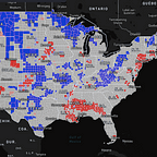
Hotspot Maps
The Atlas differentiates between hotspots and cold spots. Hot spots, shown in red, are clusters of areas (such as counties or states) with statistically significant high numbers or rates and that are surrounded by other areas with high numbers of rates. Cold spots, shown in blue, are clusters of areas that have statistically significant low rates numbers or rates, compared to the surrounding areas.
To create a Hotspot map:
- Select Data Source and Map Variable
- From the Map Type sidebar, hit the “Hotspot” button
- Click the “Local Moran” button from the drop-down menu
Natural Breaks Maps
We use choropleth maps to classify and visualize the values of pandemic data for each state or county. The Atlas uses the Natural Breaks classification to create its choropleth maps (also known as the ‘jenks’ classification). Natural Breaks maps use a nonlinear algorithm to create groups where within-group homogeneity (sameness) is maximized — thereby grouping and highlighting extreme observations in the data.
The Natural Breaks map shows how many outbreaks occur from state-to-state or county-to-county. If a state is a darker shade of red compared to others, it is experiencing higher COVID-19 counts or rates (or whichever variable is selected). A light orange or beige color indicates a state is experiencing fewer counts or rates.
To create a Natural Breaks map:
- Select Data Source and Map Variable
- From the Map Type sidebar, hit the “Choropleth” Button
- From the drop-down menu, click “Natural Breaks (fixed bins)”
Box Maps
Box maps are generally used to detect outliers by grouping pandemic data values, such as counts or rates of infection, into six fixed categories: Four quartiles (1–25%, 25–50%, 50–75%, and 75–100%) plus two outlier categories at the low and high ends of the distribution. The box map option displays the rates of COVID-19 numbers using teal and brown colors. States that are a darker shade of teal indicate lower COVID-19 rates compared to the country. States that are a darker shade of brown indicate higher COVID-19 rates compared to the country.
To create a Box Map:
- Select Data Source and Map Variable
- From the Map Type sidebar, hit the “Choropleth” Button
- Select the “Box Map” button from the drop-down menu
Ready to get started?
Start exploring the Atlas and its most recent data here.
See the Methodology and FAQ pages for more detailed information on understanding data sources, map types, indicators of emerging spatial trends, and more.
We want to hear from you!
We are excited to be working on new features and upgrades to the Atlas, to be released in the coming weeks in early 2021. The updates are well underway, but we need your help to make sure that the changes we’ve made work with how you use or might use the new Atlas. Give it a spin here and let us know any thoughts you have on the feedback form.
Follow & stay informed
Make sure to follow our Instagram and Twitter for the most up-to-date news about the Atlas.
Graphics by Laura Chen.