How to understand over 500,000 lives lost to COVID
By Kenna Camper
Kenna Camper is a fourth-year undergraduate student at the University of Chicago and a Research Assistant with the US Covid Atlas Project and Center for Spatial Data Science at University of Chicago.
COVID-19 has taken an incomprehensible number of lives since the pandemic began last year. In the U.S. alone, we’ve reached over 570,000 deaths and 32 million COVID cases. For me, it has become more and more difficult to conceptualize these amounts of people as the numbers increase. In order to help people see the lives lost through COVID, Dylan Halpern, our principal software engineer, collaborated with our senior research specialist Susan Paykin to create an interactive visualization called All of our US Covid Deaths. Through this project, you can view what these numbers of people look like in real-world locations, such as the St. Louis Gateway Arch.
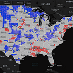
With the US Covid Atlas, you can visualize data as a map to track trends over time and see differences in cases across the country. This map, on the other hand, adds a more personal perspective to the data. Although many people have either had the virus or have a personal connection to someone who has, understanding the scale of harm and loss wrought by the virus can be difficult to place in the context of the real world.
Dylan explained that “after a certain scale, the number of lives lost or cases becomes a statistic, and no longer a story of people and communities. It’s hard to wrap your mind around what 100,000 really means, even harder for 500,000 and beyond.” For this reason, he created this narrative visualization to show what having everyone who lost their lives to COVID in one location would look like. By representing these lives in a space together with icons of people, not dots, the visualization aims to help us comprehend the pandemic’s impact and to provide a more intuitive, poignant way of grasping what these numbers really look like.
“After a certain scale, the number of lives lost or cases becomes a statistic, and no longer a story of people and communities. It’s hard to wrap your mind around what 100,000 really means, even harder for 500,000 and beyond.”
The project’s locations include Millennium Park in Chicago, Central Park in NYC, the National Mall in D.C., the Gateway Arch in St. Louis, and Buffalo Bayou Park in Houston. These places were selected because they are where people would gather together for festivals, rallies, and celebrations. These cities and their landmarks were highlighted to make this sort of metaphor accessible and personal for people across the country.
The pandemic has changed everyone’s lives. It has brought on many losses and challenges this past year. While vaccinations have brought hope for life to eventually “return to normal,” COVID cases and deaths are still increasing. These numbers are more than just statistics, and hopefully this visualization helps a sense of scale to the amount of people across the country who have lost their lives to COVID.