Tracking COVID Hotspots in the U.S.
By Marynia Kolak, Moksha Menghaney, & Qinyun Lin at the USCovid Atlas
COVID-19 has been emerging as a rapidly changing, and wide-spread pandemic in the US since the beginning of 2020. As of June 21st, the US had a total of 2,252,895 confirmed cases, out of which more than 180,000 cases were added in the last week (June 15th to June 21st). In fact, every day since the end of March has been seeing more than 15,000 daily new cases (see Figure 1 for the number of new cases in the US from March 15th).
Additionally, the pandemic is affecting all states in the US. Figure 2 shows the spatial distribution of new cases per 10K population across the country at a county level.
The Challenge
Our team of health geographers and data scientists at the University of Chicago Center for Spatial Data Science had been following the pandemic closely since the original outbreak in Wuhan back in December. By early March, we had identified several emerging challenges that impacted a more comprehensive understanding of COVID.
First, there was a lack of publicly available county-level surveillance data. By focusing on state-wide or even US-wide metrics, it’s easy to miss rapidly surging cases at a more local level.
Identifying outbreaks earlier on is critical to isolate effectively; a hot spot would have to be extremely large and mature, and therefore even more difficult to contain, to be flagged as a hotspot at a state-level.
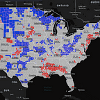
For example, the hotspots across borders of different states, as highlighted in the county-level surveillance (Figure 4 and 5), cannot be identified if we only look at the state-level data (Figure 3).
At the same time, in early March there was a focus on large cities and one’s own areas — not what may be happening in surrounding places. This makes it difficult to understand what’s happening in a comprehensive way, as things are “hidden” this way. Adjusting for population is also critical to understand how more rural areas are being disproportionately hit by COVID.
In addition to identifying areas of highest risk, we also need to detect vulnerable areas to again isolate and contain cases before they get worse.
The Solution
Prior to this pandemic, some of us had been analyzing the spread of the opioid epidemic at a local level, and saw the importance of approaching these challenges as complex systems from a regional perspective.
So we pivoted and created the US COVID Atlas, a county-level visualization tool that enables interactive exploration of COVID case data, statistical hotspots, and community indicators across the United States from multiple sources, from the beginning of the pandemic to today.
The maps on the Atlas are not static — they are interactive and quickly provide access to multiple sources of COVID data over time for historical exploration. We include statistical hotspots using spatial statistics of both the total number of cases and adjusting for population to support decision-making.
Hotspots representing clusters of counties are updated daily; this graphic shows confirmed cases per 10,000 persons, though we also recommend checking out daily new confirmed cases to track the most recent changes in COVID.
Through our research coalition partners at County Health Rankings, Madison, & Berkeley, we also connect social and economic indicators, as well as COVID death forecasting statistics — with more to come.
The Atlas thus provides a much more detailed landscape of the disease and helps us “see” things that were previously hidden.
The Benefits
We have uncovered multiple vulnerable communities, like the persistent regional supercluster in the Navajo Nation or across the Southern Black Belt in Mississippi, Alabama, and Georgia.
We uncovered multiple clusters occurring across borders that are missed in State-wide metrics, as well as multiple cases of spatial spillover. For example, an outbreak spilling out of a ski resort in Colorado, or COVID cases spilling from NYC to nearby vacation homes.

More recently, we see new hot spots emerging along the southern borders of Arizona and California (see Figure 8), likely resulting from residents taking advantage of different social distancing guidelines in May.
With a patchwork of policies across the country, it’s not uncommon to find hotspots emerge along borders or major traffic routes accordingly.
In summary, we have found that COVID is a national story with a local experience. By accessing data and insights directly, we can better work together to understand the complex nature of the pandemic.
Who Uses the Atlas?
The Atlas is used by a wide variety of users including healthcare professionals and department officials, business leaders, journalists, and the public. We have a community of 30K+ users and growing.
The Atlas remains a free, open source tool & public good.
Launching the COVIDAtlas Blog
To better translate our findings and connect the lived experience of the COVID-19 Pandemic in the United States, we are thrilled to kick off the COVIDAtlas Medium Publication with this article!
Stay tuned in coming weeks for weekly research insights and posts from guest contributors to learn about how COVID is changing the landscape of the country.