Winter Hotspots Sustain in South, Southwest
Weekly updates on the geography of COVID
By Laura Chen
Last week the C.D.C. mandated all domestic travelers in the United States to wear masks, including in areas qualified as “airport, bus terminal, marina, seaport or other port, subway station, terminal, train station, U.S. port of entry or any other location that provides transportation.” Although we have yet the scale of impact, this policy is designed to slow the spread of the COVID infection and, hopefully, decrease hospitalization rates — all while the national vaccine campaign continues to roll out. While these developments are a step in the right direction, as we head into the second month of 2021, the virus is still very much with us.
Here at the Atlas, we’ve integrated data from our Weekly Hotspot Report to compare regional trends and provide a data-driven, county-level update. This interactive report presents high-level Atlas data summaries with a focus on county-level, statistically-significant hotspot trends. It’s available through Observable, a code integration and data exploration platform. We’re excited to share this additional resource with Atlas users to quickly identify both emerging and stable hotspot counties.
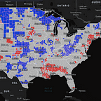
Regional Hotspots
The below maps capture the hotspot states and counties of concern throughout the past week, from January 23, 2021 to February 1, 2021. These included regions of South Carolina, Georgia, North Carolina, Virginia, Texas, Oklahoma, Arizona, Arkansas, New York, Kentucky, California, Mississippi, Alabama, New Jersey, and West Virginia.
Notably, over 30 counties in both Georgia and South Carolina were labeled as stable hotspots, meaning COVID-19 numbers are continuously increasing relative to other counties.
As of January 30, California had four stable hotspot counties — San Bernardino, Los Angeles, Kern, and Orange — with a disproportionate number of increasing counts of COVID-19 cases compared to the rest of the country.
However, the state overall is seeing improvements in transmission numbers considering its high rate of cases in 2020. The Los Angeles Times reports that “California officials estimated that the state’s order — which prohibited nonessential travel; banned outdoor social gatherings; and closed nail and hair salons, museums and outdoor dining — kept as many as 25,000 people from landing in the hospital with a severe case of COVID-19.”
Moreover, counties in Texas that are seeing more than 1000 daily cases include Dimmit, Zavala, and Uvalde.
Vaccination Data
The national effort to distribute the first and second doses of the CDC-approved COVID-19 vaccines continues. The states seeing the highest rates of distribution as of January 31, 2021, include Pennsylvania, Massachusetts, and Florida. However, parts of these states still remain vulnerable to high COVID-19 case numbers. We know that not all counties and communities in these states have the same access to vaccines as others — see this report just last week from Tampa, FL. Early reports show that this is especially true in cities and areas where racial inequities are already high.
You can explore the current vaccination data from the CDC on the US COVID Atlas here. We have broken down the data into three variables: % Received First Dose, % Received Second Dose, and Doses to be Administered per 100K Population. The latter variable represents how much vaccine has been distributed to the state, which can be compared with the first two variables of how much has been administered to people. While the CDC has only released state-level data publicly as of yet, we anticipate the agency making county-level data available as the rollout continues.
While vaccines represent a welcome sign the tide is turning, we are not out of the dark yet. The national rolling average death rate currently hovers around 3,000 deaths per day. We should continue to act with caution and awareness by maintaining social distancing, wearing a mask, washing hands regularly, and staying home when possible.
Edits by Susan Paykin.