Responsive and adaptive images using focus points
Published in
1 min readJan 5, 2015
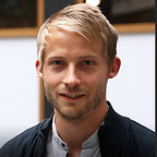
Devices and computers come in millions of shapes and sizes it’s very hard as a web developer to make your images fit and look good at every size. In this post i’m going to look at a second solution which uses focal points to tell the browser what should be on screen.
Responsive and adaptive images can be implemented in several ways and there are advantages and disadvantages to each method. Here are just a few of those:
- Background image set with css to cover the area (fits to content height)
- Responsive image library such as picturefill
- Replace the image src using css content:src for different media queries (see my previous blog post)
However these solutions don’t solve the main problem. How do we ensure the most important part of the photo is always shown in view? regardless of the format/size of the image?
Enter focus point solution!
- First choose the most important point of the image
- Work out the coordinates as a percentage of the image width/height e.g. 24% from the left 48% from the top
- Then add it as a background image to an area of the page and define the background position using the percentages
.image {
  background-image: url('https://i.pinimg.com/736x/17/30/42/17304288adec0f9350546e7a745305c9--antlers-elk.jpg');
  background-position: 50% 55%;
  background-size: cover;
}.landscape {
  height: 90px;
  width: 160px;
}.portrait {
  height: 284px;
  width: 160px;
}.square {
  height: 160px;
  width: 160px;
}
View the example:
https://jsfiddle.net/kmturley/y6s5bawr/4/