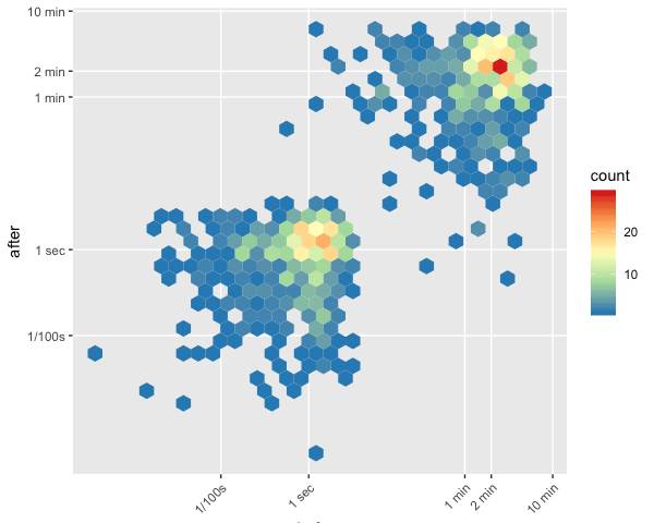
Time Maps are a great way to understand events that happen with a certain cadence over time. Take a look at this…
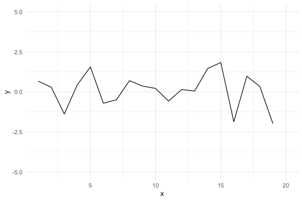
If you want to plot a chart with a few outliers in ggplot, you might be temped to use ylim. The problem with ylim…