A new identity based on the interactions between team members

The new identity of Dataveyes originates from the relations between its members, literally and figuratively. It is dynamic, set in motion by our activity data, which best reveals how we all work together.
WHY A NEW VISUAL IDENTITY?
We recently unveiled a whole new approach to our identity: new website, new logo, new way of describing our business, and more generally, new visuals and terminology across all our media platforms. This project was ongoing for over a year before we finally found the tenacity — and time — to finalize it between November 2013 and January 2014.
This long moment of hesitation probably speaks of the difficulty we experienced to define our business. Big data, open data, data journalism, infographics, etc.: we were often associated with these terms, although we felt that none of them captures what we actually do.
Our work takes different forms: we create data visualization applications as well as ambient experiences, connected objects, or business dashboards. Our approach is as much about technology as it is about design. We put these two dimensions at the service of our users, with the technical ability to process large volumes of data. We are neither a software publisher, an agency, a consulting firm nor a research laboratory. We lie at the crossroads of them all.
How to visually embody so many paradoxes?
While working on a new way of describing our business, we laid down the foundations of a new visual identity.

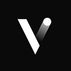
Our old logo had done its time. At the beginning of Dataveyes in 2010, the logo allowed us to gain a foothold in our market by alluding to the Pie-Pacman reference. It was simple, light and friendly: the image of our young impetuosity to implement data visualization in France
Three years later, we felt ready to embark on a logo that reflects a more mature, explicit vision of Human-Data Interactions.
A DYNAMIC IDENTITY
After initially exploring graphics, we unanimously headed towards the option of a generative logo. That is to say, a logo whose shape is not settled, but is self-generated by an algorithm and operates by creating a pattern. It may be because we had a hard time envisioning our identity as something static, considering how we keep on learning new things on a daily basis.
Our field, data visualization, is recent and still largely unformatted: methods, techniques, approaches are constantly re-invented. The market we play in is expanding very quickly, and is still in the process of understanding its needs.
How to express this dynamic situation without making our identify confusing? The idea of a generative logo brought an answer: it allowed us to create a coherent symbol, a frame, while leaving room for endless variations. Generative art is also a field that is not so distant from ours. Where we create interfaces fueled by data, generative art bases its creative approach on algorithms.
However, despite its captivating aesthetics, we were not comfortable relying on the randomness of generative art. We are used to leveraging data at the service of a better understanding of information; generative art seemed comparatively pretty poor on the informational level.
Our job is to tell stories with data. What’s more natural for us than trying to tell our own identity from data?
Beyond generative identity, we were looking for a dynamic identity, linked to real data.
AN IDENTITY DRIVEN BY DATA
Although many of our team members are “quantified self”-savvy, we quickly abandoned the idea of monitoring personal data. We wanted to shift the identity focus on how we work as a team.
This is one of the most characteristic features of Dataveyes. Our team is composed of very different profiles: developers, designers, statisticians, information architects, user experience specialists or data storytelling. Throughout our client projects, we combine our different skills to master the complexity of data and invent relevant and compelling user experiences.
We reached the conclusion that the best way to visualize Dataveyes would be to highlight the density of interactions within the team.
Good data to describe interactions was available, right before our eyes. Since April 2013, each team member has been logging their daily tasks (client name, nature of task, duration, resources etc) on Toggl, a time tracking tool.
From that point, we had to explore these datasets and make them talk. Time-tracking data would then shed light on the richness of our collaboration.
AN INDICATOR OF OUR ORGANIZATION

Through this prism of visualization, data describing our daily work takes a more symbolic dimension. It becomes a better way to reconcile the reality of our organization and its potential of representation.
Our time-tracking tool allows us to export our data in csv format. We conducted a preliminary exploration to update links between team members, as they appear in the tasks inside the tool.
A first exploration workshop allowed us to compare our interpretations of the data by designing early sketches.

The circular shape seemed naturally obvious: it is the visual translation of the unity and cohesion of the group.
The circle served as our framework for organizing our data. Through multiple variations, it gave birth to a strong identity of a company revolving around the interactions of its team.
We defined a methodology to visualize the concept of cooperation from our data.

- Tasks: over the course of a week, each team member would carry out a number of tasks.
- Projects: each task corresponds to a project, which is then highlighted in a specific color.
- Interactions: We then connect the tasks performed by different team members for a common project. Interactions within the team indicate the fact of working together or at the same time on the same project: design group, pair programming, design duo, discussions, etc. Each project takes on a unique shape; it becomes a key element which gathers the relevant skills and elicits collaboration.
- Patterns: repeating the previous steps for each project helps build a pattern. All projects show complex shapes that intersect, split and merge as if to reveal the activity in a neural network.
The complexity of the forms obtained helped us identify the limits of classic visual design tools. Illustrator (or any other vector drawing software) proved too cumbersome to handle such dense patterns (approximately 500 dots for tasks spanning 2 weeks, and 250,000 possible connections between them)
Our test dataset covering a week’s worth of collaboration also had limitations. We needed to address the data more broadly, to discover the good and bad surprises that our dynamic logo had in store.
We needed a dynamic prototype to keep moving forward.
AT THE CROSSROADS OF DESIGN AND DEVELOPMENT
Like with many of our projects, close collaboration between interaction designers and creative developers enabled us to build a prototype suited to give life to the data.
Through successive iterations between design and development, we created a customized tool that freed us from the constraints of traditional tools and nourished our creative process.

The major advantage of this prototype is its method of rendering SVG and Canvas:
- The SVG format is ideal for handling visualization both technically (through code) and graphically (using a vector drawing tool): a true common language between designer and developer.
- Canvas allows us to visualize more data with fewer limitations on the display performance.
We managed to tame our data to give it shape and meaning. But we feared that our emerging logo would begin to look too cold and technical.
A HUMAN LOGO

We returned to working on the graphics. During this last phase, we were particularly sensitive to metaphors evoking humans. We believe our mission is to inject a human dimension into the data. This is why we refer to the concept of Human-Data interfaces.
Mastering complexity to humanize it: this is our paramount goal, for this logo as well as for each of our projects.
In order to face the “data deluge”, we looked for a familiar and reassuring visual like the iris of an eye. A symbol that resists the variations in data, and is recognizable over time.
This design introduces a subtle dialectic between the whole team and its components. It encompasses every team member, every task, every project in the same symbolic universe.
A PATTERN-LOGO
The prototype has continued to evolve by integrating the latest graphical iterations. Dynamically connected to the Toggl data, it allows us to generate and refresh a logo for Dataveyes at any time.

We created a logo that is flexible and changing. The overall pattern remains the same, but the fine details are different each time.
This is a pattern-logo: it remains coherent over time and changes with our activities.
It does not command a unique vision, but instead articulates a multitude of daily fragments to form a coherent representation. In our quickly changing environment, this elasticity creates strength, like the Reed in La Fontaine’s fable.
Now it is up to you to explore this visualization on your own

A LIVING LOGO
To make this logo more expressive, we animated it several times over.
The pattern-logo becomes organic, it evokes how nature thrives on apparent complexity to structure life.
By inhaling and exhaling, the visualization breathes in unison with the collaboration of the team.
On our website, we visually translate the new definition of our business. The construction of the logo becomes a relevant metaphor of the link between Humans and Data, by turning abstract particles into a symbolic eye iris.
CONCLUSION: FROM THE LOGO TO OUR GLOBAL IDENTITY
We managed to visualize Dataveyes through our own methodology, our vision of data and their potential.
The logo is a tribute to the shape and unity of Dataveyes, by materializing the multitude of interactions that make up the team.
The logo and its graphics system now apply to every communication material produced by Dataveyes, such as business cards, client deliverables, or large posters.

Want to know more? Get yourselves ready for our next articles by subscribing here on Medium.
You can also follow us on Twitter or discover our last use cases on our website.