Space management in Android with compose
In the last years the variety of screens has increased drastically. From small devices such as watches to wider ones such as big displays in shopping centers. Despite the variety of dimensions, densities and interaction methods, the fundamentals of building a screen remains the same because design principles are based on user experience.

In this article we will explore strategies to make an effective space management in digital products and efficient ways to apply them in Android with compose. The study is divided into two parts. This first article is centered in:
- Why is spacing important?
- General tips
- Understanding the basics
- Space management in detail
- White space
Layout and adaptative layouts will be covered in other article.
These points will be explained based on accesibility, guidelines and user experience best practices.
Why is spacing important?
- It defines the hierarchy of elements and organizes information.
- Groups and identifies related content.
- Helps highlighting relevant elements.
- Improves aesthetics.
- Helps guide the user and enhances navigation understanding.
- Prevents information overload, which is crucial for clarity.
- Ensures accessible interfaces.
General Tips
Here are some basic recommendations to improve the design of your digital product and identify spacing inconsistencies:
- Use Mirror Apps such as Figma Mirror or Android Studio Emulator connected to devices to see your design and prototypes in real devices. It helps to see the real proportions of elements and how the user is going to interact with them.
- Take screenshots for references, measure elements or spaces and distributions and compare them to your app.
- Base your designs in guidelines such as the Material Design ones and Android documentation. Resources are specially prepared and optimized for the system you are working on.
- Take into account accesibility guidelines.
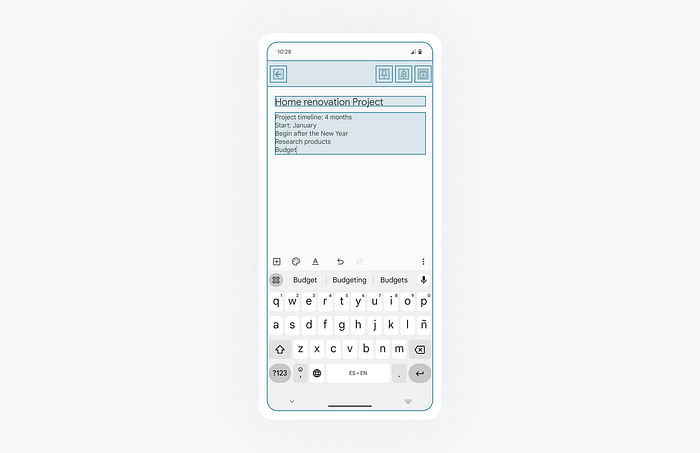
Understanding the basics
Grids
Grids work as a first reference to distribute and measure elements. It is common to use grids of 8pt and its multiples. This number reduces the decimals compared to, for instance, 7. As a result, all distances between elements will be x1, x2, x3, x0.5 of the reference distance.
This may vary depending on the product or case, but it’s about understanding its significance and how it helps to maintain a consistent system throughout the product.

Figma Tip: Select and element and press Shift + Arrow to move it a multiple of 8 points.
Spacing
Elements should be distributed following also these measurement guidelines by maintaining a consistent space between atoms, element and blocks.
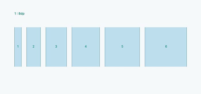
Non-linear scales are more versatile. A lot of similar values like 8,12,16,20,24…are usually not needed. Instead it is more useful a scale that provides you with small and large values in a simpler set.
Deep analysis of space
Distribution of elements
Distributing elements with consistent spacing between them helps group and recognize them as related elements.
Find a balance between proximity and space. For example, elements in lists are usually closer because scroll should be comfortable and quick but also they have to be wide enough to be clickable and readable.
Tip in Android Studio: If elements in a column or row are spaced by the same distance, instead of using the Spacer component many times, use spacedBy property to simplify your code or de gap property in Grids.
horizontalArrangement = Arrangement.spacedBy(16.dp)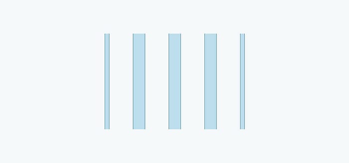
To easily apply the dimensions across your app, add them to the dimens.xml file. This method has been inherited from Views but since Material Design and Compose have evolved there are new ways to manage it in complex apps that will be explained in the next article centered on layouts adaptability.
<resources>
    <dimen name="space_between">8dp</dimen>
    <dimen name="padding_horizontal">16dp</dimen>
    ...
</resources>
Figma allows also to apply numerical variables to distances or dimensions in the local variables menu following the same logic.
Inside components
Spacing is also important between the atoms of components. It helps grouping or defining hierarchy inside them. Here is an interesting article writen by Adham Dannaway comparing different cases of good and bad space management inside a card component.
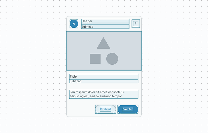
Explore the composables by pressing Command and tapping on composable name in Android Studio, and see the different tokens that they use for dimensions. Here is an example of the NavigationBar component tokens. As you will see, distances have been mapped using multiples of 8.dp. This scale gives a lot of consistency across all the design system. If you need to use other values for your product, ensure that you maintain the core principles to preserve that consistency. (Remember that you can not edit this file)
internal object NavigationBarTokens {
    val ActiveIndicatorHeight = 32.0.dp
    val ActiveIndicatorWidth = 64.0.dp
    val ContainerHeight = 80.0.dp
    val IconSize = 24.0.dp
    ...
}
The M3 components are also available as a official resource in Figma since 2024.
By studying different app layouts, distributions, and spacing, you’ll notice many common conventions. Icons are typically 24.dp, and top bars often share the same height. You can learn and internalize these patterns by using official resources and reading documentation but also by taking screenshots and many references.
Texts
This space management affects also texts. A correct lineHeight marks the difference. It is crucial to choose one around 1.5 the text size for a better readability, specially in long paragraphs. See Material Design 3 documentation about readability.
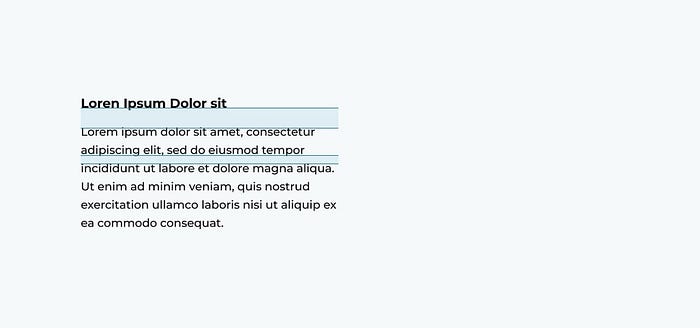
Here is an example of a TextStyle defined in the Android theme:
bodyLarge = TextStyle(
        fontSize = 20.sp,
        fontWeight = FontWeight.Normal,
        lineHeight = 30.sp
    )
Touchable elements
Touchable elements should have special attention because they have to be wide enough to interact with them easily. It is recommendable to use a 48.dp for touch targets and 44.dp for pointers targets. (See details in the Material Design Accesibility documentation)
Here is a variable, the minimumTouchTargetSize, that is applied across the composables in Android compose library.
val minimumTouchTargetSize: DpSize
        get() = DpSize(48.dp, 48.dp)
The IconButton composable is an example of a component that uses it. The use of composables will allow you to be carefree about some accesibility common mistakes because they have been designed to follow the best.
IconButton(
        onClick = {}
    ) {
        Icon(
            imageVector = Icons.Default.Favorite,
            contentDescription = "Hearth icon",
            tint = Color.Red
        )
   }
)
White space
In many cases, enclosing information or components in boxes isn’t necessary. Using a good space system and alignment of elements will be enough to see agrupations or differenciate components. Visual weight will be reduced exponentially.
A recommendation of Material Design 3 is:
Use close proximity and open space (rather than lines and shadows) to group related items
Reduce cognitive load and group elements and zones. Avoid the obsession to present all the information simultaneously.
References
Guidelines:
- Material Design 3 spacing documentation
- Material design 3: hierarchy, target sizes
- Android Developers documentation: dimensions
Articles and videos:
Conclusions
The aim of this article has been to make an overview of how to make a good space management in Android Apps with compose, but applicable to other products or technologies. It is not just about making products look good. It is about enhancing the user experience by optimizing the distribution and helping users quickly find and associate common elements. The best way to achieve this is by taking references and learn from official resources.

