DoorDash Dual Delivery Feature: Case Study

Too much time is spent deciding and compromising on what to eat for dinner. The Dual Delivery feature aims to give people more of what they want, instead of needing to compromise. In this case study, I will be explaining the Dual Delivery feature, why people need it, and how I would implement this feature as a UX Researcher/Designer.

Empathy Research: What Users Want & Do Not Want
Here is a summary of my findings from 5 user interviews that I conducted with interviewees with varying frequencies of ordering takeout food. The larger circles represent how common that response was among interviewees. The yellow circle represents a finding that was not directly related to the Dual Delivery feature, but I still wanted to include because more than one participant brought it up. Cost was an important factor to users. This was an important takeaway and something to keep in mind as I’m designing my wireframes, as well as finalizing the details of the Dual Delivery feature.

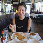
Persona 1: Lily Koi

Persona 2: Paul Picasso

Multiple Entry Points To Consider
In creating my low-fidelity mockups, I needed to consider the user flow and different entry points that users could take to access dual delivery. Here were the options:
1. Immediately access Dual Delivery from the Homepage, with curated options of popular pre-paired restaurants.
2. Access Dual Delivery whilst browsing a restaurant. Users can click from a restaurant page to access list of available restaurants for Dual Delivery.
3. Access Dual Delivery at the end of the user flow, as an “add-on” option. This will prompt users who are just about to check out to see if they want to add on another restaurant as part of Dual Delivery.
Low-Fidelity Wireframes

I wanted to focus on the first two points of entry:
1. Access from the Homepage
2. Add-on dual-delivery while browsing a restaurant
One big challenge in figuring out the user flow was figuring out the checkout process. I wanted to make sure that it was clear to users that they were starting a dual-delivery, but allow users to easily cancel if they change their minds. It was important to make it easy for the user to go back and forth between carts.
Usability Testing
I tested my prototype with 5 medium-high frequency DoorDash users to evaluate how natural the user flow feels to the average DoorDash user. These are the most common feedback that I got from usability testing:
Feedback
Most users want the option to add food to their first cart, then easily add on Dual Delivery just as well as easily cancel Dual Delivery, without needing to lock-in two restaurants at once before they can start adding items to their first cart.
Iteration Plan
Allow users to add to Cart 1 first as normal, and merge with Cart 2 if they decide to add on Dual Delivery. This will take away the extra steps that users had to initially take to add to their first cart (Dual Delivery -> Cart 1 -> Cart 2) so that they can add to their first cart and decide later if they want Dual Delivery (Cart 1 -> Dual Delivery -> Cart 2).
Feedback
All users stated that they had trouble going back to Cart 1 after they were on the Cart 2 page.
Iteration Plan
Add captions to the navigation bar so that it’s more clear to users that they can use the navigation bar to go back and forth between carts.
Final Designs

Next Steps
- Create versions of Dual Delivery with multiple different entry points.
- Expand Dual Delivery to restaurants that are far from each other (charge a fee for users).
Takeaways
- Users want control and flexibility of options. There can be a streamlined process for Dual Delivery, but users don’t want to feel like they are committing to Dual Delivery with no chance of backing out. It was important in my iterations to include exit-options for users who change their minds about Dual Delivery.
- Creating a UI Kit at the beginning of the design process was crucial to ensuring that my designs were within the scope of DoorDash’s UI. In addition it saved me a lot of time as a designer!