Designing our new company brand: Meta

Designing for the future of social connection
Our company builds technology around people and their relationships because nothing beats being together. The metaverse is the next evolution of social technology — where you can share immersive experiences with people even when you can’t be together in person, and do things together you couldn’t do in the physical world.

In 2019, we started the journey of developing a company brand to be clearer with people when products are from Facebook. Now, with a new name, we can more clearly represent that the company is more than one product as we help bring the metaverse to life.
“Right now, our brand is so tightly linked to one product that it can’t possibly represent everything that we’re doing today, let alone in the future. Over time, I hope that we are seen as a metaverse company, and I want to anchor our work and identity on what we’re building toward.”
-Mark Zuckerberg, 2021
The Meta Name
We chose “Meta” because it can mean “beyond.” This next chapter is a future made by all of us that will take us beyond what digital connection makes possible today — beyond the constraints of screens, the limits of distance and even physics. For our company, Meta is a reminder that there is always more to build.
The Meta Symbol
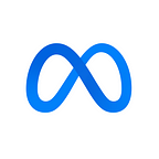
Unlike traditional brand design processes, we designed this symbol to live in motion and 3D. Drawn from a single line in space using our own Quest technology, the Meta symbol forms a continuous loop that works seamlessly between 2D and 3D contexts. It is designed to be experienced from different perspectives and interacted with. It can resemble an M for “Meta,” and also at times an infinity sign, symbolizing infinite horizons in the metaverse.

The Meta symbol was designed to dynamically live in the metaverse — where you can move through it and around it. It can take on infinite textures, colors and movement, capturing the creativity and imagination of a 3D world. It was also important that the symbol take on a blue gradient and pull in the color of our core products, connecting our future to our company’s origins.


The Meta Wordmark
The Meta wordmark was designed to be simple and effective in a wide range of applications — from the smallest in-app use case to the immersive world of the metaverse itself. The wordmark uses our company typeface that was introduced in 2019.


Beyond Today
We’re proud of what we’ve built and are excited about what comes next as we move beyond what’s possible today. Welcome to Meta.

See this article and others like it at the Design at Meta website.