Research Methods for Design
Reflection Document | Spring 2021| Carnegie Mellon University
Team — Alice Chen, Alex Heyison, Aashrita Indurti, Hannah Kim
Research Overview
In partnership with Prospect Studio and the Portland Public School (PPS) district, our team chose to focus our research on creating artefacts to better realize the futures of “Schools as Community Hubs,” inspired by the PPS vision document. Due to our group’s relative unfamiliarity with Portland and our limited access to research participants (especially those from marginalized communities), our research approach focused on finding ways to integrate primary and secondary sources. By shifting our project’s focus towards the needs of future caregivers, we also expanded our ability to conduct participatory research sessions, although, despite our best efforts, our design solutions ultimately were still shaped by the influences of access and distance.
In the following document, we will recap the research methods we used during our research. Over the past 3 months, we’ve experimented with a wide range of approaches. Some of these experiments were brief, some in-depth. Some of the experiments ended up being very impactful, some less so. Here, we present a near-complete inventory of these efforts. For the sake of brevity, we will choose to expand upon the details of the most impactful (good or bad) methods and with condensed notes on the remainder.
Table of Contents
1. Concept Overview
2. Defining the Problem Space
- Territory Map
- Literature Review
- Secondary Research
- Web Eavesdropping
- STEEP Diagram
3. Exploratory Research
- Interviews
- Synthesizing Qualitative Data
- Region-Specific Survey
4. Generative Research
- Participatory Persona Toolkits
- Storyboard Speed Dating
5. Prototyping
- Sacrificial Wireframes
- User Flow/Information Architecture
- Service Blueprinting
- Journey Mapping
- Mood boarding
- Wireframing
6. Research Outcomes
7. Reflections
Concept Overview
Ultimately, our research led us to design a multimodal platform to gather and organize caregiver feedback, facilitate action, and preserve a history of the efforts being made by the community in order to progressively build community capacity for change-making. Our system has two main components, an interactive wall situated outside each PPS school, and a companion app to facilitate engagement away from the school building. In addition to our system’s value as a tool for community organizing, we believe this tool will help establish the culture of celebrating feedback that PPS will need to support in order to realize their future vision of “Schools as Community Hubs.”

Defining the Problem Space
Territory Map
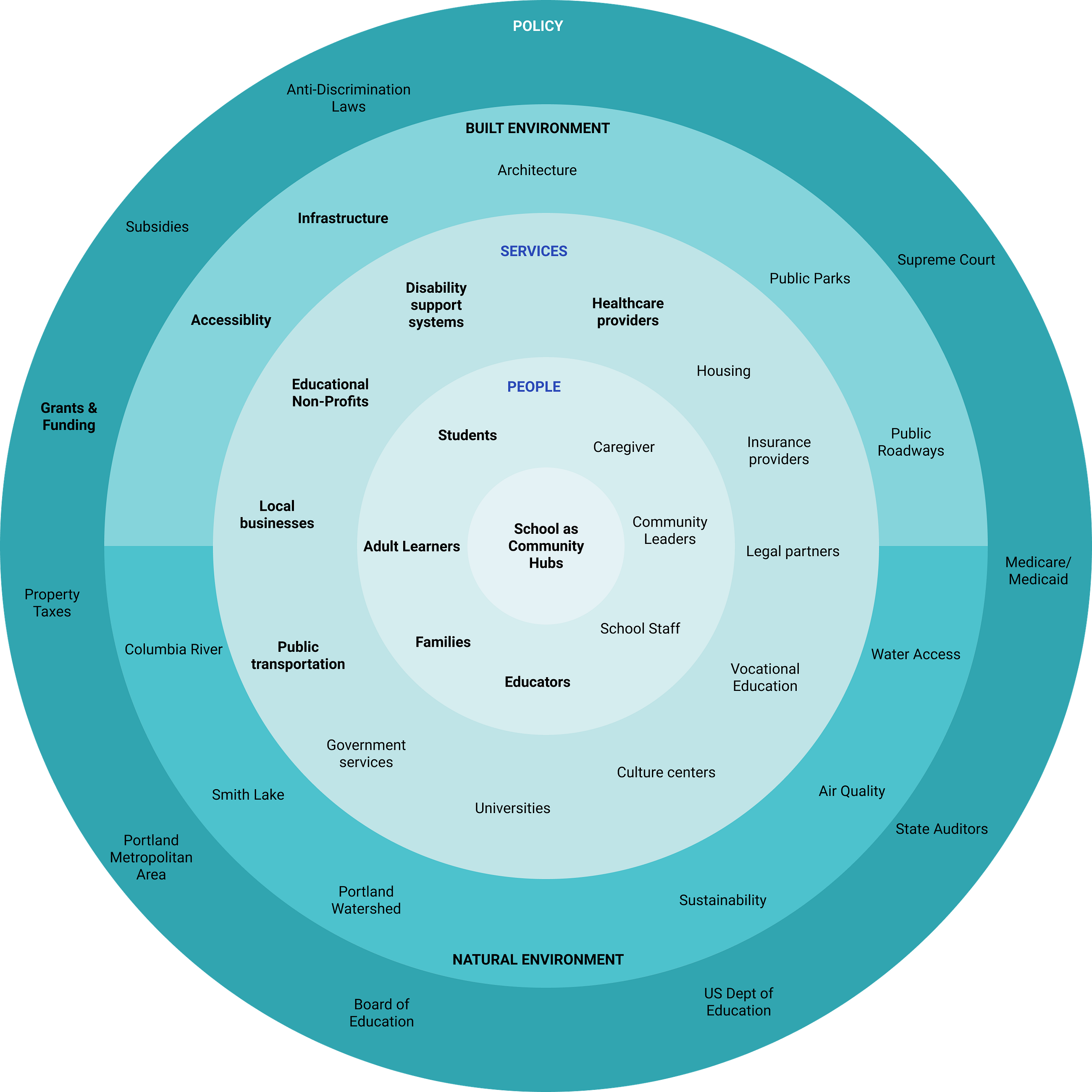

Early in the project, we understood that the scope of our prompt was broad. To help us quickly narrow down the scope, we used a territory map to surface the potential problem spaces that we were each interested in, as well as areas of opportunities. The mapping process started with us listing out all the stakeholders related to the theme. We then grouped similar keywords together to form clusters and then grouped them into rings on the territory map. While this method did not drastically shape our ultimate design direction, it was an important tool as a gut check in establishing the right rapport and alignment with our stakeholder. From our conversation, we heard that our client was in general very excited about our choice of topic, but also aware of the open-ended nature of what a “community hub” could be. The feedback we received during our presentation was to concentrate on one specific area of focus with clarity on whether we as a team were interested in pursuing the role of the community in individual learning or the role of community as a service integration.
Literature Review
We began our exploratory research with a literature review of research papers and case studies to get an insight into the idea of schools as community hubs. We reviewed various research papers and journals and some of the key topics revolved around the role of feedback in schools, learning frameworks in the future, community schools and integrated learning, the role of educators, school and parent communication and barriers in school/parent involvement. To build upon the idea of service integrated schools, we browsed through various cases studies of schools in the world that integrated various services and acted as harbingers of social justice.
Partially, due to practical constraints of not having access to students within the PPS community and partially from the frequency and energy with which both teachers and administrators talked about interactions with caregivers, we decided to focus around caregiver engagement. After we honed in on this area of focus, literature review formed a core part of our insights and research in order to understand the problems and pain points of caregivers, their means and frequency of communication with the school and their position in the dynamics of the school. A couple of research papers helped us understand the equity issues that caregivers of underserved communities face and the barriers that impede the education of their children. Since our project was being conducted at a distance, we found a need to reference and integrate these secondary sources throughout the project. Having an easily (and communally) referenceable inventory was great, but as we continued shifting platforms it became less and less easy to flip back and forth between this research on our more current designs.
Secondary Research
In order to get a better understanding of the city of Portland and the Portland Public School, we looked up the PPS website, the City Club of Portland, and the PPS Youtube channel and education portal. These sites and channels gave us a sneak peek into the current community engagement endeavours of the school and the programming in the city in general. From these investigations, we began to fill out our understanding of the current state of PPS and also began to piece together where power currently resides in PPS. These insights helped us particularly in our understanding of potential points of intervention and where our work might be most meaningful.
From this initial dive, we expanded in later phases to look into district-level resources and the minutes of the Board of Education. In the middle stages of the project, our ability to access these resources may have narrowed our focus a bit too quickly on the organizations that we could access on the web. Still, even this rapid narrowing did ultimately unlock a level of depth in our user research that would have been left very abstract otherwise.
Web Eavesdropping
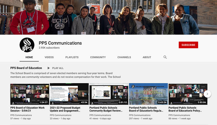
Web eavesdropping was another method we used to understand the perspective of parents and the general reputation and take on the Portland Public School system. We browsed through various social media platforms, Portland’s Reddit pages, and the PPS Communications YouTube channel, to take a look at the problems, motivations and pain points of the stakeholders associated with Portland and the PPS community. Our intention with this method was to try and bridge some of our understanding of Portland’s unique culture, PPS’s internal power structure and existing communication systems, as well as expand our research pool outside of our personal connections.
Our YouTube eavesdropping was efficient and successful at giving a sense of the power dynamics at PPS as well as keeping track of existing or new initiatives. Keeping subscribed to the channel allowed a slow drip of information throughout the project.
STEEP Diagram
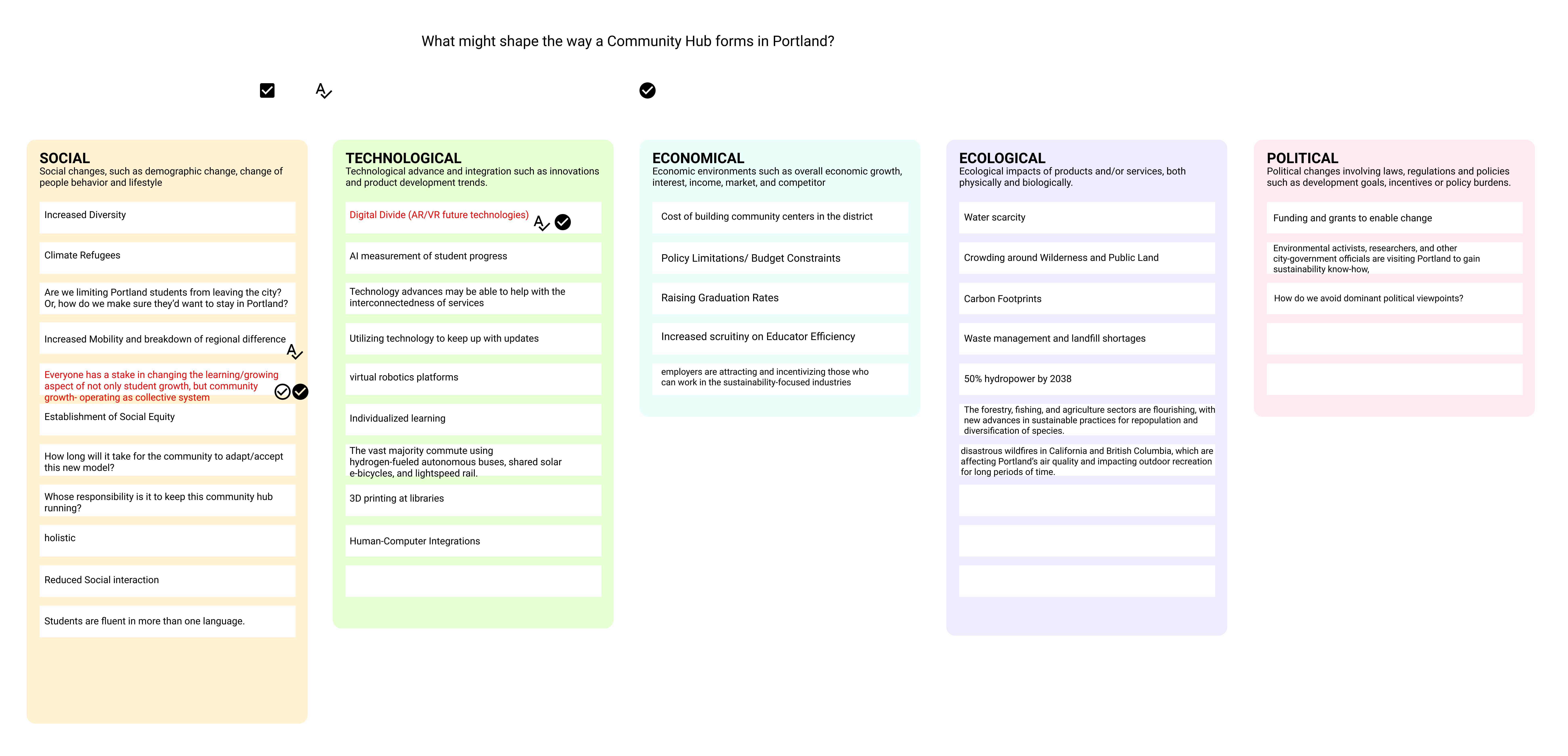
Early on in our discovery and exploratory research phase, we found ourselves feeling lost and overwhelmed by the broadness of our area of interest (school as community hub). The STEEP diagram was used to uncover social, technological, economic, ecological, and political factors that may influence the way community hubs can form in Portland. This exercise was helpful in that it showed us a high level organized view of the different categories within community hubs. Something that could have worked better during this process was we each should have chosen a category to do secondary research on.
Exploratory Research
Interviews
Our team relied on semi-structured interviews as a source of primary data on our problem space. Before each interview, we met to first establish what the goals of our session would be, focusing on information that could not be obtained otherwise. By the 3rd or 4th time around, we discovered that going one by one asking if each question was absolutely necessary was an efficient way to make sure we had a refined protocol. During the interview, we relied on these pre-chosen questions as a skeleton, with enough time for follow up questions reserved to allow for dives into greater depth.
As our project focus narrowed we also re-evaluated existing protocols and created new ones for new stakeholders. After each interview, we learned to prioritize a 15 minute debrief to capture insights, followed by a more in-depth matrix of key themes à la Ashley and Raelynn. In later phases of the project, we adapted to using a rose-bud-thorn method for synthesis (discussed below) but in the early stages of the project where we had few reference points for such normative categories, this basic excel framework was better suited.
Synthesizing Qualitative Data
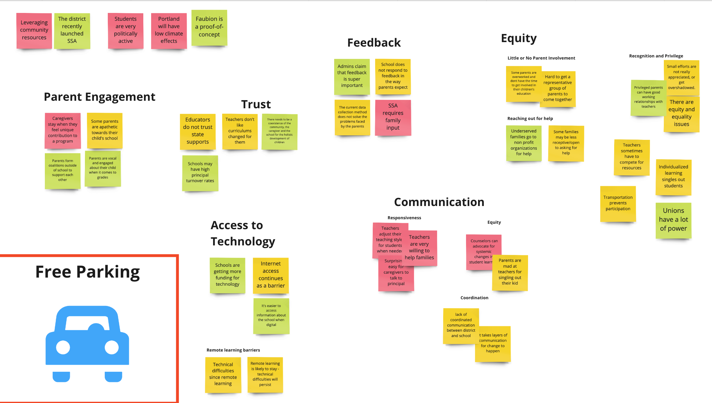
Our group created an affinity map to understand the information that we researched throughout the past couple of weeks. We found that it was easier to recall insights when we wrote out the broader themes that we looked into. This affinity mapping method helped us visualize common themes across various resources and methods, ultimately helping us pinpoint which key insights we needed to surface for our presentation. For example, we found that there were a lot of insights focused on the parent involvement theme, specifically around levels of engagement and participation. The two key insights we extracted from these insights are in the images below.
Our group also ran through a second round of synthesis during Kate McLean & Lauren Miller’s lecture. The rose, bud, thorn method was helpful because it not only allowed us to iterate on our previous affinity mapping exercise, but it also allowed us to visualize which themes had more buds and therefore surface where design could be leveraged for potential interventions. Over the course of the project, rose, bud, became an almost default approach to enhancing our affinity mapping. We returned to this method after each round of research, including our latest evaluative speed dating, and remote storyboarding sessions.

Three Horizons
- A brief method to bring clarity on what kinds of futures we would want to investigate, and where that future sits in the broader “cone of possible futures”
- An effective way to achieve a breadth of ideas quickly as well as to inspire conversations about the merits of particular concepts
Region-Specific Survey
To try for a better sense of the Portland-specific perspective, our team created two posts on r/AskPortland’s Reddit page after seeing how active that community was. We launched two sets of posts, survey and concept speed dating, as we tried to challenge our assumptions about Portland’s local culture and needs.
For the first round, we created two surveys in Google forms to accompany posts centred on communication with the school and caregiver participation in-school programming. We wanted to make sure respondents could either fill out the survey or respond directly to the post to allow multiple methods of contribution. While we were excited to find strong engagement with our post on communication, the following post on programming (launched a week later) seems to have not created the same level of engagement. In hindsight, we also found that the post responses yielded better results than the surveys they contained. In future, maybe we would focus our efforts on engagement through replies rather than emphasizing the survey.
Ultimately, our survey postings on Reddit showed moderate success, with a few parents validating our hypothesis that there was a felt disconnect and hopelessness between parents and administrators on both sides. While our hope was to expand the scope of our research participants, those who responded also commented on the limited and biased Reddit user base. These comments continued to emphasize our concern over biases in our sampling, while also demonstrating just how top-of-mind equity and inequality are within the Portland parent population as well as the felt insurmountability of that problem. For the second iteration of postings, we tried posting our storyboard concepts for speed dating feedback but did not receive any traction so we decided to move away from Reddit for speed dating and shifted to conducting synchronous speed dating rounds with Portland future caregivers.
Generative Research
Participatory Persona Toolkits
As part of our Generative Research, we looked for ways to integrate the individual perspective of our participants with elements of Prospect Studio’s Vision document by creating future persona toolkits in Miro. This method we felt would give participants the freedom to express their own perspective while also allowing them to easily build off of the kinds of futures that PPS had committed to focusing on. Using this method, we hoped to understand how individuals might situate their personal futures in particular aspects of the vision document, while also understanding the variety of ways that caregivers felt they would participate in the future of PPS. As we rehearsed the toolkit, we made continual modifications to improve the usability of the Miro board for non-designers. We also ended up creating separate toolkits for native and non-native Portlanders to allow for more authentic self-reflections. The differences between the toolkits were the questions we asked our participants. Native Portlanders were first asked how, in 2035, they would interact with their school system and then were asked to envision what role they would play in their community. Non-native Portlanders were asked what they would look for if they moved to a new city in 2035, and then were asked what they would look for in a school system within this envisioned city. These sessions were foundational in allowing us to create a more varied set of personas for our design.
In particular, these sessions allowed us a better understanding of the ways non-parents struggle to join and stay active in the PPS school community. One particular quote that stayed with us was,
“You’re just labelled as not involved if you don’t have a kid in the system, but we still pay [for the public school system]. So even though there is no direct involvement, we should all have easy access to information and know where we can step in and help.”
Even with our iterations, these sessions still struggled when there were technological barriers, and in their ability to sufficiently prime our participants to think into the future in such a limited amount of time. Still, having images to aid that still seemed better than nothing at expanding our conversation into the future.
Storyboard Speed Dating
To assess the desirability and underlying assumptions of our three chosen concepts, we went through 3 rounds of speed dating with Portland future caregivers. Prospect studio did not seem to lean towards any specific concept or direction, so we went through this research as a way to direct our focus. Storyboarding was chosen as an efficient and accessible way to convey the concepts at an appropriate level of fidelity that would ensure their reactions were focused on the core facets of the idea without being distracted by specific implementations. Storyboarding continues to be the most widely accessible way to convey an idea, although at some points it felt participants struggled to criticize or interrogate further into the concept.
As we narrowed in on a final concept (as shown above), we discovered strong concerns and hesitations about privacy and safety when contributing towards information that would be broadly viewable. These insights ultimately drove us to more radically rethink how our artefact would need to challenge and reshape the school’s existing cultures of feedback. Our artefact would need to reframe feedback as something that the school encouraged and celebrated.
Prototyping
Sacrificial Wireframes
In order to help align our thinking and concretize our ideas when looking for feedback from our professors, our group went through a round of generating sacrificial wireframes. These wireframes started to define concepts, establish hierarchies, and work through the semantics of our user flow. While we moved beyond these initial wireframes almost immediately, they were a crucial stage in pulling us out of abstract conceptual thinking and towards the tools that we would use to realize certain user experiences. From our discussions, we were able to talk through the advantages and use cases of different platforms as well as sort through how we might structure the kinds of information our platform would organize.
User Flow/Information Architecture

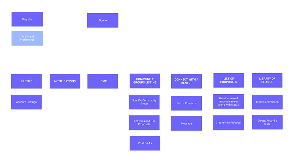
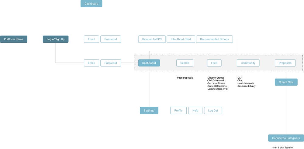
Establishing simple user flows and a basic site architecture helped our group clarify the pathways that different users might take as they navigate through our system with different priorities and entry points. These entirely served as internal planning and system audit documents to help with alignment and organization. Eventually, considering multiple of these user flows allowed us to build out a video script that would show off all the most relevant aspects of our design.
Service Blueprinting

- Undertaken to achieve a clear vision of our system and its intersections with other PPS systems and stakeholders
- Useful planning document and exercise for our team in terms of alignment and ensuring that we inventory and then highlight the most important interactions in the system
- Not very useful for non-designers. Requires more time from an interpreter to understand. This asset is uniquely bad for a presentation
Journey Mapping

We elected to create a Journey Map for our lead user, Mary as a way to further organize our thinking in a way that would be digestible by stakeholders at Prospect Studio and Portland Public Schools. This journey map went through three main iterations as we worked through modifications in the sequence that Mary would encounter aspects of our system, and as we layered on additional information about Mary’s experience. Beyond its role as an explanatory diagram, the journey map helped us narrow in on the key benefits of our proposed system. This clarity helped us frame a video script that not only explained our proposed design but also adequately highlighted the user’s felt benefits of participating in the PPS caregiver network.
Mood Boarding
Once we had agreed upon which aspects of the system would be the most influential to develop into higher fidelity examples, we undertook 2 rounds of mood boarding to establish a common visual language for our app and the interactive wall. Because of the different but symbiotic use case scenarios of the app and wall, we wanted to explore visual styles that would work at different scales while also holding true to our goal of creating a tool that would, through its use, change our user’s perspective on the role of feedback and caregiver involvement in the school system. In addition, we needed a style that would be distinctly “of the future” without pulling our audience towards focusing on the technology itself.
These explorations led to the adoption of a central metaphor, the dandelion, as a useful framework for organizing data as well as a powerful representation of the kind of growth, change-at-scale, and stubbornness that we wanted our system to represent. Our discussions around future text, UX patterns, and open space also allowed us to free ourselves from needing to show everything in our prototypes.
Wireframing
Once we had narrowed in on the specific interactions from both the wall and app that we wanted to show as part of our video/presentation, we started to wireframe out the ways the key screens might organize and display information. This was a key moment in ensuring that we were drawing our viewer’s focus to the right points in our visuals and gave us reference points to have important discussions about the hierarchy of features. Issues of voice and style were addressed at this point and we negotiated how much we needed to show to create the right conditions for suspension of disbelief without causing distraction. In addition, while we knew that we wanted to leverage the dandelion motif in our data visualization, the specifics of how to represent each element weren’t yet ironed out. Once we could see the first draft, we were able to have discussions about balancing macro-level intelligibility with more micro-level user flows, ensuring that our different stakeholders’ goals would be served.
Research Outcomes
Through the many phases of our research, we organized the form and delivery of our artefact around a core set of design insights.
- Portland has a remarkable culture that they want to preserve
- Portland cares deeply about the community
- PPS already recognizes that not everyone gets to participate and belong and a lot of groups/individuals get excluded
- PPS wants equitable participation but struggles to create systems and cultures that build and maintain equity
2. Caregivers often are the lynchpin that hold together school and the wider community
3. Caregivers already contribute in multitudes of ways, both visible and invisible. For those in the community that want to contribute, but currently can’t, often half the battle is being able to see where contributions can be made and where needs are currently unmet
4. Current systems of feedback are broken for both caregivers and the school system. Neither is getting the information they need to create positive change in the community
5. Current systems of feedback appear secretive and almost ashamed. They fail to represent the school’s intention and desire to listen. New systems should celebrate feedback, co-creation, and clearly communicate the school’s attitude towards criticism and collaboration
6. Schools are communities with an ever-changing roster of participants and leadership. This leads to “brain-drain” and broken bonds between school and community. For lasting change and growth towards a stronger, more adaptable community, PPS must be able to allow its community to learn from past efforts
Reflections
Looking back at a semester’s worth of work, it is immeasurably easier to trace exactly how each of the little bits of research ended up holding together a unified final design compared to how it felt carrying each method out. For most of the semester, our group had to contend with doubts and feelings of uncertainty about whether the approaches we were taking were the best ones for what we needed to uncover. Looking back, we can easily see shortcomings and can point out methods that didn’t seem to live up to our needs and expectations, but at the same time, it’s hard to find a truly useless bit of research. In some ways, the most consequential design decisions in our project were shaped by failed methods. Uncovering the shortcomings of the vision document led us to ask deeper questions about what might be missing. The methods that at one point seemed to outright fail (like our Reddit posts with no responses) ended up helping us understand just how meagre existing systems were in encouraging and facilitating feedback.
The arc of this project proves the amazing adaptability of many of these design methods in situations with severe constraints. At the same time, we continue to question the moral consequences of this adaptability. Ultimately, the most influential aspect of our research for this project wasn’t our choice of method, or our ability to adapt methods to project constraints. Despite our best efforts, it remains clear that access has an overwhelming effect on design research. Although it is possible to continue designing without access, nothing can quite replace it.

