The Journey into Time Series: Understanding Time Series Basics
Data Mastery Series — Episode 10: The Art of Forecasting (Part 1)

If you are interested in articles related to my experience, please feel free to contact me: linkedin.com/in/nattapong-thanngam

Predicting the future is a universal human endeavor. Whether we’re wondering about tomorrow’s weather or next quarter’s sales, our decisions are based on our anticipation of what’s to come. Time series forecasting is the statistical tool we use to make these educated guesses.
Types of Time Series Forecasting
Time series forecasts can be broadly classified into two categories:
- Qualitative forecasting: This approach is reliant on expert judgement and opinion, gathering insights from sources such as market research surveys or panels of experts. It’s particularly valuable when there is minimal or no relevant historical data to draw from.
- Quantitative forecasting: This data-driven method employs past data to predict future outcomes. It is the preferred approach when there is an abundance of relevant historical data.
Let’s delve into some popular quantitative forecasting algorithms:
- Naive: A simple yet effective method where the forecast for tomorrow is what happened today, making it a surprisingly solid baseline.
— Equation: If we denote the time series as Y and time points as t, the Naive forecast for all future time points is: Y(t+1) = Y(t) - Seasonal Naive: Also known as the “Year on Year” (YoY) method, this approach accounts for seasonality in data by using the most recent observation from the same season for forecasting. It’s a straightforward method that effectively captures seasonal patterns.
— Equation: The forecast for the next time point t+1 in Seasonal Naive (YoY) is obtained by taking the observation from the same season in the previous year: Y(t+1) = Y(t-n), where n represents the seasonal period. - Moving Average: This technique averages out a set number of recent observations to generate the next prediction, effectively smoothing out short-term fluctuations and highlighting longer-term trends.
— Equation: If n is the chosen period, then the forecast for the next time point t+1 is: Y(t+1) = (Y(t) + Y(t-1) + … + Y(t-n+1)) / n - Exponential Smoothing: Similar to the moving average, but with more weight given to the more recent observations, this technique is beneficial when data presents a consistent trend or pattern. Examples of this group include Simple Exponential Smoothing, Holt’s Exponential Smoothing, and Holt-Winters’ Exponential Smoothing.
— Equation: For Simple Exponential Smoothing: F(t+1) = α * Y(t) + (1 — α) * F(t), where α represents the smoothing factor. - ETS (Error, Trend, Seasonality): This model decomposes a time series into its error, trend, and seasonality components, making it particularly effective for data exhibiting clear seasonality and trend.
— Equation: The model includes various equations, depending on whether the error, trend, and seasonality components are additive or multiplicative. - LightGBM and XGBoost: Both of these methods are gradient boosting algorithms that create an ensemble of prediction models, typically decision trees, to enhance predictions.
— Equation: These methods apply the principle of boosting to decision tree models. The exact equations depend on the chosen loss function and tree complexity. - ARIMA (AutoRegressive Integrated Moving Average): ARIMA merges differencing, autoregression, and a moving average model to generate predictions. This versatile model requires careful tuning. Within the ARIMA framework, variations such as ARIMAX, SARIMA, and SARIMAX also exist, offering additional features and capabilities for modeling complex time series data. These models provide advanced techniques for capturing dependencies, trends, and seasonal patterns in the data, making them valuable tools for time series forecasting.
— Equation: ARIMA(p,d,q) where p is the order of the autoregressive part, d is the degree of first differencing involved, and q is the order of the moving average part. - Prophet: Developed by Facebook, Prophet is especially suited to datasets with strong seasonal effects and multiple seasons.
— Equation: The model includes a piecewise linear or logistic growth curve trend, a yearly seasonal component modeled using Fourier series, and a weekly seasonal component.
In the next episode, we’ll explore examples of these methods, crafting code and comparing the performance of these algorithms.
4 components of Time Series
Any given time series can be thought of as consisting of four components:
- Trend Component: The long-term movement or direction of the data. Does it increase, decrease, or remain relatively stable over time?
- Seasonal Component: Recurring patterns that follow a specific time-based period, such as daily, weekly, or annually.
- Cyclical Component: These are patterns that take place over longer time frames and are not tied to fixed calendar-based cycles. They occur at irregular intervals, often corresponding to phenomena like economic conditions or business cycles.
- Irregular Fluctuation: This component accounts for random or unpredictable fluctuations in the time series that cannot be attributed to trend, seasonality, or cyclical patterns. It represents the residual noise in the data.”
To gain a deeper understanding of the 4 components of a time series, let’s delve into a simulated dataset, as depicted in the image below.

To provide further clarity, let’s assume this graph represents the sales volume of “Ice Cream” from 2000 to 2023. By employing the “seasonal_decompose” function from the “statsmodels” library, we’re able to deconstruct the time series into its individual components.
- The top graph illustrates the overall movement of ice cream sales volume over time. The next graph down presents the underlying trend, revealing the movement of sales volume independent of seasonal fluctuations and residual noise.
- The middle graph showcases seasonality, providing insight into the recurring patterns in your product’s sales data, stripped of trend and residual influences.
- In the fourth graph, we combine the trend and seasonality components. Any discrepancy between the actual trend and this combined figure constitutes the residuals, which are represented in the bottom-most graph.
- By collectively examining these graphs, we gain a comprehensive picture of our time series data, distinguishing between the overarching trend, the recurring seasonal fluctuations, and the random residual variations.

Evaluating Forecast Accuracy
The effectiveness of a forecast hinges on its accuracy. We determine this by measuring the disparity between the actual and predicted values, known as the forecast error. If the error is positive, our forecast fell short. If it’s negative, we’ve overestimated.
Several methods allow us to quantify these errors:
- Mean Absolute Error (MAE): The average of the absolute errors, which gives a rough indication of the error magnitude.
— Equation: If we let Y_actual be the actual values and Y_predicted be the predicted values for n points, then MAE = (1/n) Σ |Y_actual — Y_predicted| - Mean Absolute Percentage Error (MAPE): The average of the absolute percentage errors. This method is popular due to its straightforward interpretation.
— Equation: MAPE = (100/n) Σ |(Y_actual — Y_predicted) / Y_actual| - Mean Squared Error (MSE) and Root Mean Squared Error (RMSE): These are akin to MAE but place more penalty on large errors.
— Equation: MSE = (1/n) Σ (Y_actual — Y_predicted)² and RMSE = √MSE
To better comprehend these measures of forecast errors, let’s consider the following dataset (which shows actual and forecasted sales for 2021):

We can easily calculate MAE, MAPE, MSE, and RMSE using Python, but for clarity, I’ve created separate columns for error, absolute error, relative error (absolute error divided by actual value), and squared error.

Then, by taking the averages of these columns, we obtain the Mean Absolute Error (MAE), Mean Absolute Percentage Error (MAPE), Mean Squared Error (MSE), and Root Mean Squared Error (RMSE).

After understanding forecasting errors, it’s crucial to grasp the concepts of bias and variance. Bias refers to consistent errors in a model due to its oversimplification. In other words, the model may not capture the complexity of the data, leading to a systematic deviation from the actual values. On the other hand, variance represents errors introduced due to an overly complex model that ‘overfits’ the data, learning the noise alongside the underlying pattern, which then performs poorly on unseen data.
Striking a balance between these two types of errors, a process known as the “Bias-Variance Tradeoff,” is fundamental for effective modeling. An ‘optimal model’ adroitly manages this tradeoff, minimizing both types of errors to deliver the best predictive performance. Carefully addressing this tradeoff during model preparation helps to prevent the pitfalls of overfitting and underfitting.

ABC-XYZ Analysis for Forecasting
ABC-XYZ analysis is a method used in inventory management that can also be applied to demand forecasting:
- ABC analysis groups items based on their impact on total revenue or sales. It follows the Pareto Principle, where ‘A’ items represent 20% of the total but contribute to 80% of the value.
- XYZ analysis classifies items based on their predictability. ‘X’ items have high forecast accuracy, while ‘Z’ items are difficult to forecast.
- Combining ABC and XYZ analysis provides a two-dimensional approach that can be incredibly helpful. For instance, ‘AX’ items are both important and easy to forecast, while ‘AZ’ items are crucial but hard to predict. Handling each product category differently based on these classifications can lead to more effective management. This method serves as a powerful diagnostic tool in forecasting, enabling us to allocate resources more efficiently, prioritize our efforts according to the items’ importance and predictability, and make more informed strategic decisions. This in turn can result in improved inventory management, increased sales, and enhanced customer satisfaction.

Demand Pattern Type
Forecasting demand can be particularly difficult for products with volatile demand. In these scenarios, two metrics stand out: the Coefficient of Variation (CV) and CV², which measure volatility, and the Average Demand Interval (ADI), which measures the frequency of demand occurrence.
- CV = Standard Deviation / Mean
- CV² = square of the Coefficient of Variation
- ADI = Total number of periods / number of instances of demand
Based on these criteria, products can be classified as Smooth, Erratic, Intermittent, or Lumpy (Reference: https://frepple.com/blog/demand-classification/):
- Smooth Demand: CV² <= 0.49 and ADI <= 1.32
- Erratic Demand: CV² > 0.49 and ADI <= 1.32
- Intermittent Demand: CV² <= 0.49 and ADI > 1.32
- Lumpy Demand: CV² > 0.49 and ADI > 1.32

Additional Considerations
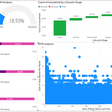
- Cohort Analysis is a strategic technique that groups customers based on specific criteria and tracks their behavior over time. It provides insights for targeted strategies, customer retention, and loyalty. This technique also helps businesses gain a deeper understanding of their customers across time, enabling them to adapt to evolving needs and preferences while optimizing the customer experience. Cohort Analysis empowers businesses to make informed decisions and enhance long-term customer relationships.

Time series forecasting is a potent tool that can guide us through the uncertainties of the future. As we explore more sophisticated forecasting methods in our subsequent articles, remember that our aim isn’t just achieving accuracy but also understanding the underlying patterns shaping the data. Stay curious, and enjoy your journey into the fascinating world of forecasting.
Thank you for taking the time to read this article! If you found it enjoyable, we recommend checking out these other articles for your reading pleasure.


Please feel free to contact me, I am willing to share and exchange on topics related to Data Science and Supply Chain.
Facebook: facebook.com/nattapong.thanngam
Linkedin: linkedin.com/in/nattapong-thanngam