How to get more subscribers with a user-friendly paywall. Part I.
If you are a product manager or engineer who is working on a direct monetization system for online content, this post and the next one may save you months of research. And our code may save you months of user research and engineering.
We recognized early on that content monetization via ads is not for everyone. Ads pay peanuts, competing for advertisers is extremely hard (Twitter and Snapchat are still not profitable), adblocking is growing fast and readers hate ads unless they’re implemented natively and non-intrusively (like ads on Quora). Some companies which have scale, such as Pinterest, Quora and Fandom/Wikia, are slowly grinding the advertising mill. Others, like Medium, decided to bet on subscriptions completely.
We as content consumers know how painful it is to subscribe (or unsubscribe) to online content. On a typical website, it takes over 10 clicks to subscribe. You often have to leave the main website to deal with a clunky third-party subscription service, and it’s almost always impossible to unsubscribe. If you want to access content on another website, you gotta go through nine circles of hell again.
We decided to build a better paywall and membership product. We started with a few first principles. First, the paywall must be as user-friendly as possible. If content is worth paying for - paying should be seamless. Second, it should be easy to add the paywall to any web stack. Third, the content creator or publisher should have fine-grained analytics on the best performing content and on any user’s location within the subscription sales funnel. We spent a year on intensive user research and development and recently decided to open-source the basic version of our product. If you are a product head or startup founder and decided to build a paywall or membership system from scratch, check up our Github repo and email us with any questions (kelly@getdrizzle.com). We offer a feature-rich commercial version and custom development service as well.
In this post, we summarize some of what we learned about building a user-friendly paywall that converts visitors into subscribers. Our SaaS clients observed 200–300% more subscribers after switching from their custom-built paywall/membership system to ours.
Visitor experience.
In this subsection we summarize the product features, which if implemented correctly, dramatically increase conversion rates.
(1) The type of paywall.
Website visitors’ experience will vary significantly depending on the type of the paywall. If access to content is strictly limited (a hard paywall), then visitors have to decide right away to either bounce off or pay.
Publishers have a choice on how strongly to limit access to their content. If content is really unique and the brand is known, then a publisher can get many paying users pretty quickly. An obvious choice would be a site-wide paywall with some kind of preview. Check out these 3 premium publishers: The Information, WSJ or Pando. If a website relies on ad revenue or there’s some other reason not to limit access for most of visitors, a metered paywall is the answer. Check up Harvard Business Review or New York Times.
As we discussed in our previous post, the publisher or website owner has to decide on the type of paywall from the beginning. Content uniqueness, audience, and financial goals have to be taken into consideration.
(2) Content preview.
No one wants to pay or moreover subscribe without “trying” content out. The key to high conversions is allowing visitors to preview and consume enough content so they can make an informed decision. The publisher can let visitors preview content in multiple ways. As always, there is no single rule that works for every publisher. The decision should be based on type of the content and audience.
Our product has all 4 preview methods: metered access, teaser effect, free trial and daily pass.
Metered access allows most of your visitors, who are casual and come only a few times per month, to never hit a paywall. The metered paywall will appear only to frequent visitors. For most websites, frequent visitors make up a relatively small fraction of entire audience. This will allow the publisher to monetize the majority of the audience (casual visitors) via ads and encourage only the frequent visitors to pay. We recommend that publishers experiment to figure out the number of free articles given per visitor per month. Industry consensus is around 10 but varies between 5 and 20.
Teaser effect can be used with any type of paywall. We always encourage publishers to give away 1/3 to 1/2 of their articles for free. This allows visitors to engage with the story. Once engaged, they’re less likely to bounce off the page and more likely to convert. We showed that this teaser works well for all types of conversions: lead generation, payments and even asking visitors to turn off Adblock.

Free trial allows publishers with valuable content to collect visitors’ payment information in exchange for access to free content for a limited amount of time. Visitors usually get 1 week to consume and evaluate the content, and they can cancel the trial at any time. However, if the trial is not cancelled in time, then the visitor will automatically become a subscriber. You’ve probably already seen this strategy in Hulu and Netflix.

Daily pass can be used by publishers who have regularly updated content and whose audience accesses that content casually. For example, infrequent players of Fantasy Sports like to purchase daily stats whenever they decide to play. A single $2 payment (not a recurring subscription) allows these visitors to access unlimited content on a website for one day.
(3) Signup and Login.
The first step in becoming a paid subscriber is signing up. We’re not sure why, but legacy membership products often redirect visitors to a new page (and many times an unknown third party) to sign up. This introduces extra steps, damages the publisher’s brand and makes some visitors too suspicious to complete registration. We listened to users and implemented the signup and login forms on the same page:

We currently ask users for name and password, which is overkill. Every second matters, and an ideal signup form has only one field: email. It’s possible to implement, there are at least two solutions. One solution is to send the user an email with a one-time signup or login link (approach is called passwordless). When the user clicks a special link, he or she gets redirected and signed up or logged in automatically. Slack and XYZ use this method. A second solution is to ask the user to set up a password after clicking on the link. The user gets redirected and modal asks for a password in order to continue.
Social signup button is an interesting option, there is no solid rule on whether you should use Fb, Tw, G+, etc. buttons. We decided to add a Fb button in addition to email signup. Depending on the website, anywhere between 20–70% of users signed up via Facebook instead of email. The numbers may be skewed a bit since our current signup form is way too long. One thing we’ve learned, perhaps an obvious but powerful UX rule, is that no matter what action you ask your visitors to take - make sure that the number of options is low, ideally one. Mailchimp UX engineers did a quantitative study showing that adding extra signup methods did not result in higher conversions. If anything, showing too many options reduced conversions. To decide on signup methods, start with email signup and experiment with just one social button. Depending on your audience and size of mobile audience (it’s painful to signup or login on mobile via email and password) you may or may not see an increase in conversions.
Visibility is important. Both existing subscribers and publishers have asked us to increase the visibility of their subscription/membership. Existing subscribers wanted to find the user dashboard faster, and publishers wanted new visitors to find the subscription offer right away without clicking. To address it, we added two optional features. One is a sticky footer bar which shows the publisher’s offer to new visitors and helps existing subscribers find their dashboard. In addition, the publisher can generate a link and place it anywhere on the website. The link brings up the login/signup form for guest visitors and the dashboard for an existing user.

One more area of innovation is single sign in. Early on, some of our SaaS clients wanted to use the paywall on multiple websites but maintain a single user base. For example, the publisher has two websites A and B. When a visitor registers on website A, he or she does not need to register on website B in order to purchase content there. A and B have a single, shared user base. This is possible to do with our product as well, and it obviously increases the number of subscribers immensely for such publishers.
Subscription flow.
We noticed that a general mistake among most publishers is to give visitors as many subscription choices as possible. We typically see at least 3 subscription options (basic, premium, digital + print) plus 3 ways to pay (weekly, monthly, annually). Surprisingly, we found that giving too many options does not increase (and in some cases decreases) conversions. In most cases, visitors prefer just one option with one billing period. One of our clients offers monthly and weekly billing cycles, still over 80% of visitors opt for monthly. Adding extra cycles or options did not increase conversions.

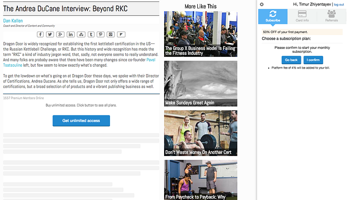
Some users would never become subscribers, but not because they don’t see any value in the content, but because the subscription process is hell and unsubscribing is even worse. The internet user experience bar is slowly going up, with more people who can’t tolerate 10+ clicks to signup and pay. We made sure from the beginning that it’s extremely easy to subscribe or unsubscribe on our product. Subscribing is straightforward and takes 3 clicks, unsubscribing takes 2 clicks, including confirmation steps.

Curated lists.
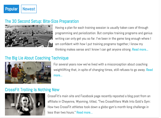
Another way to increase conversions is to engage casual visitors with other content, so we built a basic curation tool into our paywall product. Without any extra effort on publisher’s side, the publisher can show newest, most popular and most similar content on their website at the bottom of each article (we call it “upselling lists”). We took an empirical algorithm of collaborative filtering to compile the list of most similar content. If a visitor reads article A, then we recommend article B if many visitors read both A and B. Our data shows that visitors read 10-20% more content if the publisher suggests (upsells) content via curated (upselling) lists.

This list summarizes the key UX features of our paywall and why we built them. In the next post, we focus more on publishers and discuss a set of features and metrics which help publishers sell more content and save time.
